What William Zinsser Taught Us about Visualizing Data Well


William Zinsser, author of On Writing Well: The Classic Guide to Writing Nonficton, died last week at age 92. Zinsser was an inspiration to writers and aspiring writers, including myself, since he first published his manual in 1976.
Zinsser’s book taught me to respect sentences and words. Or, to put it another way, it made me realize that my writing sucked. It was a harsh realization at the time, but I needed to know that up front. I’d like to think that my writing sucks a little less now thanks to Zinsser.
As I read On Writing Well, it struck me that his advice for communicating well with words applies directly to the craft of communicating visually with data. His seven principles in Part I—the transaction, simplicity, clutter, style, the audience, words, and usage—could be written about visualizing data as well.
Let's call this conversation "On Visualizating Data Well."
1. The Transaction
Zinsser opened his book by teaching that “the product that any writer has to sell is not the subject being written about, but who he or she is.” The “transaction,” then, is a personal one. The reader is drawn in by the “enthusiasm of the writer for his field,” and the two most important qualities that result are “humanity and warmth.”
The same is true when someone examines the product created by a data visualizer. The humanity of the visualizer should shine through:
• What does the author of the visualization think about the topic?
• Why does the author care about this topic?
• How does the author feel about it?
• Do you know something more about the author, not just the given topic?
Take another look at one of the most talked about visualizations of 2014, Periscopic’s animated U.S. Gun Deaths. Regardless of what you think about the design, form, or aesthetic of the final product, you can’t help but feel the emotions of those who created it. Is there any doubt about what they’re trying to say, and more importantly, why they’re saying it? Kim Rees and her team brought their humanity to the transaction:
2. Simplicity
Zinsser said “the secret of good writing is to strip every sentence to its cleanest components." He said there are a “thousand and one adulterants that weaken the strength of a sentence.”
Here’s an example he gave of “the clotted language of everyday American commerce”: “The airline pilot who announces that he is presently anticipating experiencing considerable precipitation wouldn’t think of saying it may rain.”
It’s easy to laugh at this bloated phrase because we see it all the time, and we even fall prey to it ourselves. The same is true when we communicate with data. The lesson is that we shouldn’t overcomplicate the message.
This lesson is often misunderstood to mean that we should dumb down the message, or only choose simplistic messages in the first place. This interpretation is wrong. Just as a writer sometimes seeks to articulate a profound thought, we sometimes seek to show relationships that are complex. That’s okay, and we shouldn’t shrink from that challenge in the name of simplicity. But if there’s a clear way to show it, then we should show it clearly. In the words of Albert Einstein, “everything should be made as simple as possible, but not simpler.”
3. Clutter
Zinsser said “writing improves in direct ratio to the number of things we keep out of it that shouldn’t be there.” He opened his third chapter with a funny example from the annals of U.S. history: “Consider what President Nixon’s aide John Dean accomplished in just one day of testimony on television during the Watergate hearings. The next day everyone in America was saying ‘at this point in time’ instead of ‘now.'"
His admonition: “Examine every word you put on paper.” When working with his students at Yale, Zinsser would “put brackets around every component in a piece of writing that wasn’t doing useful work.” Sound familiar? Edward Tufte’s notion of “chartjunk” is the same notion. Designers and artists celebrate the “white space” in their creations. Obviously we shouldn’t remove every pixel, just the ones that aren’t doing any work. The trick is knowing which is which.
4. Style
Next Zinsser addressed the objection that reducing a writing product to its simplest form leaves no room for style. He did concede, however, that “simplicity carried to an extreme might seem to point to a style little more sophisticated than Dick Likes Jane and See Spot Run.”
In data viz, the corollary to these preschool sentences is the bar chart—simple, easy to understand, but no flair. We’re in familiar territory. It’s the never-ending “clarity vs. beauty” debate. But it’s a false dichotomy. Clarity and beauty are not mutually exclusive. Of course we can achieve both. Info viz design firm Accurat does it all the time. Here’s an example of the firm’s work:
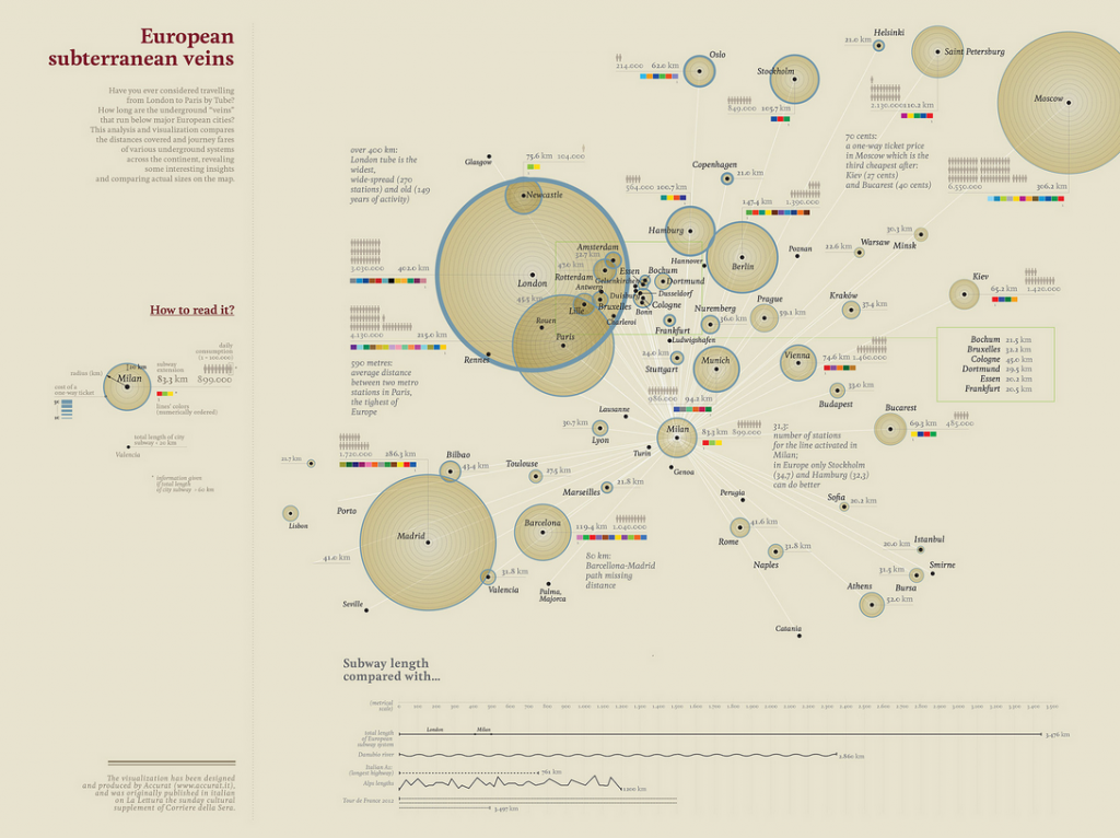
This viz by Accurat shows the European subterranean veins. Click to enlarge.
How can we achieve both simplicity and style? Clarity and beauty? Zinsser’s advice for writers applies to us, too. There’s a reason his chapter on style follows the previous two. A singer with loads of personality who sings out of tune won’t sell records. A carpenter who adds bevels and carvings galore to a chair that doesn’t hold your weight won’t stay in business for long. “This is the problem of writers who set out deliberately to garnish their prose,” Zinsser said.
He used the woodworking analogy to show us the way: “Extending the metaphor of carpentry, it’s first necessary to be able to saw wood neatly and to drive nails. Later you can bevel the edges or add elegant finials, if that’s your taste. But you can never forget that you are practicing a craft that’s based on certain principles.”
To create a data visualization that is both clear and beautiful, we first must get right the raw materials and basic proportions. Only then we can add what Willard Cope Brinton calls “judicious embellishment of charts.” What’s judicious? Fortunately, as Zinsser put it, “there is no style store,” and you’ll have to answer that for yourself. Your audience will also have an opinion on the matter.
5. The Audience
Speaking of audience, Zinsser addressed this critical element in the fifth chapter of his masterpiece. We often talk about “knowing your audience” in data viz, and user-centered design in product development. It’s a very popular topic. I even give similar platitudes in the first chapter of my own book.
But Zinsser gave what at first seems like shocking advice on this subject. He said, “You are writing for yourself. Don’t try to visualize the great mass audience. There is no such audience – every reader is a different person.”
Only write for yourself and don’t even consider who will see your work? Really? He clarifies by differentiating between a mechanical act (“work hard to master the tools”) and a creative act (“the expressing of who you are”). If you lose someone through “sloppy workmanship,” then it’s your fault. If you lose someone because they don’t like what you have to say, don’t worry. “You are who you are, he is who he is, and either you’ll get along or you won’t,” he said.
In other words, care about your audience’s ability to decipher your message, and get that part right, but don’t care about whether they’ll agree with you or like you. Just say what you need to say based on what you find in the data.
6. Words
Zinsser’s sixth chapter, titled “Words,” deals with avoiding “cheap words, made-up words, and cliché that have become so pervasive that a writer can hardly help using them.” His advice: “You must fight these phrases or you’ll sound like every hack.”
Do we have clichés in the world of data viz? Yes, we do. We all seek to imitate others in some way. The cliché in any field is just the tacky or ineffective element that people continue to use in spite of the fact that it’s bad, just because others use it. Think periodic tables and subway maps.
At the 2014 Tapestry Conference, Martin Wattenberg and Fernanda Viegas discussed the genres in data visualization. They explained how we often use a shared language that gives our readers shortcuts to understanding. While this can be good, we are in danger of getting stuck in these genres, which can become formulaic.
The key, Wattenberg and Viegas pointed out, is awareness—of the elements of the genre or genres we’re in, and those elements to which we really shouldn’t adhere because they don’t work or are tacky. We have to care enough to examine each element, and root out clichés, regardless of what our peers might be doing. According to Zinsser, “the only way to avoid it is to care deeply about words.” We also have to care about the data. (Here’s Wattenberg and Viegas’s full presentation.)
7. Usage
Zinsser’s last principle deals with usage. How do we determine whether what’s new should be “ushered in” as accepted practice, or whether it should be “thrown out on [its] ear?” For any field to be vibrant and thriving, and for it to be at all fun, it must be fluid and not static. Is data viz fluid, or is it static?
Just as there is “no king to establish the King’s English,” there is no anointed panel to accept or reject new methods or tools in data viz, at least not that I know of. We all get to cast a vote by what we use. One of the chief values that innovators like Accurat and Periscopic bring to the field of data viz is a fresh take on this business of communicating with data. We all get to observe one another’s work, and if we keep the principles in mind, the history books will determine what gets kept and what gets left behind.
I’m confident that we’ll get the pixels right.
A version of this post first appeared on Ben Jones's personal blog, DataRemixed.
เรื่องราวที่เกี่ยวข้อง

5 Ways to Use Tableau Public to Achieve Your Goals
 มกราคม 11, 2025

World Mental Health Day: Elevating Awareness Through Data Visualization
 ตุลาคม 10, 2024

From TV Screens to Tableau: Visualize Your Favorite Shows with IMDb
 สิงหาคม 31, 2024