How W.E.B. Du Bois used data visualization to confront prejudice in the early 20th century
In celebration of Black History Month, we're taking a closer look at how Du Bois’s visualizations for the Paris Exposition were innovative.


W.E.B. Du Bois is predominantly known as a scholar, activist, and author, but he was also a data visualization innovator. Born in 1868, Du Bois was the first Black American to receive a doctorate from Harvard, then studied and traveled in Europe before returning to the United States to focus on a career in the social sciences. Desperate to advance the rights and quality of life for Black people, Du Bois set out to collect the compelling evidence needed for cultural change. But he quickly realized more than reporting statistical data was needed to change a lifetime of racial oppression. David Levering Lewis, in his excellent Pulitzer-prize winning Du Bois biography, explains: “More than any other American Sociologist during the decade after 1898, Du Bois undertook for a time the working out of an authentic objectivity in social science. [He] strove to avoid apriorism, to generalize cautiously, only after questionnaires, census records, government archives, cross-cultural data…had been digested.”
 Left: W.E.B. Du Bois in Paris, 1900. Right: “The Exhibit of American Negroes” at the 1900 Exposition Universelle in Paris.
In 1900, Du Bois had the opportunity to design and curate “The Exhibit of American Negroes” for the Exposition Universelle in Paris. He writes in his autobiography: “I wanted to set down its aim and method in some outstanding way, which would bring my work to the thinking world. The great World’s Fair at Paris was being planned and I thought I might put my findings into plans, charts and figures, so one might see what we were trying to accomplish.” Du Bois’s visualizations for the Paris Exposition were innovative in two ways. First, his systematic approach to building a data-driven argument is powerful in its comprehension and scope and second, he took a unique approach with the graphical methods he used in his visualizations.
Designing for the 1900 Paris Exposition
The 1900 Paris Exposition was a unique opportunity to tell the story of Black Americans to a new audience and Du Bois chose to use the language of charts. The 63 data visualizations in “The Exhibit of American Negroes” are split into two sections: “A Series of Statistical Charts Illustrating the Condition of the Descendants of Former African Slaves Now in Residence in the United States of America,” which focuses on the national and international view of the data, and a companion work done the same year called, “The Georgia Negro” that focuses on a single state.
By organizing his charts in a way that breaks up his data into three distinct views—international, national, and local—Du Bois crafts a data story that explores AfricanAmerican history, education, business development, and property ownership. Du Bois links his data across the charts, crafting an elaborate, interconnected data story that builds and reinforces itself from a local to an international view.
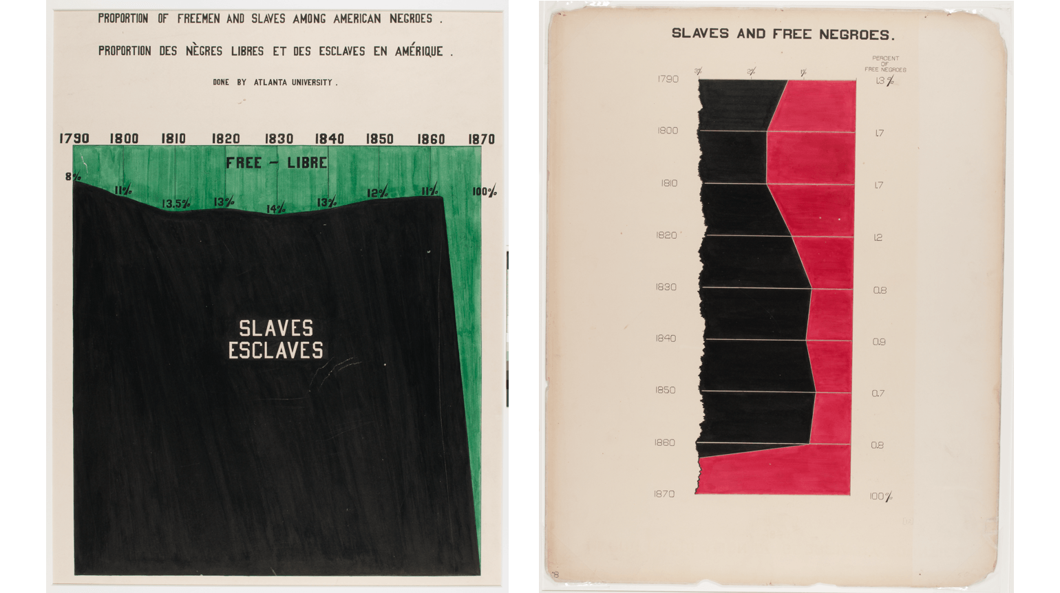 Two of Du Bois’s charts from the 1900 Paris Exhibition. Left: Chart showing national overview of the total number of free African-Americans in the United States from near the beginning of slavery to five years after the U.S. Civil War. Right: Subset of the same data, focusing on the state of Georgia.
For example, “Proportion of Freemen and Slaves Among American Negroes” provides a national overview of the total number of free Black Americans in the United States from near the beginning of slavery to five years after the U.S. Civil War. Then, in “The Georgia Negro” series, Du Bois presents “Slaves and Free Negroes” as a subset of the same data, the green ribbon from the first chart is rotated 90 degrees and magnified. What was presented at the national level as a thin green ribbon that represented free Black Americans, was a stark contrast to the massive black section, representative of the amount of enslaved Black people — this was ripped from the larger story in the Georgia version; its scale so tiny that Du Bois can only exhibit the fragment. Since the same national and state view of the data corresponds, one might consider this to be the 19th-century equivalence of interactivity.
Creating new methods and new chart types
While many of the charts in the exhibit were bar charts, Du Bois also invented several new charts. The most well-known coined the “Du Bois Spiral” by the prominent data visualization and D3 expert Elijah Meeks. Similar to a stacked bar chart, the Du Bois spiral takes disproportional data and angles (or wraps) them to point out the inequalities in the data. Each acute angle highlights the change in category, while the largest number is so grossly disproportionate that the bar is coiled into a spiral. It’s really an interesting solution that is as beautiful as it is effective for the right data.
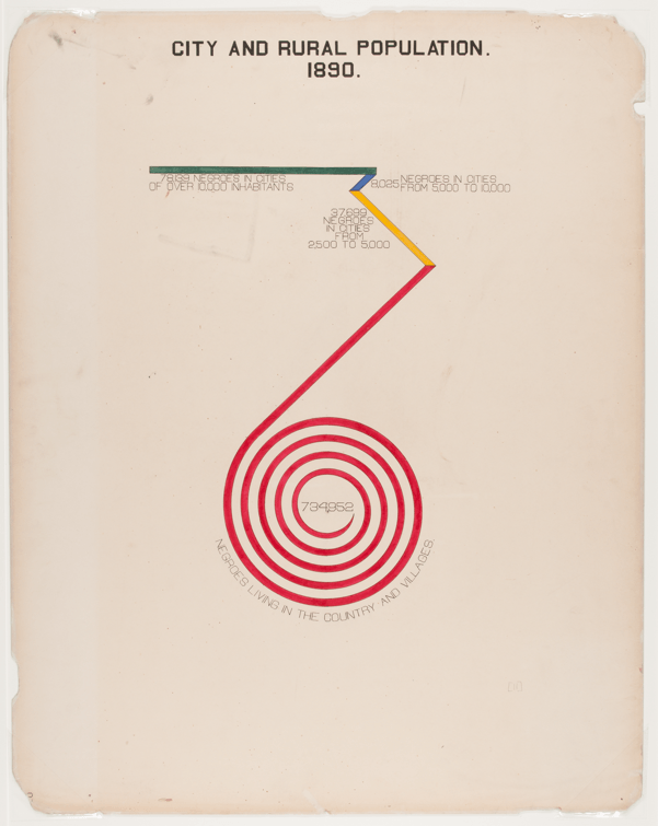
Du Bois’s new chart type for the 1900 Paris Exhibition, showing changes in rural and city populations.
Another visually distinctive chart is Du Bois’s innovative take on the pie chart. “Occupations of Negroes and Whites in Georgia” is a comparison of two fan-charts showing the comparison of occupations by race. By presenting the proportional slices as mirror images, Du Bois crafts an elegant visualization that makes comparison easy and visually interesting. Reading this novel chart is aided by the singular legend, clear labeling, and categorical colors reflected in each half.
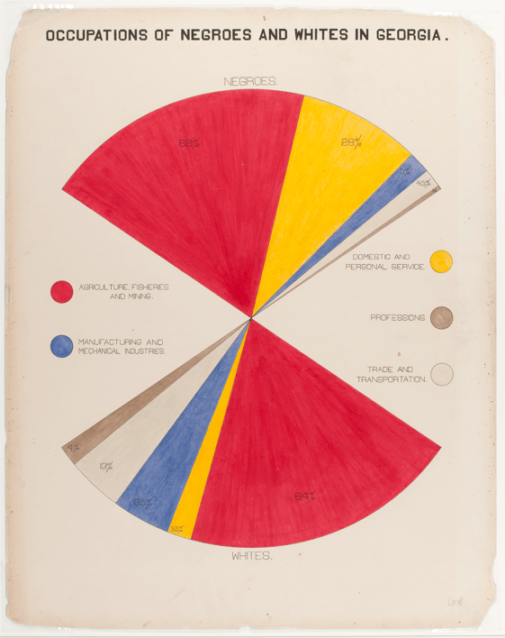
Du Bois’s take on a pie chart, comparing occupations by race.
But the real story of “The Exhibit of American Negroes” is how Du Bois directly confronts negative stereotypes. By presenting the carefully collected data, Du Bois clearly draws equivalent comparisons between Black Americans, white Americans, and Europeans. This was a bold gesture by 19th-century standards for a Black American to present on the world stage, when voices of color were noticeably absent. By presenting the statistical data, Du Bois created an effective argument that sidesteps prejudice and focuses on empirical truth.
Du Bois’s impact on data visualization
While the exhibit was praised by officials of the Paris Exposition, the direct impact of “The Exhibit of American Negroes” is hard to measure. While the BlackAmerican press gleefully reported on the exhibit, the European media only moderately mentioned the effort and white American press completely ignored the exhibit. Had the exhibit caught the attention of the press, maybe Du Bois would have made a name for himself as a sociologist instead of a social activist, and the “Du Bois Spiral” might be considered equivalent to Florence Nightingale’s “coxcomb” in its historic significance.
As history is being rewritten to be more inclusive, Du Bois’s innovations deserve an equal place in the history of data visualization. His influence triggers new research efforts and his work continues to inspire new methods for visual communication. In 1899, W.E.B Du Bois was an innovator that thought about data in similar ways to the data scientists of today, 119 years later. Hopefully, his genius will inspire new generations of data designers to challenge the world around them by telling stories with data.
Explore more of W.E.B. Du Bois’ legacy in Nightingale–the journal of the Data Visualization Society–in this six-part series.
The Du Bois Challenge
The Du Bois Challenge hosted by Anthony (AJ) Starks, Allen Hillery, Sekou Tyler, and Chimdi Nwosu provides a platform for people to engage with and recreate Du Bois visualizations and share their work online.
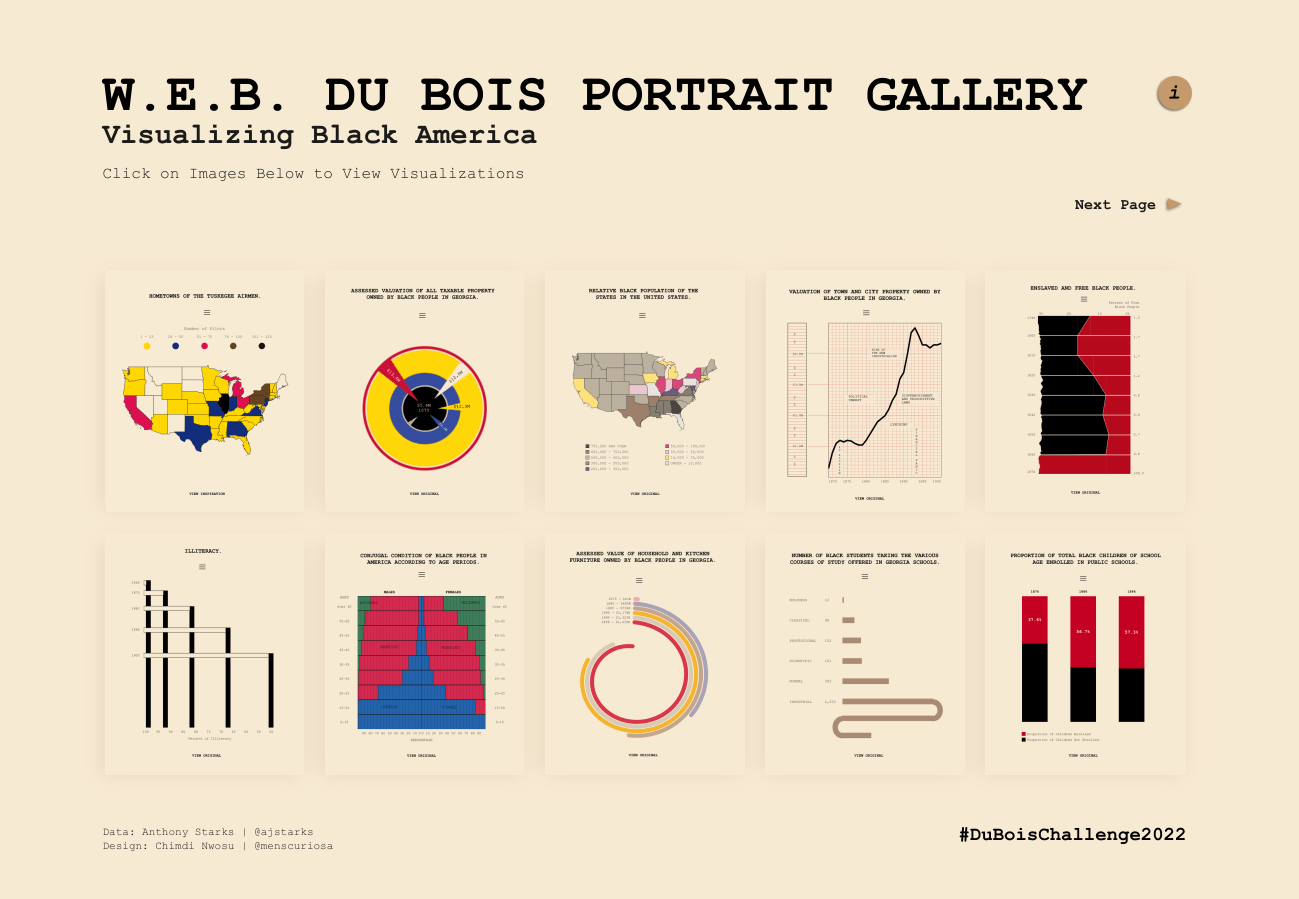
Chimdi Nwosu’s interactive visualization, the W.E.B. Du Bois Portrait Gallery, is a beautifully designed exploration of 20 re-created Du Bois charts. This data visualization won Favorite Viz of the Year at the 2022 Tableau Conference.
Learn more about the history of the Du Bois Challenge, see the latest news about it on Twitter, and find out how to participate. You can also search #duboischallenge on social media and Tableau Public to explore these interactive recreations.
เรื่องราวที่เกี่ยวข้อง

Iron Viz 2026: Read Between the Data
 May 28, 2026

Tableau's Iron Viz Winners

Explore the 2026 Iron Viz Entries
 ธันวาคม 15, 2025