How global teams can create multilingual dashboards


Note: The following is a guest post by Tableau enthusiast David Pires.
Tableau’s mission is to help everyone see and understand their data. Keeping that premise in mind, I thought I’d share what I have done in the past to make a dashboard available to a wider audience that may not speak English.
I know I’ve seen great-looking dashboards which I couldn’t understand because of the language barrier (Seoul weather patterns comes to mind). Rest easy, I’m not sending you back to school nor will I tell you to buy Rosetta Stone’s latest offering in language studies. But you may be asking: So what? What’s the point?
I’d like to give you a use case where this might come in handy:
A multinational super-company with offices in:
- Washington (English)
- Lisbon (Portuguese)
- Buenos Aires (Spanish)
If at each of these sites you have someone creating a dashboard in the native language, the person can then email it to a user that has Tableau Server publishing rights.
This recipient, without needing to know how to read the other languages, can then quickly copy those other dashboards into the same workbook. Then by using shapes and actions, the person can create an interactive dashboard that allows users to select their preferred language. Publish it to Tableau Server, and there’s only one link to share. Wherever people are in the world, they can read it in their native language.
I did this recently with the poll numbers from the Portuguese presidential elections.

First things first, you’ll need to have all the different versions. Then create a sheet with each of the languages you want to include. In my example, I created English, Portuguese, and Spanish versions. I then brought in from Excel the names of the countries and added the flags as custom shapes.
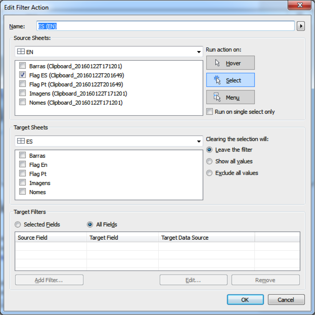
How to add custom shapes
Once that’s done, add the sheets with the flags of the other two languages to the dashboard. For example, for the English dashboard, I’ve added Portuguese and Spanish flags, and so on. You can also use tooltips to prompt people to click on the flags. Google Translate could help with the wording.
Finally, it’s just a case of playing a game of dashboard actions.
Here are settings for the English dashboard:
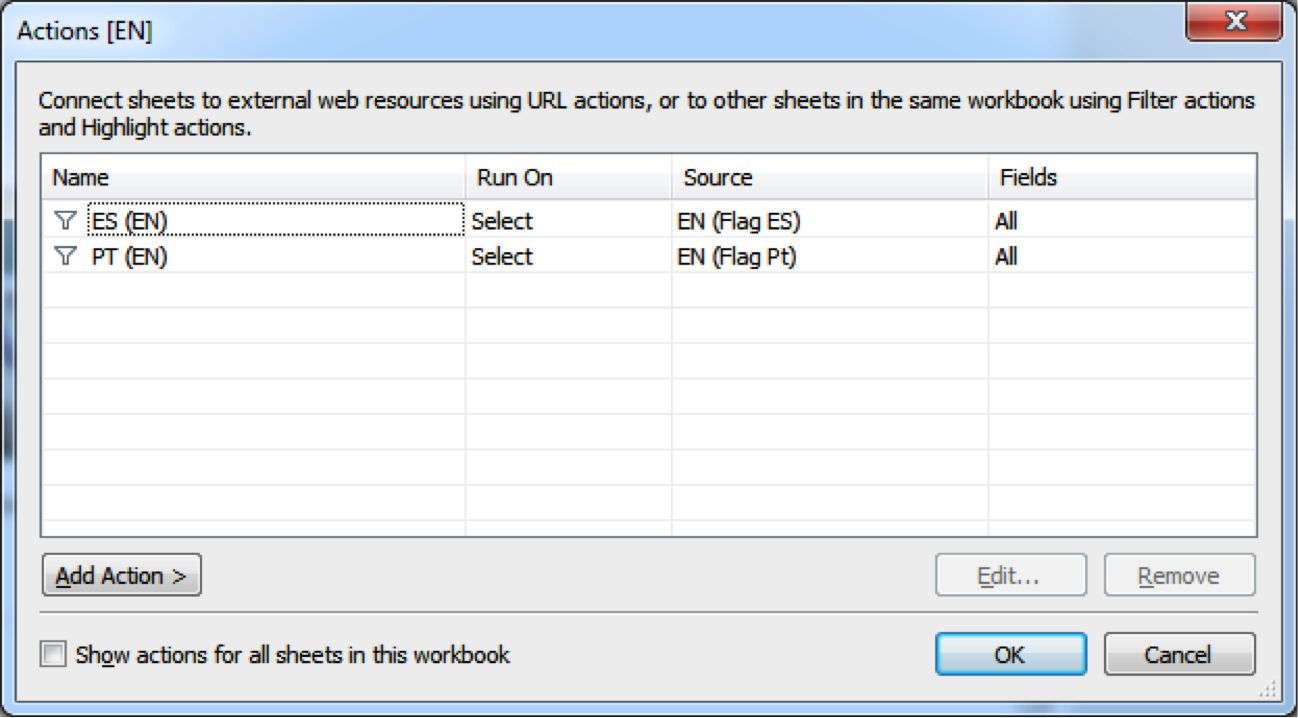
You will notice below that I don’t actually add a filter to the dashboard. There’s no need; the objective is just to navigate to the dashboard.
Repeat the above within the first dashboard and twice again on each of the remaining dashboards. And that’s it! You have a multilingual dashboard.
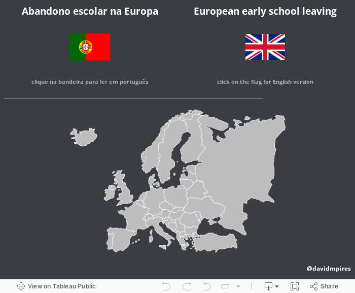
If you don’t want to have the flags on each dashboard, create an entry sheet where users can select their preferred language. Here’s an example.
I hope you have found my tip useful. Please leave any comments or questions below.
For more tips, ideas, and vizzes by David, check out his Tableau Public profile page and connect with him on Twitter @davidmpires.
เรื่องราวที่เกี่ยวข้อง

5 Ways to Use Tableau Public to Achieve Your Goals
 มกราคม 11, 2025

World Mental Health Day: Elevating Awareness Through Data Visualization
 ตุลาคม 10, 2024

From TV Screens to Tableau: Visualize Your Favorite Shows with IMDb
 สิงหาคม 31, 2024