You are (almost definitely) not qualified to make predictions about COVID-19. We’re here to help explain why.


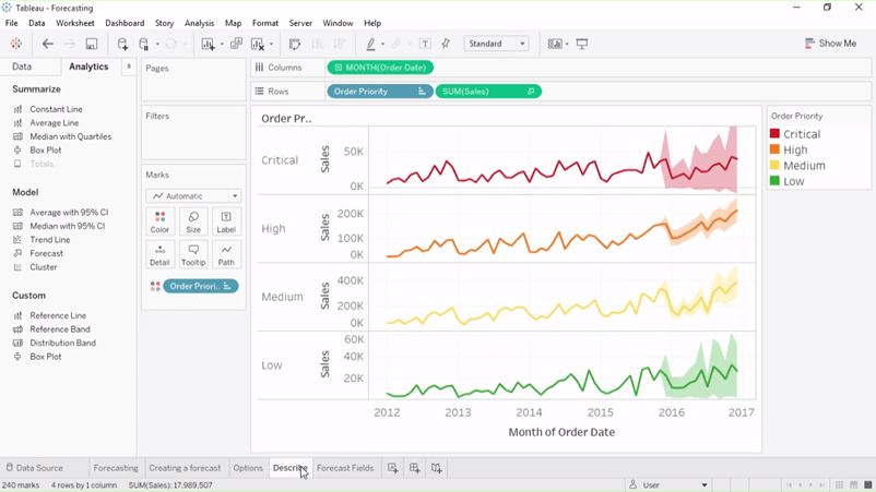
Tableau, along with many other analytics platforms, has a built in forecasting tool. With just one click, you can add a forecast to your time series charts. If you’ve been exploring data about COVID19, you might be tempted to use that feature to look at the trajectory of COVID-19 cases and deaths. But if you do, should you publish what you find?
To help you decide, I’ve created a list of prerequisites. It has one item on it: “Are you a qualified epidemiologist?” (actually, you could also be a virologist, or other infectious disease specialist).
Let me explain. We are in the midst of an unprecedented crisis caused by a new disease. Experts across the globe are scrambling to understand the disease while an anxious public are seeking out answers. We must resist our temptation as data experts to become armchair epidemiologists.
I asked the Tableau Analytics team for some thoughts on using out-of-a-box forecasting models. This team built Tableau’s forecasting model and are expert statisticians as well as software engineers.
“Any out-of-the-box forecasting model is going to have an assumption of 'consistency over time' baked in,” says product manager Sarah Wachter. “In reality there are many changing variables. These include knowledge of COVID-19 as well as social and political issues unique to each country.” she warns. “Anyone who’s not an epidemiologist won’t be able to account for these correctly.” For detail on the complexities, check out this article from FiveThirtyEight.
Nathan Mannheimer, also a product manager, “strongly discourages people from drawing or sharing conclusions about the future of COVID19 infections based on forecasting features, especially if they do not have experience in this field.”
Like many analytics platforms, Tableau’s forecasting tool uses a Holt-Winters forecast model, says senior software engineer Jeff Booth. “It assumes that the underlying process can be broken down into two parts: a linear trend line, plus a seasonal cycle,” he says. “That works pretty well for sales data because sales tend to come in cycles, and tend to increase or decrease by a consistent amount every year. While some people think COVID-19 might settle into a seasonal pattern, we are in the early stages of understanding the disease and many factors will impact the trajectory of cases.”
In a nutshell, forecasting models, including Tableau’s, are built for the kind of predictable data the majority of our customers use: data with seasonality and trends. The fact that it doesn’t work for COVID-19 data “isn’t a flaw so much as it being used for something it wasn’t designed to do,” says senior software engineer Tyler Martin.
Our role as analysts is to provide clarity, not confusion. We encourage people to download and explore our COVID-19 data, available on our Data Hub. We have already seen hundreds of effective, sensible explorations of the data.
Like many of you, I too have downloaded and explored the data; I even used the forecasting tool to look at its prediction of numbers. I chose not to publish any kind of prediction for four reasons:
- How I would feel if one of my visualizations went viral on social media, and then turned out to be wrong. Would I be prepared to have my name, and reputation, associated with that?
- Am I confident enough in my numbers that it would be okay if someone used them as a justification to take COVID-19 less seriously or not stay at home?
- If I use a software tool’s forecasting model, instead of turning it on with one click, do I understand how to build that model myself? If not, it indicates I do not understand the underlying model and thus any conclusions I make are likely to be flawed.
- I’m not an epidemiologist. I am simply not qualified to make predictions about this disease.
This does not mean you shouldn’t download the data and explore it, or even share your work to the community. The data is an incredible resource, a record of what is being reported by countries across the world. There are countless insights and perspectives to be found. Go find those stories!
Forecasting, though? Leave that to the infectious disease specialists. If you are seeking a great example, try this one by Alison Lynn Hill, a Research Fellow from Harvard.
Relaterade berättelser
What we can learn from open data: COVID-19 in the Netherlands
 29 April, 2021

After a year of COVID-19 charts, eight data communication lessons learned
 19 April, 2021
Data innovations in public health: PATH creates COVID-19 diagnostic test dashboard
2 April, 2021