The Viz Police: Overhaul of Recovery.gov
 We at Tableau applaud the Obama administration’s efforts to improve accountability and transparency. The best way to kill germs, as they say, is to put them in the sun. We’re big believers in a digital democracy: making information accessible and understandable to the people who make decisions by it. In a democracy, that’s voters. In a company, that may be a workgroup or division.
But how do I say this nicely… the representations of data on recovery.gov are uninspired at best. In this post the Viz Police offer a little help.
Floating Bubbles. Really?
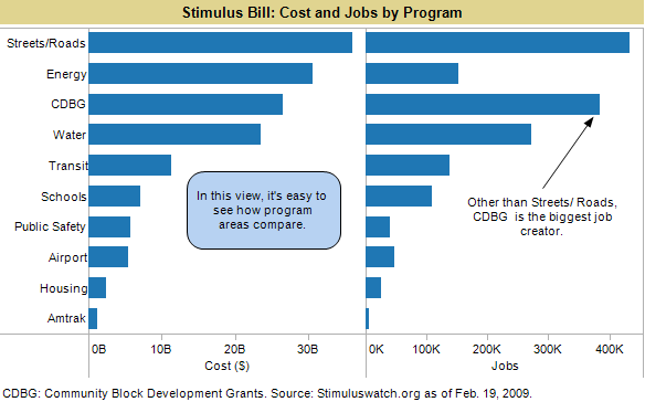
The first chart on Recovery.gov, the site that explains the new stimulus bill, is a bubble chart. Bubble charts can be useful at times but humans don’t tend to compare areas as well as lines. We have three beefs with Obama’s bubbles:
- Having the bubbles floating in space makes it hard to visually compare amounts.
- The colors don’t encode any additional data.
- The bubble labels don’t match up with the actual line items: you’d be hard-pressed to find “Protecting the Vulnerable” in the text of the Stimulus Bill, which makes it hard to dig deeper.
The graphic is pretty, but if you’re trying to understand where the money is really going, not too useful.

In the public interest, we re-created the chart. We’ve added jobs to the view but not broken it down by cost per job because, as Stimulus.org notes, without a time dimension it’s impossible to get a meaningful metric. Using a tool like Tableau you could drill down into each program to explore the data further.
Which brings us to our second point:
Put the Data Online
You can get the text of the stimulus bill online in a document, but you can't get the data by line item in a chart. That leaves people with the choice of digging through the bill line-by-line or accepting the summary-level graphs on recovery.org. We worked with a datasheet from Google Spreadsheets that was drawn from Stimuluswatch.org, which asked people to vote on projects. As a result, our dataset is not the final one in the bill.
President Obama: You won the presidency by assuming Americans are smarter than we’re given credit for. Put the all the data online so we can discuss and bring new thoughts to the debate.
Make the Data Visual
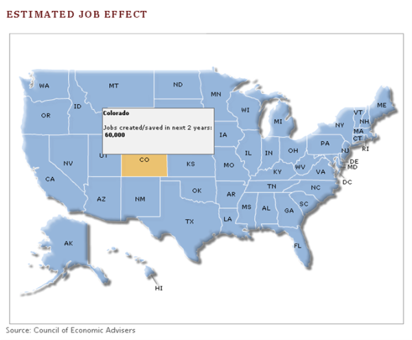
Finally we look at the other visual representation featured on recovery.gov-- a map of where the dollars will go. In this case we’re shown jobs per state, but we have to hover over each state to get the data. Again, it makes it difficult to compare data state by state. And jobs, cost and program data are split up, perhaps intentionally. But we can get a lot more out of this data by looking at them together without even creating any bogus measures.
Perhaps we want to see how the jobs split up by state. In this case, displaying bubbles on a map helps us visually compare job creation in terms of a known reference point—the map of the US. And since we often think of national bills in terms of region, I’ve added color by region. Now it becomes obvious that the South and the Rust Belt parts of the MidWest should do well in terms of jobs.
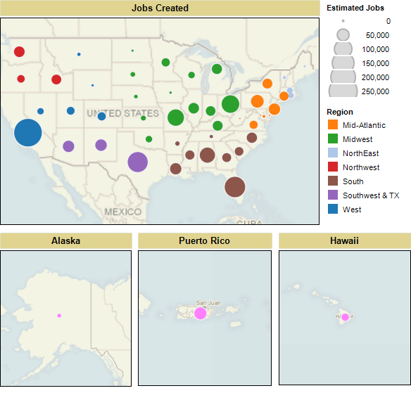
Now let’s look at what programs are going on in each region.

The Digital Community to the Rescue
Other sites have done better. The aforementioned Stimuluswatch.org has done a nice job of fostering discussion on the bill, and made its data set available. OFF the MAP did a great visual analysis of the US Economic Stimulus and Unemployment by County.
Despite our criticism of the visual presentation of this data, we’re ecstatic that the Obama administration is taking steps to make more data available. And we’re here to help make that data comprehensible to human beings, who must ultimately make decisions based upon it.