The Order of Things: How to Control the Layout of Marks
Building a viz in Tableau is easy enough: Drag and drop pills onto the canvas, chose a template from the Show Me menu, or—if you want more flexibility and control—place pills directly onto rows or columns shelves, or the Marks card.
The logic behind the latter method is as follows: With the rows and columns shelves, you determine the vertical and horizontal alignment of marks. The Marks card determines the nature of the marks in the view (How do you want to break up the data? Should the size, color, and shape of the marks be controlled by a variable in your data?)
However, here is a trick: By changing the sort order of dimensions and by ordering dimensions on the Marks card, you have additional leverage over the layout of marks on the canvas.
This trick came in handy recently when I made a pictogram for Rare Disease Day. The problem I had was that Tableau had colored the last person in my viz in pink when really I wanted the first person to be pink, so as to align it better with my sentence “one in 25 people is affected by a rare disease."
To achieve this, I changed how the variable that determines the color is sorted. By reversing the order as shown here, Tableau will first place the pink mark on the canvas and then the light blue marks:
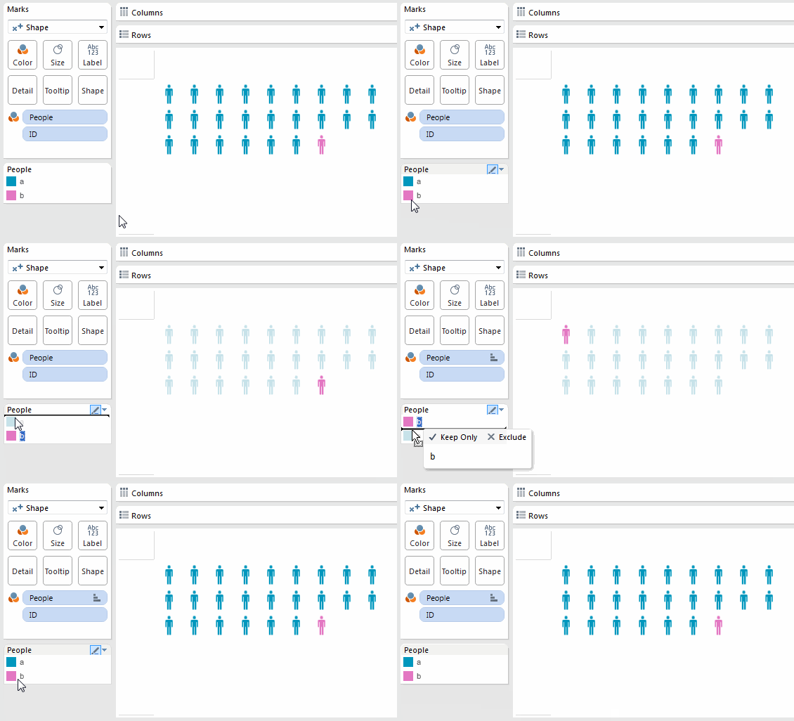
Re-ordering the colors.
This trick works for different chart types, too. For instance, I also used this trick to change the order of the slices of the pie chart in the above-mentioned viz. Unlike with shapes, where Tableau lays out the marks in a wrapping line, with pie charts, marks (i.e. pie slices) are placed in a clockwise manner starting from 12 o’clock.
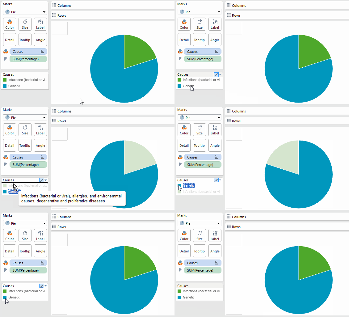
Reordering the slices of a pie chart.
Bubble charts are a fascinating use case for this trick, too. Recently I was asked by a reporter of WirtschaftsWoche, a German weekly, whether there is any way one can influence the way Tableau lays out the bubbles on the screen. Her bubble chart was showing how many Twitter followers the attendees of the World Economic Forum in Davos have, and she was unhappy about the fact that the women (the orange bubbles) were pushed out to the fringe of the bubble chart (although, one could argue that this is not an unrealistic representation of the gender dynamic in Davos—a male-dominated circle of world leaders.)
Luckily, I'd discovered the sort-trick, so I was able to help her change the layout of her viz. By changing the sort order of the “gender” variable, we were able to move the women into the center of the viz.
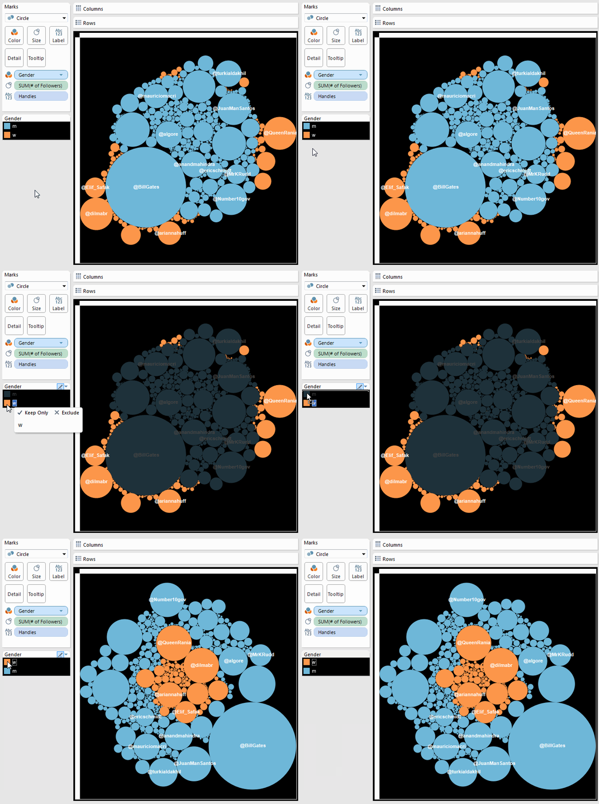
Moving women to the center of the chart.
The reason it works as it does is that Tableau first lays out the bubbles associated with one category and then continues with the next. With packed bubbles, Tableau starts at the center and works outward in a spiral manner, assuring that neighboring bubbles touch each other.
Understanding how the bubble algorithm works, we can also consider other ways of laying out the bubbles. For instance, we can sort the Twitter handles according to how many followers these people have, instead of sorting them alphabetically. This way, the smaller bubbles will sit closer to the center while the larger ones sit further out, near the edge of the chart (by reversing the sort order, you could also achieve the opposite effect):
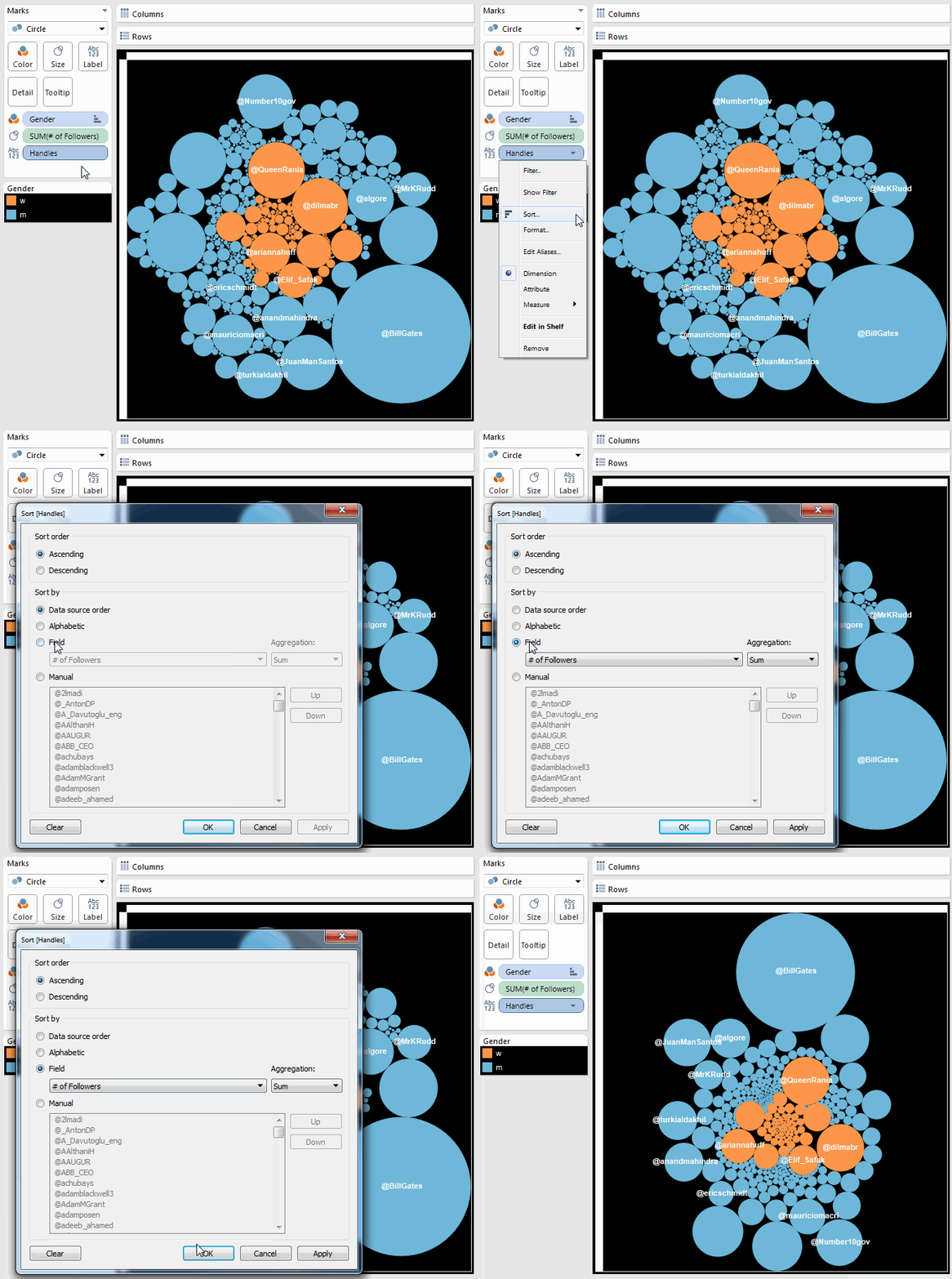
Sorting the bubbles by gender and size
But this sorting only affects how the bubbles are sorted within the different color categories. That is, Tableau lays out the orange marks for the women going from small to large, and starts again with the blue bubbles, going from small to large.
To overrule this, we can apply a second trick. We could either change the “gender” variable to an attribute (which means it doesn’t affect the layout anymore), or we can move it down below the Twitter handle variable on the Marks card, so that the latter takes precedence in the hierarchy of how things are sorted. This way we get rid of any gender segregation in our chart, and the orange bubbles are mixed in with the blue ones.
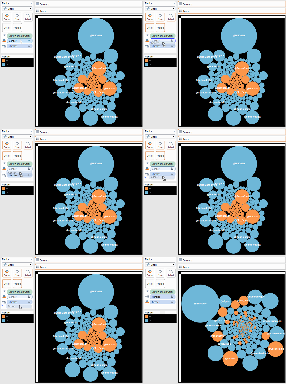
Sorting the bubbles only by size
Got a Tableau tip to share? Post them in the comments below or via Twitter using the hashtag #TableauTipsMonth!


