8 resources to jumpstart your Iron Viz entry


Iron Viz is, without doubt, a highlight of working at Tableau, and it always inspires me when I see each year’s entries. The competition has come a long way since the first edition, and it might feel daunting to enter. But I can assure you that if you are thinking about entering, do it! Win or learn, you can’t lose: by entering, you are developing your skills in data literacy, data storytelling, data discovery and, of course, data visualization.
Inspired by Joshua Smith’s super tips on designing a great entry, I wanted to put together my own list of thoughts and resources based on my eleven years judging and hosting Iron Viz.
1. Learn from previous finalists
After last year’s Iron Viz, we sat down with each finalist (Pradeep Kumar G, Samuel Parsons, and 2021 Iron Viz Champion Lisa Trescott) to discuss their builds, focussing on their analytical and design decisions, as well as their general tips about Iron Viz.
We also did this with the 2020 Iron Viz contestants, finalist (Alex Jones, Simon Beaumont, and that year's winner, Christian Felix).
2. Not sure where to get datasets?
Our themes are always quite broad to provide a great deal of flexibility for entrants. If that seems a little daunting, and you’re stuck for data, there are loads of places to go to find data. Check out some of the following ideas:
- Tableau Public has a long list of datasets to get you started. Scroll to the bottom of this page to find broader data sources such as data.world and Kaggle.
- Community-run projects such as Data Plus Music provide datasets that are ready to use.
- Data Is Plural is a fantastic fortnightly newsletter from Jeremy Singer-Vine focussed solely on sharing links to datasets. The archive is incredible.
- Yale has a pretty good collection of art sources. GW has a pretty good collection of literature sources.
- Try Google searching the type of art you're interested in + database and you'll likely find something interesting.
3. Are you using images?
Images can really enhance your Iron Viz entry. However, there are a couple of considerations if you’re going to use them.
First, do you have the copyright to use them? Don’t use images if they infringe copyright. Resources I use for copyright-free images are pixabay and unsplash.
Second, remember that Iron Viz is an analytics competition using Tableau. Images should complement your analytics, but they should be secondary to the analytics. We love seeing wonderful designs in Iron Viz, but if your images take up over 75% of your final entry’s space, with the charts squeezed alongside, you might want to reconsider your design.
4. Keep it real
Remember that two of the scoring categories are analysis and storytelling. Thus, your entry must be understandable by your audience. What do we mean by that? It can be tempting to think that the more crazy the chart type you build, the better your Iron Viz entry will be. Non-standard chart types can work exceedingly well in Iron Viz, but it you’re going to build a radial-sunburst-Sankey-scatter-plot, take a pause: your mastery of Tableau will be proven, but if nobody can parse the information, it will damage your analysis and storytelling scores. One of the reasons I love the field of data storytelling so much is how we, as practitioners, have to manage this tension of form versus function.
Look at the Top 10 Finalists from 2020 and from 2021: there are very few non-standard charts in the entries that qualify. I hosted an announcement of the finalists in a #datafamjam where we discussed the issue of non-standard charts. You can see it here.
Mark Bradbourne’s Real World Fake Data project has been encouraging people to think about business dashboards. While Iron Viz isn’t about making operational-style dashboards, it’s worth looking at the business-style dashboard to see just how beautiful designs for that function can be.
5. Is your entry accessible?
Two trends we’ve seen in recent years are for longer and longer long-form dashboards, with more and more embedded images. Also, text has gotten smaller, and often been added as an image to the dashboard, rather than as a text object. As you design, consider whether this creates an accessible visualization? For some pointers on this, check out these resources:
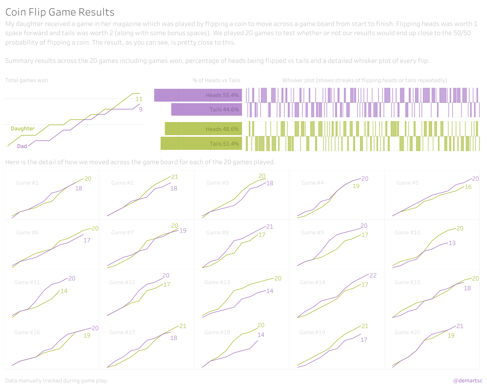
- Chris De Martini has done a series on accessibility in data visualization that I would say is a must-read.
- Frank Elavsky has created an open source Chartability resource for you to use when creating visualizations.
6. Get daily inspiration with Viz of the Day
7. Dive into the Tableau Public archive
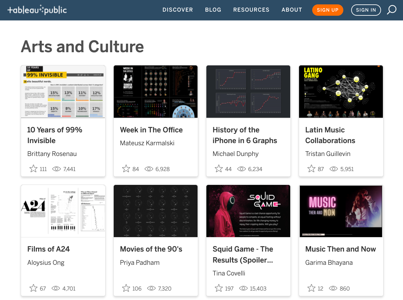
With Tableau Public Discover, you can find the latest vizzes, featured authors, and personalized content to keep you inspired. Dive into the Arts & Culture gallery for some viz-spiration.
8. Get more context on the mission of Tableau Public
Tableau Public hit a ten-year anniversary in 2020. They also achieved 2 million Tableau Public Authors and 5 million Tableau Workbooks last year. In If Data Could Talk #24, Tableau Public Director Taha Ebrahimi, sat down with some of us who were there at the beginning: myself, Jock Mackinlay and Ellie Fields. We talked about why Tableau created Tableau Public as a way of improving data literacy and widening data skills.
I hope those ideas give you some inspiration! I can’t wait to see your Iron Viz entries.
Relaterade berättelser

Iron Viz 2026: Read Between the Data
 28 Maj, 2026

Tableau's Iron Viz Winners

Explore the 2026 Iron Viz Entries
 15 December, 2025