Subject Area: Design
Level of complexity: Intermediate
Approximate Time to complete: 1 hour
Companion Workbook (twbx): KPICalculations.twbx
Additional Resources on the web:
- http://www.tableau.com/learn/tutorials/on-demand/logical-calculations
- http://kb.tableau.com/articles/knowledgebase/kpis
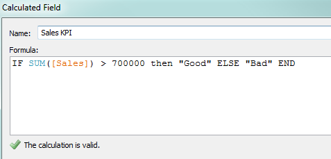
Key performance indicators are an integral part of analytics today. Tableau customers can quickly create KPI's in Tableau. The best practice here is to aggregate the measure we want evaluate the performance of ([Sales] in this case) and then select the level at which we determine whether something is good vs. bad. See picture:
Now there are a multitude of ways we can use this KPI to visualize the performance of data. One recommended practice is to place these KPI calculations on the color shelf to quickly to see which metrics are performing well.
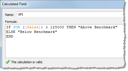
As a visual best practice, we recommend using Tableau's built in KPI shape files. As an example, we can look at the Category field across all of the Regions and then create a KPI calculation like this:
Now place this on the shape tile on the marks card and edit the shapes to the preferred KPI shapes!
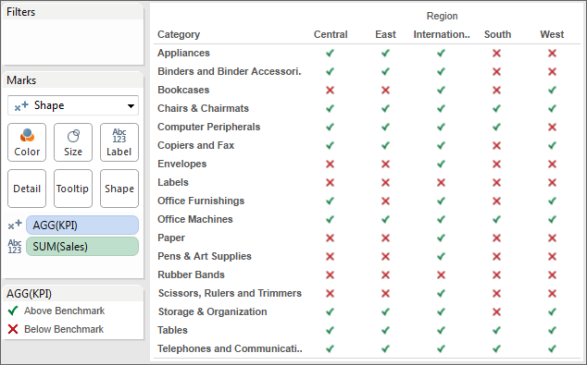
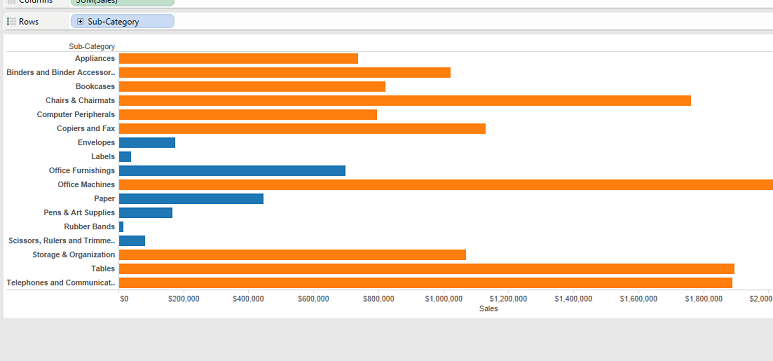
The important thing to note here is that Tableau will color ALL of the marks in the view based on your KPI so if you want conditional formatting on a crosstab you might end up with something like this:
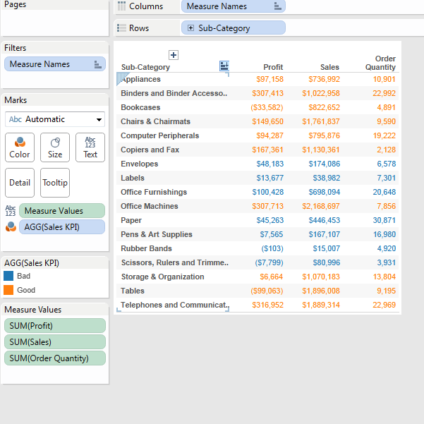
In this example, we built a KPI on the SUM of Sales but when we place it on the color tile Tableau actually colors all three of my measures in the crosstab based on my KPI for Sales. You will need to treat each measure separately in order to color each column separately for each measure. See the Conditional formatting guide for more details.