These data vizzes show how COVID-19 has affected traffic and pollution levels in Europe


As the world went into lockdown during the COVID-19 pandemic, satellite data from NASA and the European Space Agency (ESA) show a fascinating side effect: pollution levels reached exceptionally low levels in the parts of the world that rolled out shelter-in-place orders. Data from road-side air quality measurement stations by the European Environment Agency (EEA) corroborate that finding. This is of course a welcome trend: NO2 is believed to cause a range of harmful effects on the lungs and other organs and is a driver of climate change.
Because NO2 is a byproduct of fossil fuel combustion, NASA, ESA, and EEA argue that the observed reduction is due to a slowdown in road traffic, as well as a reduction in industrial production, when various shelter-at-home measures were in place in major cities around the world.
Inspired by those satellite images, but perhaps also because I felt I had reconnected more with nature again on many long walks in the countryside during the lockdown, I decided to dig into the EEA data to understand how extreme these effects were, and if we could see a correlation between air quality and road traffic.
In Figure 1, we see that in several European cities, especially from March onward, nitrogen dioxide (NO2) emissions decreased to levels below those of previous years, as represented by the grey lines.

Figure 1 - Click here for interactive version showing other cities as well
But NO2 measurements are known to vary widely across years, seasons and days, as Figure 1 also shows. I wanted to understand if it was possible to determine to what extent the lockdown measures drove the decrease in NO2. Could I place road traffic and air pollution data and side-by-side to see what effect the former had on the latter? The answer was “yes,” but, as we will see, it turned out to be more complicated than I first imagined.
Analyzing traffic data
Up-to-date traffic numbers are hard to come by. This type of data is usually collected by local road authorities and takes a while to make its way into national or international databases. But there are a handful of cities with open data platforms, which it possible to access data from recent months. One of those cities is Madrid, which provides data on the number of vehicles that pass different measuring stations.
Below, Figure 2 shows Madrid’s traffic volume for individual days from January to July. From 2016 to 2019, we see weekly cycles with mid-week peaks and Sunday dips, outliers during public holidays like Good Friday, and a decline from mid-June onwards when school holidays start.
In 2020, however, there is a clear break in the pattern. Car traffic levels plummet starting March 14, when Spain went into full lockdown. Traffic volumes stayed low through April, and slowly increased again with the gradual re-opening starting in May. As in other years, there appears to be a slowdown during the summer months, albeit at a lower level than in previous years (is this “the new normal”?). Perhaps that dip is also due to the re-instatement of various public health measures in different parts of the country following a resurgence in reported Covid-19 cases.

Figure 2 – Click here for interactive viz
Incorporating data from Apple
For data from other European cities, I used an innovative dataset from Apple. The maker of the iPhone can estimate how many people are on the road at any given time by looking at the demand for their map services. The dataset, which includes major cities around the globe, comes in the form of an index. That means it is measured relative to a benchmark date—January 13, 2020 in this case—whose value in the index is set at 100.
Figure 3 below shows the evolution of this index for several European cities. You can see the same broad pattern as from the Madrid dataset: Route searches on Apple Maps decreased drastically in mid-March, when most European cities went into some form of lockdown and non-essential cross-border travel was banned across the EU.
There are a few interesting differences that match what we know about the various policy responses in different countries. The Spanish cities of Madrid and Barcelona had some of the strictest shelter-at-home rules in place, so traffic there went down to 10% of the mid-January levels. The same is true for Milan and Rome, but in Italy the decline started a week earlier than in Spain and other countries. At the other extreme, Stockholm is known for having taken a more lax approach. There, we can see that the traffic volumes only dropped 20 or 30 points in the index, at most. The German cities of Berlin, Munich and Frankfurt sit somewhere in between.
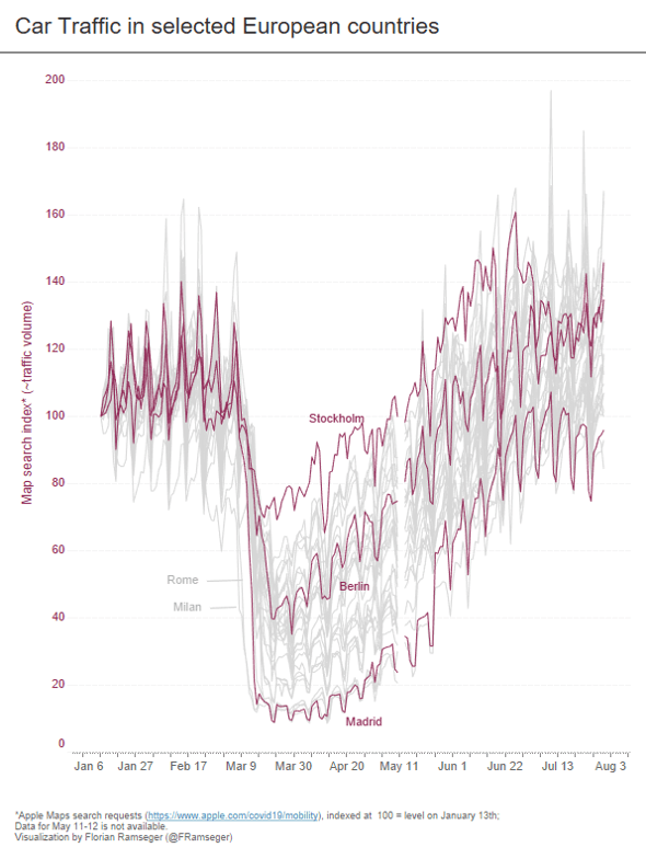
Figure 3 – To see other cities, go to interactive viz
The map search index is an imperfect approximation of actual road travel, as it only captures those trips for which directions are needed. Most people don’t need a map to find their way to the office or to the nearest supermarket. As a result, the dataset is somewhat skewed towards non-essential travel. When I compared this index to actual car counts for the city of Madrid, I noticed that the map search volume on Sundays drops less than actual traffic does, and that the overall drop during the lockdown is slightly larger than that of actual traffic (-85% vs -72%). Also, the Apple data missed the Monday peak in traffic just before the steep decline—which perhaps represented a spike in essential travel, when people went out to stock up their pantries in anticipation of the lockdown.

Figure 4 – Click here for the interactive viz on Tableau Public
Looking at hourly pollution levels
The European Environment Agency collects data from roadside air quality measurement stations all over the continent. The frequently updated database provides hourly values of NO2, as well as PM2.5 and PM10 (common types of pollution) for anyone to download. These are measured in µg/m3. For NO2, the EU sets an upper limit in terms of the annual average at 40 µg/m3.
Figure 5 shows that daily NO2 concentration in Madrid varies widely but appears to fluctuate less and around a lower level during the lockdown, compared to the beginning of the year. The change is less drastic than for the traffic data, but still apparent.

Figure 5 – See data for other cities in interactive viz
There is a correlation between the two variables, but clearly it is not perfect. You can see that while both variables dipped dramatically in March and April, the trends diverged since the economy began to reopen gradually.
Looking at the data in Figure 1 and Figure 6, though, you can see that this pattern is somewhat to be expected. Historical data for the years 2016 to 2020 show that air pollution in the summer months is typically lower than other seasons. Winter months usually produce higher air pollution than spring and summer months because both car and building heating use rises, and colder air slows the rise of pollution particles into the atmosphere.
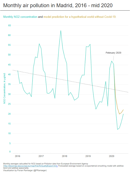
Figure 6 – Click for viz on Tableau Public
What's more, there is also a longer-term, downward trend visible in the NO2 data that is well documented across many European countries (Figure 6). This is a result of concerted efforts at the national and the EU level in recent years to bring air pollution in line with the World Health Organizaiton’s air quality guidelines.
Given the influence of pre-existing trends on pollution data, it’s not enough to just look at the actual pollution levels during the lockdown—nor can we use the levels from previous years as a benchmark, as some reports around air pollution during the lockdown have done. Instead, it might be more appropriate to consider what would have happened in a hypothetical world this year without the pandemic. To do that, I ran a forecast model that accounts for both the seasonal pattern and the long-term trend. Figure 6 shows that the observed NO2 levels during the pandemic are well below those of the COVID-free forecast.
Accounting for the effects of the lockdown
To quantify the effect of the lockdowns on air pollution, I split the data into two parts of roughly equal length: before and during lockdown. The goal was to compare the two sets, and calculate how much of a decrease the lockdown brougth about. In Madrid, the average NO2 concentrations decreased by 63%—from 43 µg/m3 just before the lockdown, to 16 µg/m3 in the time period from mid-March to end of April.
The difference is not as pronounced in every city, but in almost all 30 cities for which Apple provides data (the EEA data is available for many other cities), average emissions decreased during lock-down.
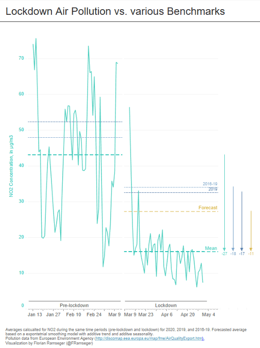
Figure 7 – See interactive viz to see data for other cities
Even though it’s clear in Madrid that emissions plummeted by 27 µg/m3, it would be wrong to attribute all of the reduction in NO2 in March and April to the decline in vehicle traffic alone.
As you can see in Figure 7 above, the forecasted average pollution for mid-March through May of this year—if COVID-19 hadn’t happened—was around 27 µg/m3. The pandemic and the lockdowns brought that total in Madrid down 16 µg/m3. That’s still a sizeable improvement in air pollution over what would’ve been expected, but it’s important to note that the lockdowns and decline in traffic aren’t the sole driver of the massive decline from earlier this year to the spring. Instead, the data shows that it amplified the preexisting seasonal downturn (as well as the long-term downward trend).
In Figure 8 below, you can see that, in the same way,most other European cities also show much lower observed NO2 emissions that what the forecast model predicts. There are a few exceptions—like Dortmund, where actual NO2 concentration is higher than the forecast, and, Lille, Dusseldorf and Zurich, where the two values are very similar—but overall, it’s clear that the lockdowns had a demonstrable improvement on air quality in these cities.
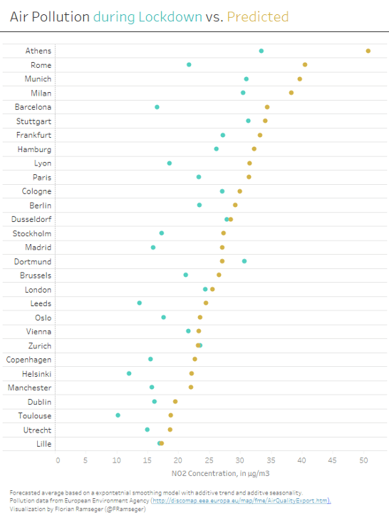
Figure 8 – Click to open viz on Tableau Public
Methodology
The data used is all publicly available: Madrid open data portal, Apple Mobility Trends, European Environment Agency (EEA) air quality data. To save time with preparing the air quality data, we were able to build upon an updated version of a Tableau Public workbook provided to us directly by the EEA.
The different data sources were merged and cleaned in Tableau Prep. We also used Tableau Prep to pre-aggregate the data at less granular levels before analysing it in Tableau Desktop.
To create two time periods of roughly equal length (“pre-lockdown” and “lockdown”), the traffic data was used to determine the approximate date when a city went into lockdown. We did that with a Tableau table calculation that takes a rolling seven-day sum of the daily changes in traffic, which gives us the mid-point of the week with the most drastic decline in traffic.
To model what the pollution data would have been in a hypothetical world without Covid-19, we used the forecast feature in Tableau Desktop, and exported the data for further use in Tableau Prep. The model uses an additive trend and additive seasonality.
관련 스토리
From Kidney Donation to Tableau Dashboard
 2022/10/25

Using data to drive conversations about climate change
 2022/04/28