Tracking Champion Trees with Dynamic Custom Shapes and Web Scraping


Editor's Note: John Keltz likes making graphs to better understand things, and also works on data for Atlanta Public Schools. In this #HackerMonth blog post, John explains how he built his champion tree map using dynamic custom shapes and web scraping. Check out more of John's work on his blog, Numbers Box.

This blog post serves as a "how-to". For a more general post about the champion tree map see here.
This is the closest I've come to a "Pimp my Viz" submission. For a moment I thought two different graphical representations of tree shape was too crowded for one dashboard, but I like them both too much. Here's how I got there.
The Data: American Forests
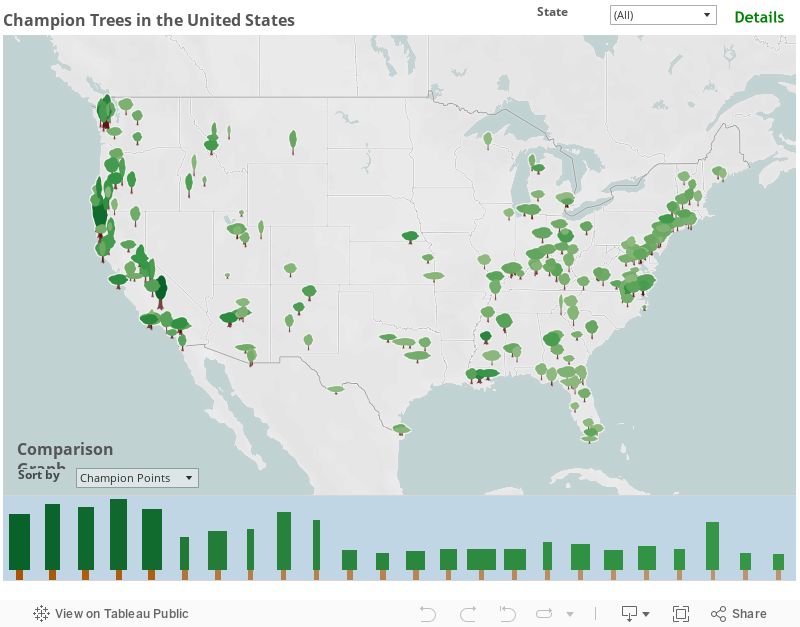
The nonprofit American Forests has over 700 champion tree pages- one for each tree. I used import.io, a free web extraction tool, to collect the American Forests data. This was a two step process- first use their extractor tool on their tree search page to get a table of all of the champion trees and their URLs. I then trained the extractor tool on individual tree pages and fed it the URL table to get a data set of all champion trees and their dimensions.
 |
| Screenshot of training import.io on a tree page. |
One drawback of the resulting data set is the location data is somewhat inconsistent. Some locations are a county, some a city, and some a national park. I didn't know an easy way to deal with this, so I looked up the latitude and longitude for the largest 240 trees by hand. This was relatively quick on latlong.net and took me about 90 minutes.
Dynamic Custom Shapes
I made my first tree map a few months ago using Atlanta data and circles for each tree. I avoided tree shapes the first time because I thought it would look chart-junky. But this time I figured out how to make the tree shape proportional to the actual height, canopy size, and trunk width of the tree, so each image adds unique information.
 |
| How can we display all these unique tree shapes?! |
Tableau custom shapes are easy to implement, but are designed for dimension variables- a different shape for each discrete value. They can vary in size on one continuous variable, but I wanted my trees to vary in size with respect to three independent dimensions- height, trunk, and canopy. To add a second size dimension, I created a bin on the height to canopy ratio, and assigned different-sized canopy images to each bin. To add a third size dimension, I used a dual axis map and did the same thing for trunks that I did for canopies. By assigning images based on the height to trunk and height to canopy ratios, I was then able to make the overall image size proportional to height, and all three variables are in correct proportion to each other and other trees. (I actually used height^1.6 as the size variable to get the proportions right- because the image size scale is based on area, not height.)
 |
| Canopy image for 0.5x height to canopy ratio. |
 |
| Canopy image for 3.5x height to canopy ratio. |
The two images above are examples. The top was used for trees whose total height is half the width of the canopy, and the bottom was used for trees with a height 3-4 times greater than the canopy width. Note that both PNG images use the same size canvas so Tableau will size them correctly when scaling for height. Both images leave space for the trunk at the bottom too. This keeps the trunk and canopy from overlapping on the dual axis graph. (I used the same image size for the trunk and kept them on the bottom half.)
 |
| A sad clear cut and weird green clouds- the workbook before selecting dual axis. |
Tree Graph Bar Graph
I like the tree map, but their scattered locations and small size makes it hard to really compare different trees. So I added the "tree graph bar graph" at the bottom. To make this graph, I created a dual-axis bar graph, with one series of graphs for the canopies, and on for the height. I then played with the axes settings to make the trunk stand out below the canopies.
 |
| Tree graph before selecting dual axis |
Final Touches
Final touches included a highlight action from the graph to the map, a dynamic sort on the bar graph, and background color for both the map and the bar graph. I usually keep backgrounds white to keep focus on the data, but in this case I enjoyed using colors consistent with nature.
관련 스토리

Iron Viz 2026: Read Between the Data
 2026/05/28

Tableau's Iron Viz Winners

Explore the 2026 Iron Viz Entries
 2025/12/15