Surveys, revisited: Listening for individual voices in a crowd


This is a follow-up to Lessons from Crowdsourcing a Data Set on the Women’s March, a recent blog post I wrote about cleaning survey data.
One of the questions I’m asked most often about surveys is how to display answers to free-text questions such as, ‘is there anything else you would like to add?’ These are often very insightful to the surveyor, but nearly impossible to quantify in a standard chart (like a bar or pie chart) without manually standardizing the results.
Additionally, depending on the nature of the survey and how the data’s gathered, displaying free-text fields can expose personally identifiable information (PII), making it possible for the individual survey respondent to be identified through her responses. This alone is enough to dissuade researchers from sharing these responses verbatim, but with some editing there’s still a lot of value in sharing the honest word.
Here are two examples of research projects where the researchers decided the responses were worth sharing verbatim.
World Food Programme's mVAM Nigeria Bulletin #6: January/February 2017
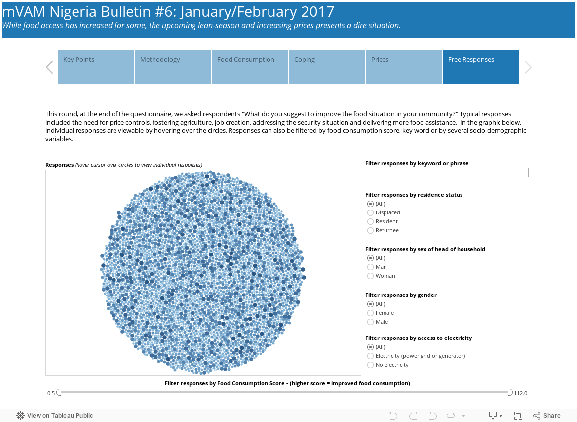
This story by the World Food Programme is driven by their need to understand areas of Northeast Nigeria where people are affected by the Boko Haram conflict, and how this conflict has disrupted markets and peoples’ access to food.
On the last page of the story is a bubble chart the organization used to display user responses. Each is equal in size and the viewer must hover to see the complete text.
Coming Out of the Shadows: Women Veterans and Homelessness
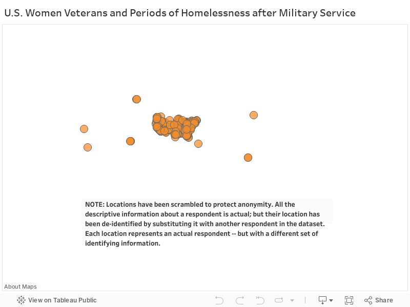
Another approach was taken by Lily Casura in her story about homelessness amongst female veterans. She used the map below to give voice to the service members she described in this three-part article for Huffington Post (part 1, part 2, part 3). Notice that she has placed the comments on specific locations on the map, but I confirmed with her that the responses were randomized to protect the identity of the respondents. She wanted to use the map to demonstrate to her readers that the issues vets were facing weren’t restricted to one geography – but in fact were felt from vets across the services in the US and those stationed abroad.
Texas Monthly BBQ Word Analysis
In this final example, I built a word cloud based on restaurant reviews because I wanted to see the trends across restaurants (they were all BBQ restaurants in Texas). To make this word cloud, I:
- Pulled significant words in reviews into their own rows
- Made consistent the wording (tangy, tangey, atngey, and TANGY all became "tangy," for example)
- Used a count (how often the word appeared in the list) to dictate size
Tangy, for example, was used many more times in the responses than velvety.
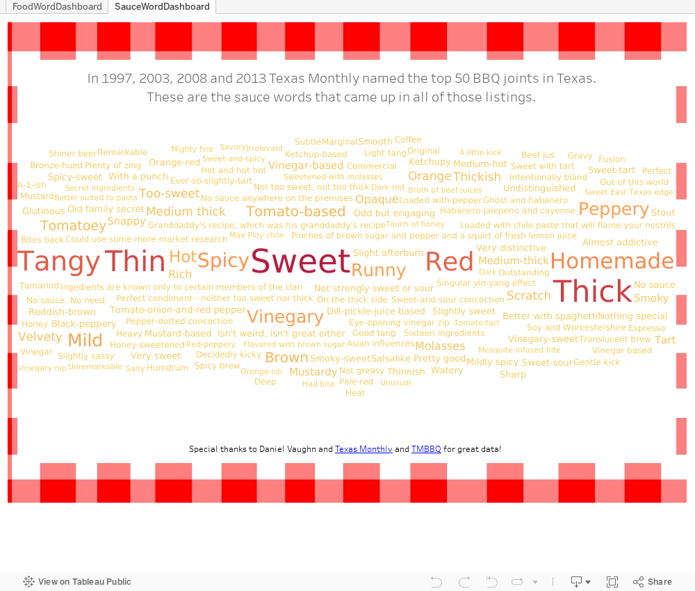
The advantage to this approach is the quantification of the responses – I could ‘measure’ how often a word was used. The disadvantage was the time it took me to identify those valuable words and build a data set by hand. That said, I had 50 reviews to read and it went quickly – but larger data sets (a comment system, for example) would be far more challenging without using something like Python to break apart the comments.
Have you found others showing individual voices in survey results? How might we best do this without violating the privacy of the respondent?
관련 스토리

Iron Viz 2026: Read Between the Data
 2026/05/28

Tableau's Iron Viz Winners

Explore the 2026 Iron Viz Entries
 2025/12/15