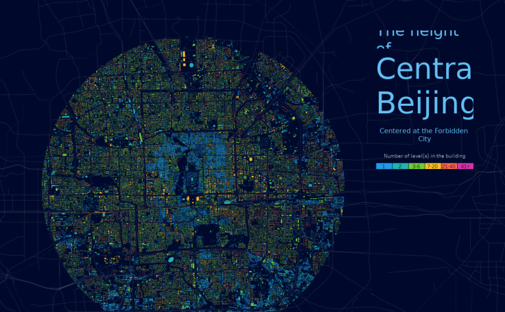
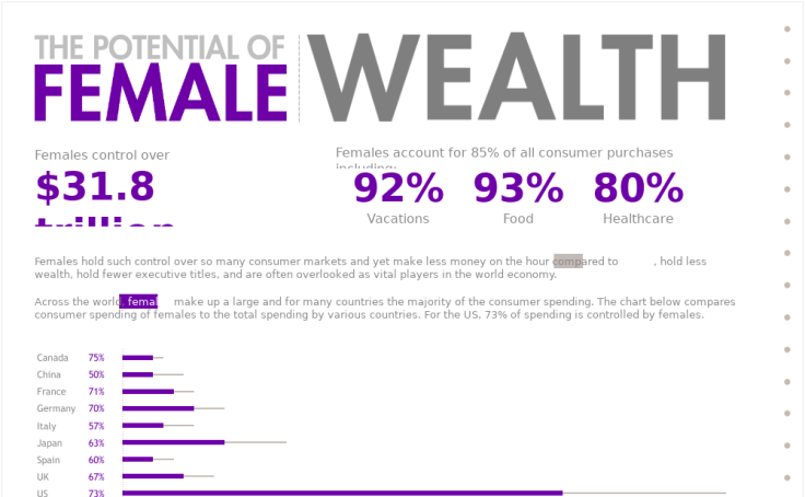
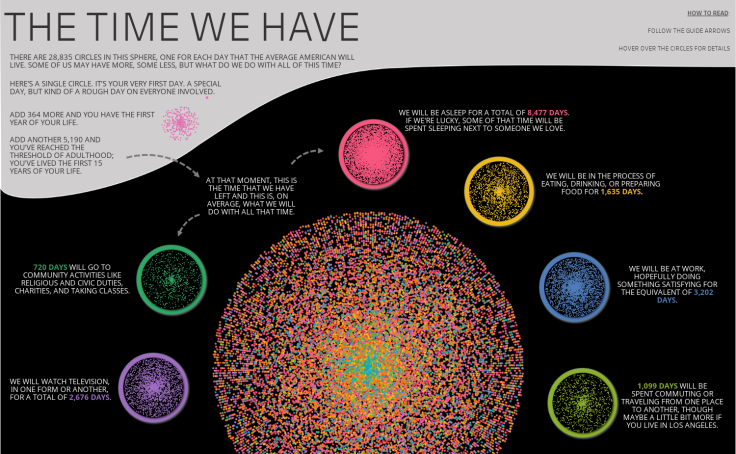
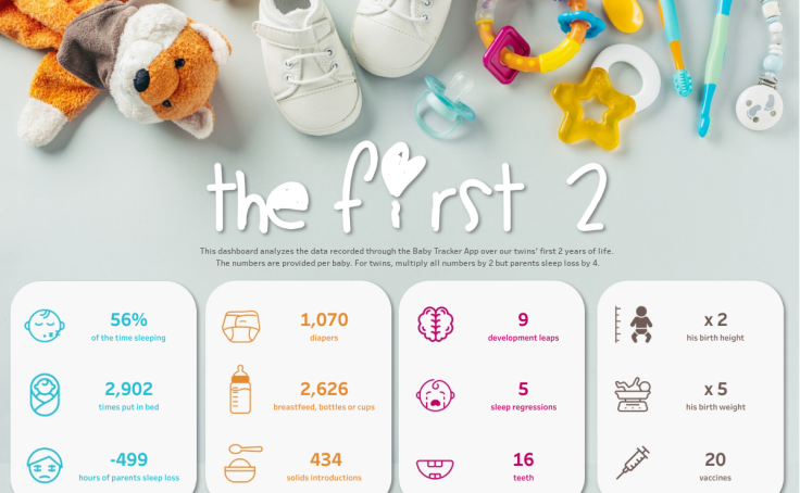
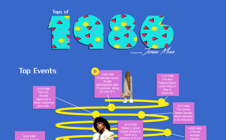
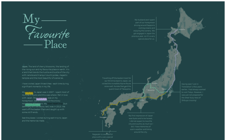
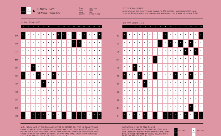
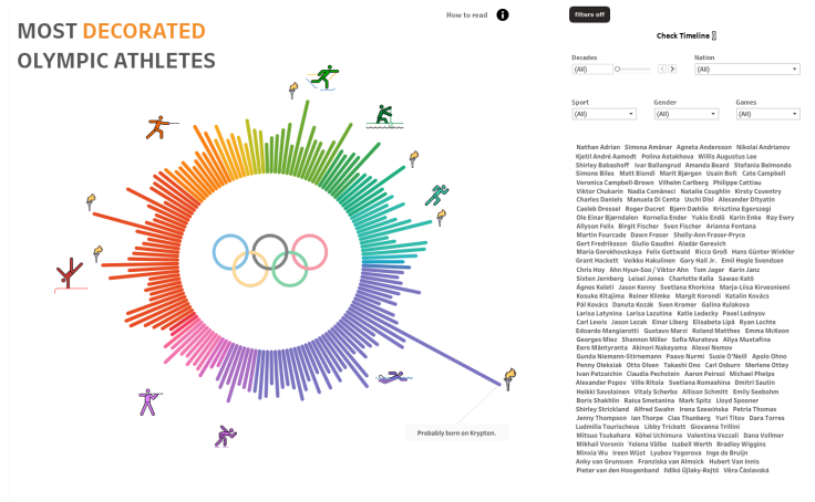
A look back at some great data visualizations from 2021


Viz of the Day (VOTD) shows the many ways our community uses Tableau Public to visualize data on topics they’re most passionate about and share their work with thousands of like-minded data enthusiasts around the world. Every week, the Tableau Public team selects and features a VOTD based on a variety of criteria—you can read more about it on this blog post, a collaboration with David Murphy. But overall, we focus on outstanding vizzes that spark meaningful data conversations, showcase what’s possible in Tableau, and highlight our diverse community and their interests. In 2021, there were 221 VOTD vizzes featured by authors in more than 30 different countries. Explore Tableau Public Discover to see VOTDs of the past. Although we’d love to feature each one of the hundreds of amazing visualizations created daily, we only get a few chances. Here’s a handful of additional data visualizations created by the Tableau Community in 2021 that we admire and hope will inspire you in 2022 and beyond.


Is there a viz you’d like to see honored as a Viz of the Day in 2022? Fill out our Nominate a Viz form. Craving more viz-spiration? Visit Tableau Public to stay up to date with the latest data visualizations this year.
관련 스토리

Iron Viz 2026: Read Between the Data
 2026/05/28

Tableau's Iron Viz Winners

Explore the 2026 Iron Viz Entries
 2025/12/15