Defend your data: 5 visualization practices for data advocates


The African American Roundtable (AART) in Milwaukee Wisconsin had a challenge: they needed to show city officials that non-police response was not only a popular demand in their community, but that it was supported by the city’s data about what police do. Working together with Membership and Coalition Manager Devin Anderson, we identified calls for service data published by the city that listed when, where, and why police were dispatched.
The data we put together showed that most of the calls for police were to check on the welfare of a neighbor or other non-criminal functions. For elected officials in the city, the presentation of this data opened their eyes to how their resources were being allocated – and they found it difficult to ignore, discredit, or refute the AART report. As a result, the city has assembled a task force to identify how to serve these community calls without dispatching police.
As Devin Anderson says: "Although we haven't won all of our demands, using data has given our abolitionist demands more power."
As an advocate seeking to make change with data, whether in business or in society, you face a higher burden to defend your data, analysis decisions, and conclusions. Each aspect of your data viz—from selecting the data to framing the findings—must be carefully considered and clearly documented to establish your credibility. To prevent your analysis from being dismissed when challenging the status quo, Defend Your Data.
Change will be resisted. To know what to change and how, data are essential—and, for this reason, data used in support of change will face criticism. All data used to support a particular argument are open to standard criticisms that must be anticipated. This is an idea as old as advocacy itself.
One of the best descriptions of the opposition that advocates should anticipate comes from Lee Staples’ “Roots to Power” originally published in 1984. Staples identifies the seven strategies that will be used to resist change (Staples, Lee. 1984. Roots to Power: A Manual for Grassroots Organizing):
- Deflecting
- Delaying
- Deceiving
- Dividing
- Denying
- Discrediting
- Destroying
Below, this guide will demonstrate five steps you can use to defend your data analysis against this resistance and use your analysis to make change:
- Choose the best data and use it to establish your credibility
- Prepare the data with care
- Build trust through transparency
- Frame your analysis
- Anticipate and address the audience’s questions (reactions)
Here’s Lee Staples on how to succeed in your campaign for change:
“[Your organization]… can take a number of steps to overcome efforts to discredit its campaigns. Obviously, its facts and figures should be accurate. Challenges can be expected, especially when the information is damning. The best defense will rest on solid research methodology and a good media strategy to carry your message to the general public.”
Following these steps will help you design your data visualizations to head off common criticisms and make sure your message comes through your analyses.
1. Choose the best data and use it to establish your credibility
Good data sources are your first and best line of defense. By using high-quality original data sources, your advocacy gains the credibility of the originator of the data such as the U.S. Census Bureau or a state department of education. If you or your office is responsible for being the source of the data, you need to establish the quality of the data in advance.
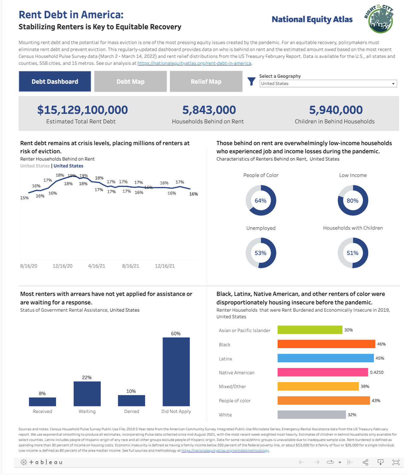
Defense in Action - Rent Debt in America
Author: National Equity Atlas
This dashboard states its source up top and describes the source in detail to lean on the credibility of the underlying data. After reading the initial paragraph describing the Census Household Pulse Survey and U.S. Treasury rent relief distributions, the viewer knows exactly where the data came from, how often they are updated, and how the geography and disaggregation options in the visualization were chosen. By choosing a high credibility source you can lend this credibility to the visualization itself by emphasizing the quality of the underlying data.
2. Prepare the data with care
High-quality data is a start, but the highest quality data can still drive incorrect conclusions when analyzed incorrectly. Skeptics will need to be convinced that you have used the data correctly, which means treating the data with care and preparing it thoughtfully. Not everyone will care about your data preparation, but having documentation of your preparation ready to share will help you respond immediately to skepticism about having calculated your metrics properly.

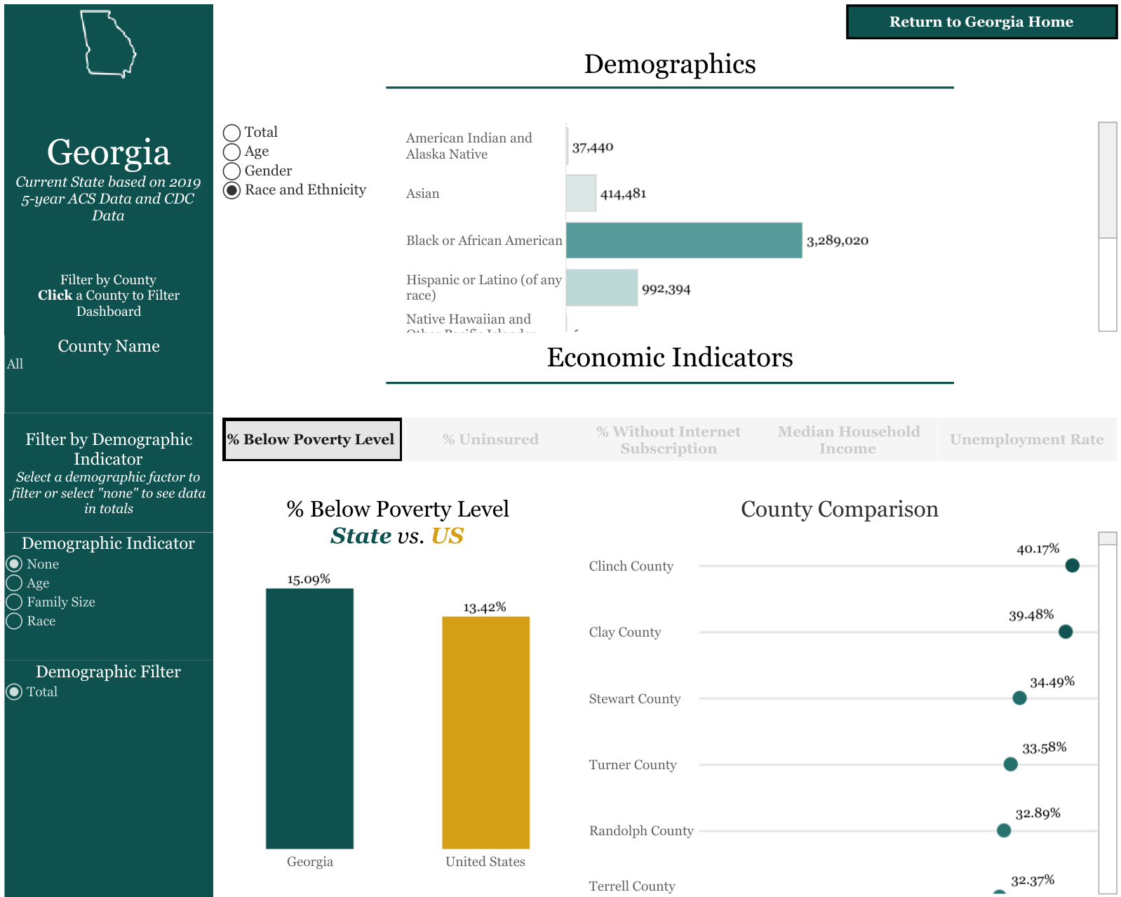
Author: Digitunity
Many visualizations and analyses integrate data from the U.S. Census. But savvy skeptics will know there are many ways to get the wrong answer from Census data and will ask tough questions of the particulars: did you use households or individuals, which vintage of the American Community Survey are you using, etc.? Notice how this dashboard shows the components of the percentage calculations in the bottom left, making it very easy to verify the data and the calculations at each step. If something surprises you, you can check the calculations yourself by following the steps listed on the dashboard.
3. Build trust through transparency
When we visualize data to persuade, we are carefully focusing the data on the question at hand. This is for a good reason – we want to capture and hold the attention of our audience and leave them with a clear takeaway. But we need to give our audience confidence that we are using the right data prepared the right way. Transparency about the work behind the visualization can build trust with users who do not trust us from the start.
Author: Southern Economic Advancement Project (SEAP)
Preparing the data with care and clearly describing the process means initial questions from skeptics about the accuracy of your data become a strength. The key to doing this well is balancing this transparency with the design and metrics on the dashboard itself. This example from SEAP does this well. The data behind the analysis and documentation on how it was analyzed is available to those who want it but stays out of the way for those who don’t.
4. Frame your analysis
Experienced data communicators know that it is important to consider the context within which the data is presented. Many factors outside of the visualization and the data affect how users hear the message of a visualization. Framing is the practice of placing your visualization in the right context and presenting information in the right order so your audience hears the message you are communicating to them.
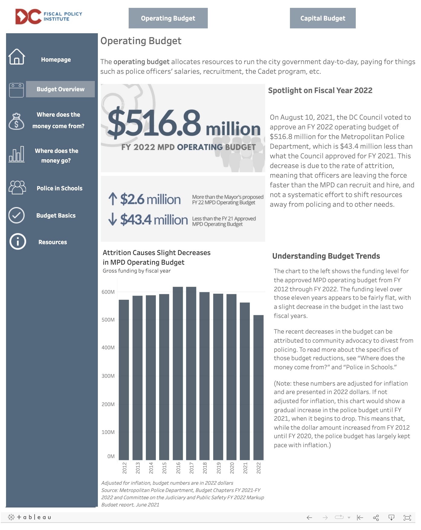
Author: DC Fiscal Policy Institute
This example visualizes the DC police budget. The complexity of police budgets is something I’m familiar with, so I particularly appreciate the way this dashboard sequences information about the budget. Each piece of information is accompanied by explanatory text and multiple ways of contextualizing the numbers (trends, increase/decrease, topline number). Through this approach, the visualization frames the budget for its audience, rather than the administrative needs of the original source document. This allows the audience to engage with questions about why the numbers are the way they are and what can be done.
5. Anticipate and address your audience’s questions (and reactions)
Finally, as an advocate, you probably know the arguments likely to be used against your work – sometimes these may be necessary data missing, other times they may be a debate about how to interpret core facts. Write down the questions you anticipate skeptics will raise about your work and find ways you can address them immediately and directly in your visualization.
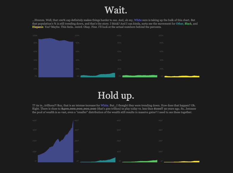
Author: Luke Abraham
This visualization invites the audience behind the scenes to the process of asking questions, making changes, and continuing to ask questions. Even for a topic that we have a lot of prior knowledge about, it is important to ask questions and anticipate how best to answer them in the design of the visualization and dashboard. By asking the questions a skeptic would ask, the author changed the design of this visualization of household wealth distribution completely.
Get started defending your data
If you are an advocate that's using data, then no doubt you and your organization have worked hard to identify, gather, and prepare the data to convey a message. For that message to be heard you need to take the steps necessary to defend your data from the most common threats to credibility. Hopefully, these examples have illustrated how to integrate these steps into your work.