Exploring Sankey and Radial Charts with the New Chart Types Pilot on Tableau Public


Editor's note: We’re pleased to announce that for the first time on Tableau Public, we’re launching a special ‘pre-Beta’ pilot that invites the Community to have more influence on product direction. For a limited time, Tableau Public web authors will have the opportunity to test out two new chart types—Sankey and radial—with the New Chart Types Pilot. From April 24th through June 30th, 2023, these new charts will be accessible through the “Marks” card drop-down menu on Tableau Public’s web authoring platform and will allow for the authoring and publishing of these charts natively to your Tableau Public profile.
To help you get started exploring these new viz types, we’ve asked Tableau Public Ambassador and Visionary Sarah Bartlett to share an overview of best practices for using Sankey and radial charts. Sarah was an Iron Viz Europe finalist in 2018, leads the Iron Quest community project, and is the co-lead for the London Tableau User Group.
When should I use a Sankey diagram?
Sankey diagrams or charts–named after their creator, Matthew Henry Phineas Riall Sankey, who first used this chart type in 1898 to show the energy efficiency of a steam engine–work best to show a “before” and “after” state with lines flowing from one side to the other to illustrate the transition between two or more states or categories (e.g. migration from one country to another). This allows someone to easily see and identify patterns and relationships that may not otherwise be apparent. While they can be visually stunning, unfortunately, Sankey charts can sometimes be misused.
A few things I like to keep in mind when considering whether to use a Sankey or not:
Are you trying to visualize flows or relationships? If not, there is most likely a better chart you could use instead.
How big is the data set you’re working with? Sankey charts work best when there are multiple inputs and outputs or when there are complex flows and relationships to represent. If the data set is small, a simpler chart type, such as a bar chart, may be more appropriate.
Will using a Sankey easily reveal a visual insight? Adding too many categories results in many lines and crossings that can make a Sankey difficult to navigate. Consider the insight you want to illustrate and the easiest way to make that obvious for someone viewing – sometimes a Sankey is a great way to simplify an insight, but other times it can make things unnecessarily complex.
Sankey diagrams may not be an appropriate chart type for all audiences. If your audience is not comfortable interpreting complex charts, or they are not as data-fluent, a simpler chart type may be more effective.
Below are some interactive, Sankey chart examples on Tableau Public:
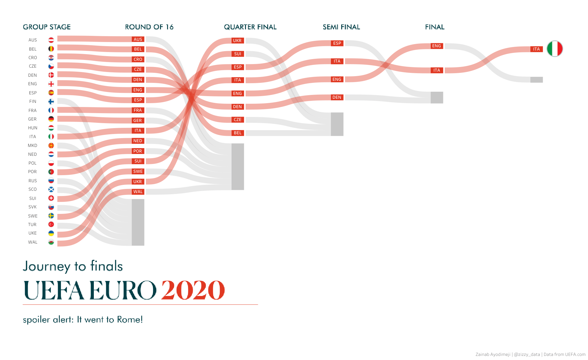
UEFA Euro2020 - Journey to Finals by Zainab Ayodimeji
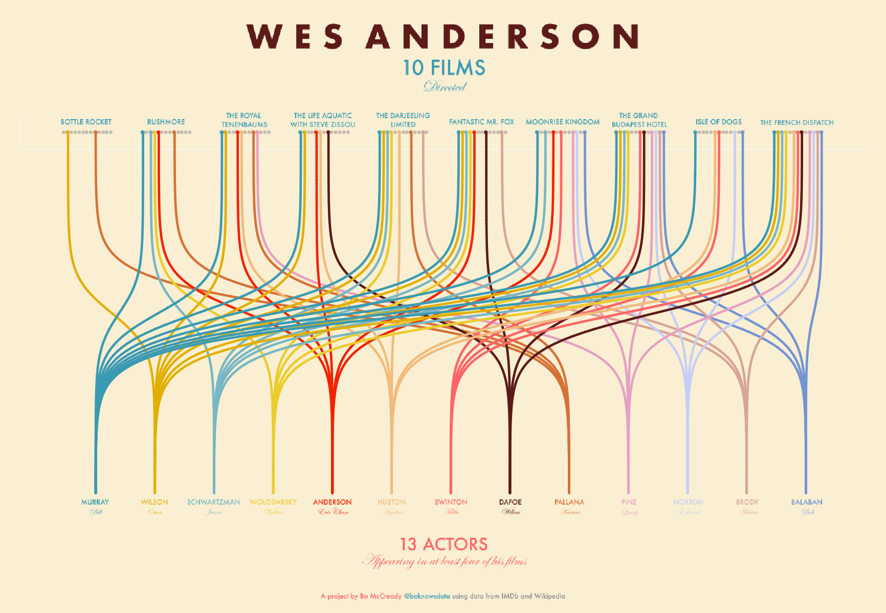
Wes Anderson Films by Bo McCready
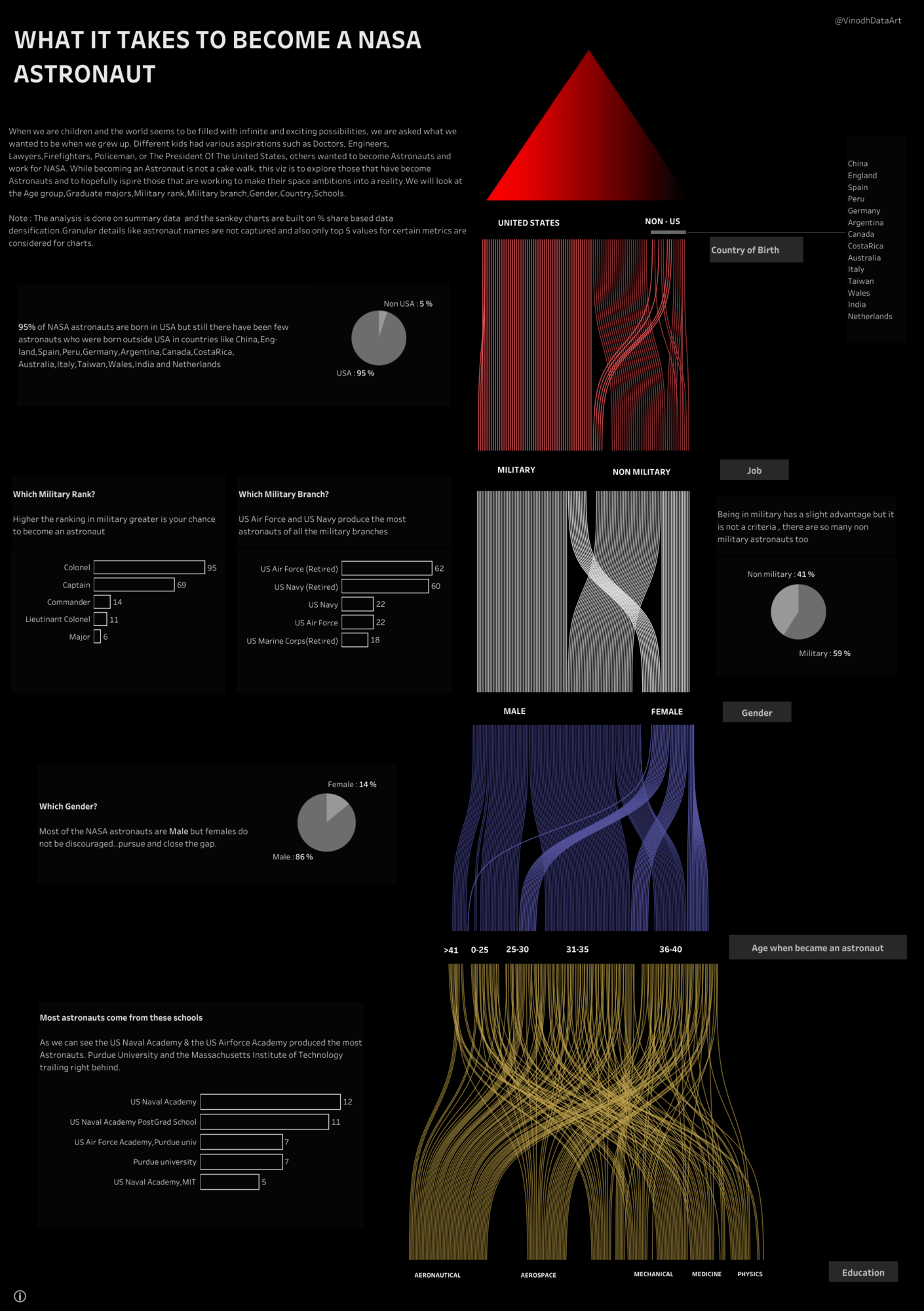
What it takes to become a NASA Astronaut by Vinodh Kumar
When should I use a radial chart?
A radial chart is a type of chart that displays data in a circular format in which the total of all segment values adds up to 100%, representing the whole. There are actually two different types of radial charts that are commonly used, donut and sunburst charts. A donut chart is effectively a pie chart but with a hole or empty space at the center, while a sunburst chart displays relationships across multiple tiers of categorical dimensions.
I love donut charts because they are easy to read and understand, even for viewers who are less familiar with data visualization.
Donut charts are particularly useful when you:
- Have a limited number of categories and want to emphasize the differences between them.
- Want to show the contribution of each category to the total, but also want to show the total value as a separate element.
- Want to show the completion percentage vs a goal.
Donut charts should be avoided in situations where there are many categories to visualize. I find they work best when used to display five (or ideally fewer) categories or segments. The more segments on the chart, the more difficult it becomes to interpret as they might seem similar-looking, making it difficult to accurately compare the sizes of the individual segments.
On the other hand, sunburst charts are wonderful for showing the breakdown of data across different categories or groups, displaying the relationship between categories and subcategories and helping people see the proportion of each subcategory within the overall category.
While sunburst charts can look very cool, they are particularly effective at displaying a large amount of data in a compact and visually appealing format, they are best suited for scenarios where there is a requirement to display hierarchical relationships and proportions. As with all circular charts, it can be difficult to clearly and simply identify patterns across categories. If the goal of the chart is to identify patterns, a 100% stacked bar chart may be a better choice.
Sunburst charts may not be suitable for all audiences. Some audiences, particularly those less familiar with data visualizations, may have difficulty understanding or interpreting the radial layout.
Below are some interactive, donut chart examples on Tableau Public:
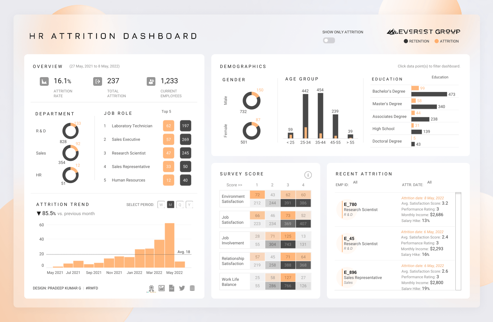
HR Attrition Dashboard | VOTD | #IIBAwards'22 by Pradeep Kumar G
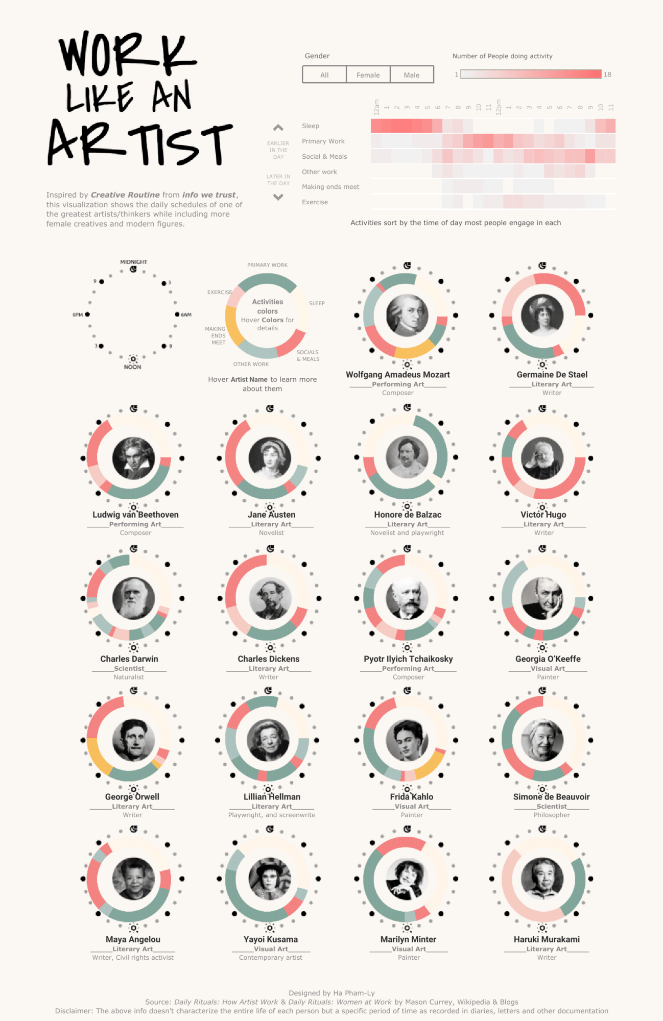
Work Like an Artist: Daily Routines of Famous Creatives by Ha PL
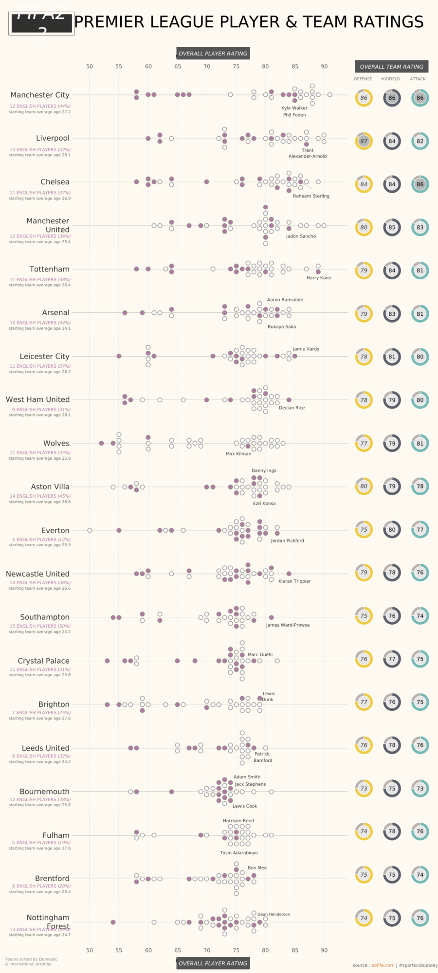
FIFA Player Ratings by Rob Radburn
And here are some of my favorite Sunburst Charts:
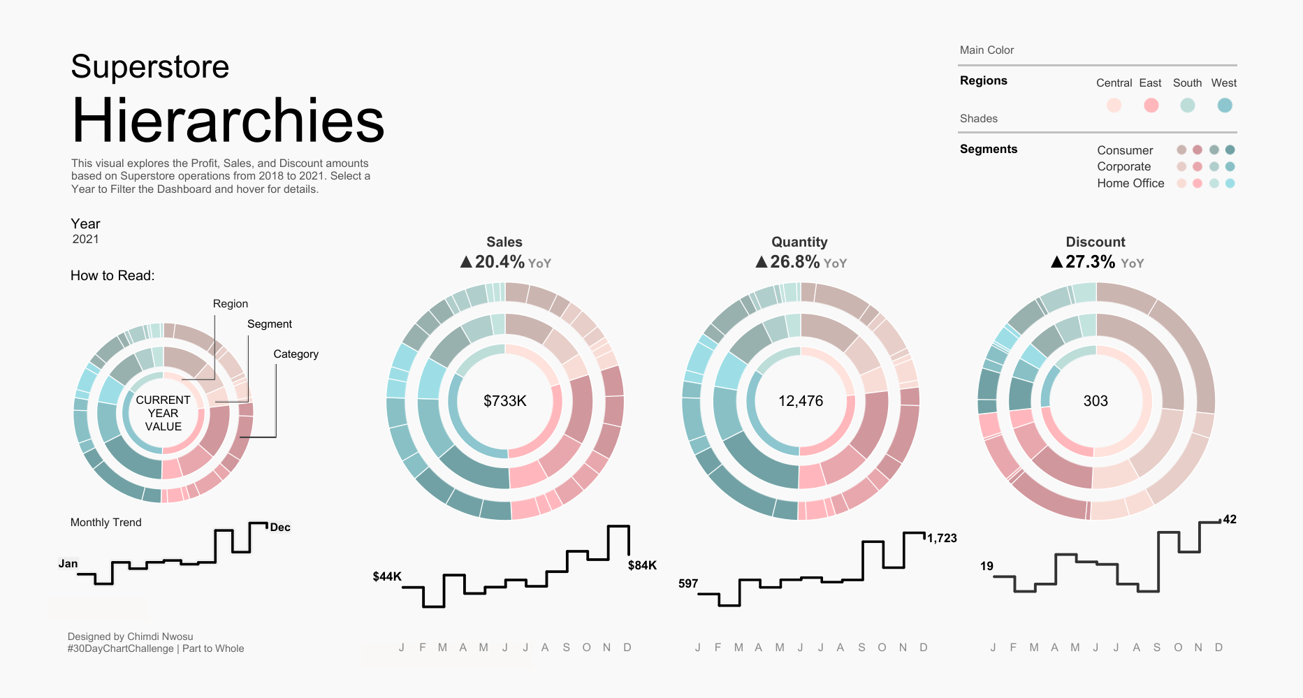
Superstore Hierarchies by Chimdi Nwosu

Data For A Cause - Global Fishing Watch by Simon Beaumont
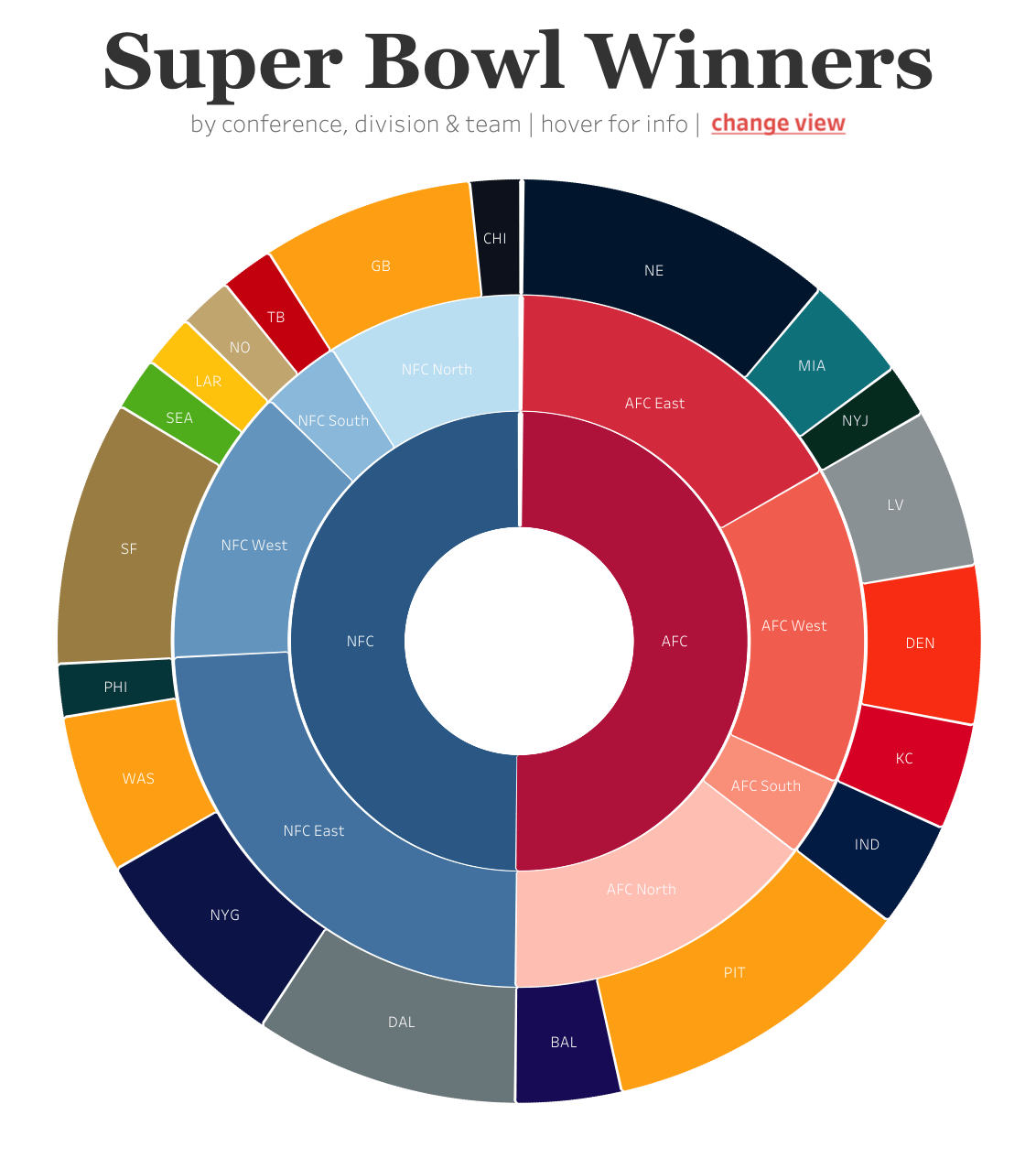
Super Bowl Winners by Adam E McCann
Now that you’ve learned a little bit more about Sankey and radial charts, you’re ready to give these new chart types a spin! Log in to your Tableau Public account, select Web Authoring under the Create menu, and connect to the data set of your choice to get started. Once the pilot ends on June 30th, 2023, the ability to create Sankey and radial charts will be removed, as will any associated visualizations created with these features. Please note: Our web authoring platform is not available for mobile or tablet devices.
Participated in the pilot? Tell us what you think! Share your feedback. For updates on The New Chart Types Pilot and other upcoming feature releases, don’t forget to follow Tableau Public on Twitter.
관련 스토리

9 Tips to Succeed in a Tableau DataDev Hackathon
 2025/01/08

A Guide to Mapping and Geographical Analysis in Tableau
 2024/11/15

Making Tables Smarter: Key Features of the Tableau Table Viz Extension
 2024/11/14