모든 스토리
 Enterprise
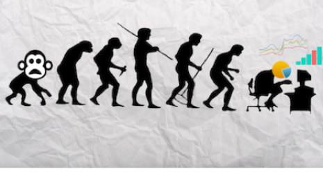
Work smarter, not harder, and don't be a data monkey
It might seem obvious, but I’ve seen, time and again, companies hire brilliant people only to have them spend a great deal of their time being a data monkey. So I’ve created this video to raise awareness and persuade analysts and their superiors to take a step back and see if they could benefit from report automation.
 Data
DataUse the new Simply Measured connector for deeper social media insights
 2016/07/21
At Tableau, we love to geek out about social media analytics. But getting started with social data can be challenging, especially because there are so many tools to choose from. If you’re a social media marketer, chances are you already have some favorite tools in your toolkit. And many of these probably include data.
2016/07/21
At Tableau, we love to geek out about social media analytics. But getting started with social data can be challenging, especially because there are so many tools to choose from. If you’re a social media marketer, chances are you already have some favorite tools in your toolkit. And many of these probably include data. Product
Tableau 10에 보다 많은 맵 데이터, 다국어 자동 감지 기능 추가
더욱 손쉬워진 Tableau 10의 맵 작성 기능. 더 많은 우편 번호,행정 구역, 도시 등이 추가되었습니다. 지리적 역할 감지 로직이 개선되어 데이터 원본에서 보다 신속하게 비주얼라이제이션을 구현할 수 있습니다. Data
DataIntegrate your data with cross-database joins in Tableau 10
You can't always answer your questions with a single data set. Sometimes, to answer your hardest questions, you have to integrate multiple data sets to uncover insight. That’s why I am so excited about cross-database joins, a new feature in Tableau 10.
 Tableau Certification
Tableau 인증으로 Tableau 전문가임을 입증
Tableau를 잘 다루십니까? Tableau 인증을 통해 차별화를 이뤄보십시오. 여러분의 기술을 검증할 수 있는 두 가지 인증 방식이 있습니다. 먼저 Qualified Associate 시험으로 기술적인 능력을 입증한 다음, Certified Professional 시험에서 모범 사례에 대한 테스트를 받아보십시오.
 Product
Do more while publishing workbooks in Tableau 10
You may remember publishing data sources got easier in Tableau 9.3. In Tableau 10, we’ve introduced the same delightful flow to publishing workbooks! Tableau Community
Who do you think should be a 2016-2017 Tableau Zen Master?
 2016/07/13
Do you know someone who is a true Tableau evangelist? Does this person use his or her skills to teach others and bring our mission to help people see and understand their data to as many people as possible? If so, that person just might have what it takes to be a Tableau Zen Master. From today until August 11, we are seeking your nominations for the 2016-2017 Zen Masters.
2016/07/13
Do you know someone who is a true Tableau evangelist? Does this person use his or her skills to teach others and bring our mission to help people see and understand their data to as many people as possible? If so, that person just might have what it takes to be a Tableau Zen Master. From today until August 11, we are seeking your nominations for the 2016-2017 Zen Masters. Partners
Microsoft Azure SQL Data Warehouse: The Tableau experience
 2016/07/12
For those customers running their applications and managing their data in Microsoft Azure, we’d recommend taking a look at Azure SQL Data Warehouse as it’s a massively-parallel processing, high-performance version built for analytics use cases. You can connect Azure SQL Data Warehouse to Tableau through our existing SQL Server connector.
2016/07/12
For those customers running their applications and managing their data in Microsoft Azure, we’d recommend taking a look at Azure SQL Data Warehouse as it’s a massively-parallel processing, high-performance version built for analytics use cases. You can connect Azure SQL Data Warehouse to Tableau through our existing SQL Server connector.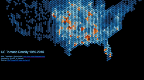 Visualizations
How to create density maps using hexbins in Tableau
Density maps are a great way to show concentration in an area. Let me show you how to create a density map in Tableau. Then we'll take it a step further to use hexbins as part of our density map.
