모든 스토리
 Developer
How to auto-generate 50 state maps in Tableau
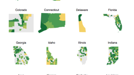
Recently I fell in love with the small-multiples types of graphs that show each individual state level metrics separated into a grid-style layout. Being the data hacker that I am, I decided to use my rusty JavaScript skills to auto-generate 50 individual state-level maps from one Tableau viz.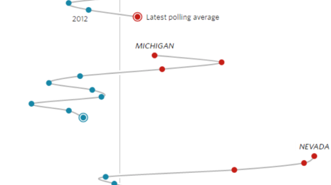 Visualizations
6 data-viz tips from election vizzes in the media
 2016/10/27
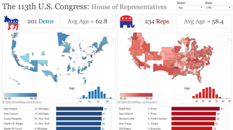
Elections are exciting times for the data visualization and data journalism field. The innovations in each election cycle set the trend for the future of the field.
2016/10/27
Elections are exciting times for the data visualization and data journalism field. The innovations in each election cycle set the trend for the future of the field.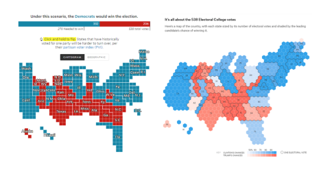
 Tableau Community
Find your mentor match in the Tableau community
Mentoring is such a great way to learn for both the mentor and the mentee. Through this relationship, we provide counsel and help each other grow. This can work almost any way you’d like. It can be formal (assigned) or informal (unassigned). It can be short or long-term.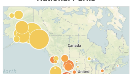 Mobile
Why a mobile data visualization isn't just a small viz
We’re not going to talk mobile dashboards; we’re talking about mobile users and how to design for them. Here are three things to keep in mind about mobile users.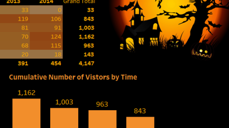 Tableau Community
#HalloweenViz exercise: Viz this data, get Tableau swag
I have lived in my house for 14 years. And every Halloween, I get inundated with trick-or-treaters. Year after year, it's like Willy Wonka's Chocolate Factory at my house, with candy flying out the door. Now, being a data guy, what do I do? Well, that's simple—I count them.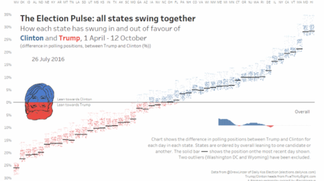
 Developer
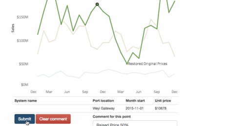
Leverage Tableau's getData() API feature to add commenting to your viz
When working with clients, the most sought-after requirement is to extend collaboration capabilities with cross-device data annotation and database write-back features. We leverage Tableau 10's feature-rich APIs to handle that request.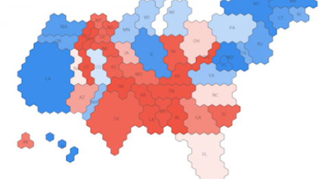 Visualizations
How to create an electoral-college cartogram in Tableau
A lot of my previous work has been centered around custom maps or mapping techniques within Tableau. I've always been fascinated with FiveThirtyEight's custom electoral-college cartogram used in its 2016 election forecast. This type of cartogram was created in response to critiques about the use of geographic maps to show election data. So here's how I did it in Tableau.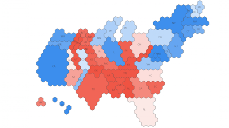
 Tableau Community
What does data mean to you? Tell us in two words!
 2016/10/18
When you hear data, what two words come to mind? Take just one minute to share your two words. Don’t worry, there isn’t a right or wrong answer—data means many things to many people. So tell us your two-word definition of data.
2016/10/18
When you hear data, what two words come to mind? Take just one minute to share your two words. Don’t worry, there isn’t a right or wrong answer—data means many things to many people. So tell us your two-word definition of data.