6 dashboards from Tableau partners to help you mitigate COVID-19 impacts


Data is a critical asset during this time—to understand, track, and mitigate the impacts of this pandemic. COVID-19 data is constantly evolving, and organizations are relying on Tableau to communicate with employees and customers, understand overall business impact, and stabilize business operations—all to pave a path towards reopening and recovery.
From the very beginning of the pandemic, partners have taken a proactive approach to supporting customers. We’ve seen an incredible amount of partner solutions emerge—including dashboard templates and extensions—that can help you move quickly and confidently during this time and beyond. The solutions cover a variety of industries and lines of business and a lot of them are customizable, so you can tailor each solution to your organization’s key performance indicators.
In this post, we’ll feature a few of the solutions developed by Tableau partners and showcase downloadable workbooks that you can use for your own analyses. For more solutions, register for our upcoming partner webinar series, the Business Recovery Solution Series.
1. Human resources: Analyze at-risk employees by building, age, and location
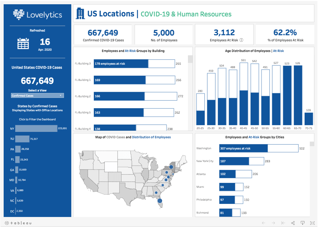
Tableau partner: Lovelytics
Use case: Human resources
Download the dashboard on Tableau Public
Organizations across the United States are struggling to make sense of the COVID-19 pandemic, and employers small and large are asking: is our workforce at risk and what can we do to protect our employees, especially those most vulnerable to the virus?
To answer this question, the team at Lovelytics fast-tracked the development of the COVID-19 & Human Resources dashboard to provide those organizations with an interactive, easy-to-follow visualization. Combining data from the Tableau COVID-19 Data Hub and sample human resources (HR) data, the viz offers a breakdown of at-risk employees by building, age group, and location.
Lovelytics suggests that organizations use this workbook as a starting point to better understand their workforce. They recommend organizations start by downloading the COVID-19 case data available to the public through the Tableau COVID-19 Data Hub, which will provide a baseline for organizations to see the states and counties that are epicenters for confirmed cases. Next, organizations can collect internal data that will offer further insight into employees that are located in these epicenters. Combining these datasets, COVID-19 case data, and internal HR data can assist in the development of strategies around employee safety.
2. Healthcare: Visualize patient-level tracing, testing metrics, and operational workflows for healthcare
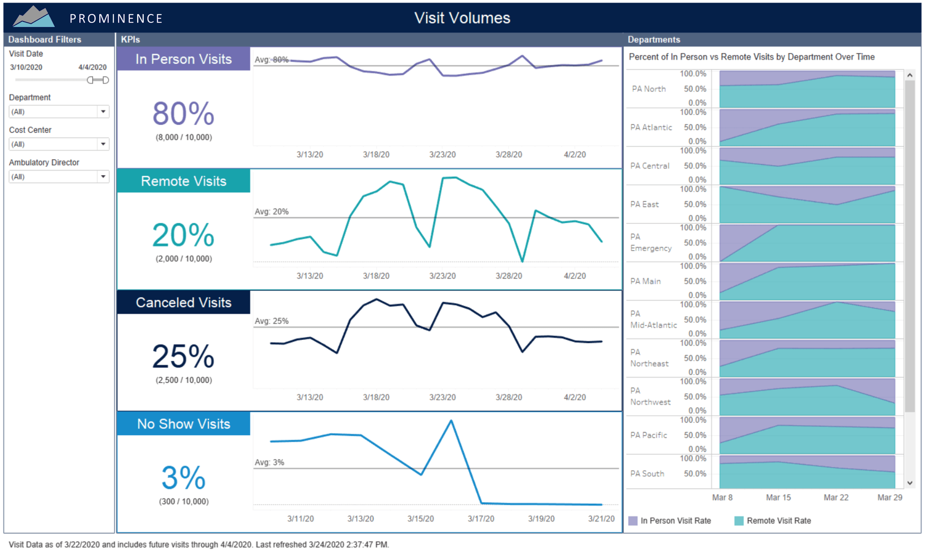
Tableau partner: Prominence Advisors
Use case: Healthcare
Request access to the dashboard
Note: Due to the sensitive nature of this data, this solution is only available to select customers. Visit the Prominence website to request access.
Prominence’s mission is to help healthcare organizations do more with their data. Prominence created a COVID-19 dashboard that enables near real-time decision making on critical measures. Additionally, Prominence has given away hundreds of pro-bono hours to support existing and new customers alike to accelerate the implementation of the dashboard, make the data more real-time, and embed it directly in the EMR.
The Prominence COVID-19 Dashboard leverages Tableau to pull and visualize data from multiple, critical sources: data from the EMR like Epic and Cerner, Supply Systems, Lab Systems, and public data from Johns Hopkins, WHO, and the CDC to name a few. With this dashboard, organizations can measure mission-critical healthcare metrics like:
- Heatmaps of testing and confirmed case trending in your geographic areas
- Key testing demographics
- Operational workflows for patients in high-risk comorbidity groups
- Visit volumes and success in telehealth efforts
- Detailed, patient-level tracing to track the pathway of every potential patient as they passed through your facilities, determine where they have been seen or where they have upcoming visits, and establish appropriate follow-up actions
3. Financial services: Enable credit risk analysis for financial institutions
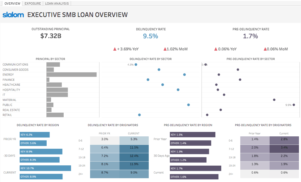
Tableau partner: Slalom
Use case: Financial services and risk management
Download the dashboard on Tableau Public
As the economy shifts during the pandemic, lending providers and governments are dynamically altering policies that impact borrowers. Meanwhile, financial institutions need to work rapidly to limit risk exposure before it impacts the bottom line and address questions like:
- How much exposure do I have across my portfolio?
- Which businesses are impacted more than others?
- How are closures in key locations influencing credit?
Every minute without insights translates to lost capital, but existing risk models lack the flexibility and granularity to pivot as quickly as the terms of the crisis demand. Slalom worked with a financial services client to build a real-time Tableau dashboard that analysts and fund managers alike use to identify critical trends and insights, revealing how new borrowing behavior and policies will impact their credit risks.
With faster time to insights, they are empowered to anticipate economic impacts of the situation as it unfolds and pivot their strategy using the same foundational data across the business. This data response allows them to communicate their preparedness more effectively with concerned investors and protect the health of their business.
4. Data storytelling: Provide written summaries for COVID-19 dashboards
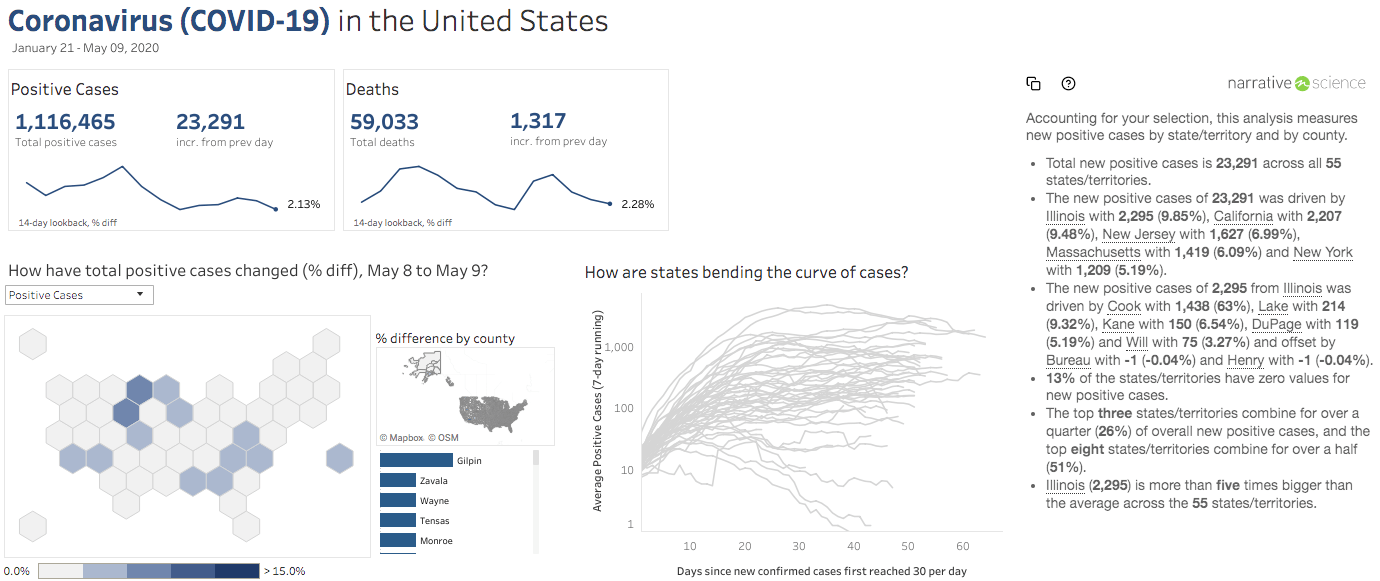
Tableau partner: Narrative Science
Use case: All industries
Download the dashboard extension
Understanding the spread of COVID-19 has proven to be an extremely difficult task for everyone. The data can be complex, volatile, and often confusing, which means people can get stuck trying to find key takeaways—or they may have to rely on someone else to provide a summary.
Quill, a product by Narrative Science, is a data storytelling extension for Tableau that turns the underlying data from a dashboard into clear, written summaries that anyone can read. This means that everyone in the organization can increase their understanding of key trends impacting health and business, even with the most complex dashboards.
When configuring Quill for your COVID-19 dashboards, the Narrative Science team recommends setting clear goals for what you want to communicate to your audience. Consider questions like: what is the main point of your dashboard, what outcomes are you hoping to drive, and what questions are your consumers most likely to ask about the data? This helps you meet the specific needs of your audience and increase communication for a distributed workforce. And don’t worry, if you want to make a change later, you can do so easily in Quill’s configuration module.
5. Healthcare: Track hospital resources like staffing, hospital beds, and protective equipment
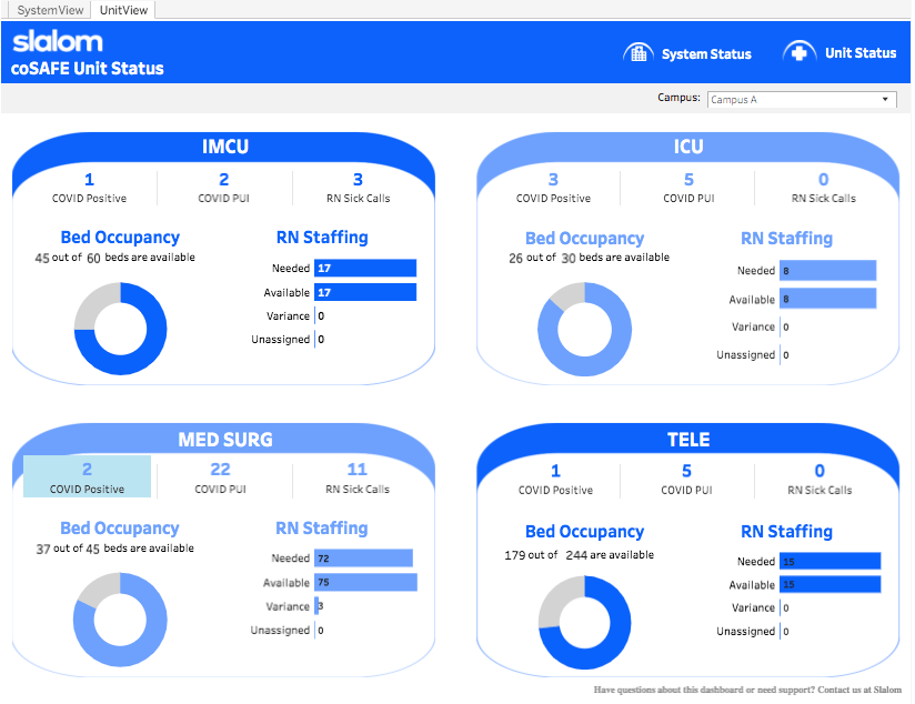
Tableau partner: Slalom
Use case: Healthcare
Download the dashboard on Tableau Public
In the face of pandemic response, local healthcare workers and hospitals are among our most essential defenses. As overburdened hospitals struggle to meet demand, healthcare executives need to understand capacity, support workers, and help staff operate in these truly unprecedented times. Working with healthcare providers and health-system researchers on the front lines, Slalom created an intuitive and accessible dashboard to display relevant hospital resources, like hospital beds and nursing staff. By keeping hospital leadership informed, they can make the most of scarce resources like staff, equipment, and personal protective equipment (PPE) in a time of exponential demand.
Called coSAFE, these dashboard templates are built in Tableau and provide important insights, such as a hospital-level summary of COVID-19 positive patients, COVID-19 patients under investigation, and available resources. Another view provides insights into each unit, like the ICU, highlighting needed RNs, available RNs, variance, and unassigned RNs. This approach allows for multi-level comparisons, so hospital leadership can swiftly make informed decisions on how to efficiently allocate resources within their system.
6. Retail: Understand and mitigate supply chain risk for retail
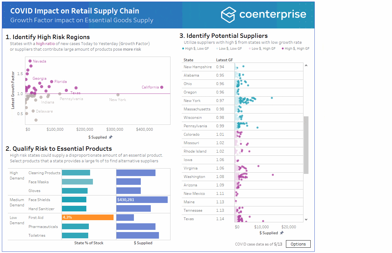
Tableau partner: CoEnterprise
Use case(s): Retail and supply chain
Download the dashboard from CoEnterprise
Companies in the retail space have seen a significant increase in demand for products such as toiletries, pharmaceuticals, and other essential goods. To ensure that communities have these critical amenities, establishments need a supply chain that can adapt to risk. They’re addressing a few key questions:
- Where is COVID-19 impacting suppliers?
- Which product families are most affected?
- Where else can those products be procured from?
CoEnterprise began to answer these questions, creating an analysis that combines historical purchasing data with COVID-19 case data. When you select a region, it filters the data in the dashboard to show the effect that suppliers have on the overall business and the extent to which COVID-19 cases are growing in that region (measured by the growth factor or ratio of one day's new cases to the previous day).
The dashboard highlights suppliers in at-risk regions and uncovers replacements that minimize supply chain impact. Users can then identify other potential suppliers that could be leveraged in the interim, prioritizing those from lesser impacted regions and those who have done more business historically. By leveraging easy to access COVID data, users can identify potential supply chain weaknesses and quickly define next steps to pivot and secure the availability of high-demand vital goods.
Explore other industry solutions
Register for our upcoming webinar series, the Business Recovery Solution Series to learn how to use these dashboards to create your own analyses, and explore other industry solutions.
관련 스토리
What we can learn from open data: COVID-19 in the Netherlands
 2021/04/29

After a year of COVID-19 charts, eight data communication lessons learned
 2021/04/19
Data innovations in public health: PATH creates COVID-19 diagnostic test dashboard
2021/04/02