Better Government with Data Analytics: Analytics is a team sport
Welcome to Part Three of our four-part blog series, Better Government with Data Analytics. In this blog, we’re going to take a closer look at how adopting a thoughtful approach to data analytics leads to success.


Welcome to Part Three of our four-part blog series, Better Government with Data Analytics. In this blog, we’re going to take a closer look at how adopting a thoughtful approach to data analytics leads to success.
I recently reviewed a McKinsey study where they found that in organizations where senior leadership adopts the behaviors and skills they ask their employees to learn, they are five times more likely to succeed. That’s an incredible data point. Imagine how your organization would be impacted if leadership took a hands-on approach to your data initiatives, modeling the data fluency you’re trying to instill in the employees.
Leading by example seems like common sense. And most agree that the tone of an organization begins at the top—but sometimes the Organizational Divide is too wide. When leadership appears to operate independent of the rest of the organization, it hampers the progress of your data initiatives.
It’s important to remember how powerful it is for leaders to model the behavior they want to see manifest in their organizations. People are hungry to be led, inspired, encouraged, and motivated. With a deliberate commitment to data literacy in theory and practice, your team will without question reap the benefits of thinking with a data-driven mindset.
Thoughtfulness inspires success
I call this a mindful, or thoughtful approach. Thoughtfulness begets creativity, which begets success in an analytics program, and that drives real business value and an empowered workforce with greater data literacy.
Thoughtfulness also encourages teams (and their leaders) to lean in, and buy in, to the organization’s data initiative. No more “I can’t/won’t adopt this new change-laden process because we’ve always done it our way and/or our leaders aren’t even using it.” Every day at Tableau we see that our customers are able to be thoughtful in new and powerful ways, answering their own business questions rapidly, and unearthing previously unknown insights with aplomb. Teams look at data with a fresh perspective, unencumbered by a “report factory” frame of mind. The output of this is a powerful formula I just invented for this blog:
(Inspiration + Empowerment) * (Encouragement)*(# of creative knowledge workers) = High Value Analytical Output.
In other words: tangible business value.
Avoiding traps, mishaps, and the dreaded time sink
Tangible business value becomes more valuable when agile process accompanies thoughtful design, both in the visual sense and in project planning and execution. To that point, I see teams waste countless hours reworking, trying to perfect exactly what their leaders want, even when that leader usually has no clue what they want. These wasted efforts are related to:
- Inefficient process: “No time” to understand what consumers actually want to see.
- Flawed results: We completed many revisions, but something was slightly off each time.
- Lack of clarity around objectives: They didn’t know what they didn’t know, so they answered everything instead.
Several problems arise here that could quickly derail any project. I’d like to share a few thoughts and sample visualizations below to help avoid these pitfalls and plan a path forward. Note that this is contrived data from the State of Texas that was modified to protect the privacy of the organizations involved.
How you “see” data is valuable (but not worth months of rework)
At Tableau, we tell our customers that visual best practices should drive your interactions with data. For example, you might ask someone to show you how performance of a series of KPI’s trends over time. If you ask for that, you could end up with anything. See below for two good examples of this.
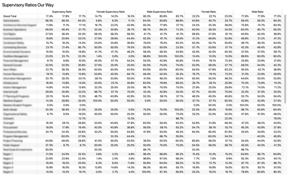

No thoughtfulness went into the design of Figure 1 as it did in Figure 2, so you’ll have to invest all of your thoughts in looking at every number on the page to see if there is a trend. Figure 2, a thoughtful design with color and linear direction elements is immediately effective.
Consider the question of which region has the least average time to retirement among supervisors.


The visual approach in the regional map helps identify pockets in the state where retirement will be felt sooner in seconds. It should be clear that the visual approach is superior, yet skeptics sometimes cannot trust the picture when they don’t see the numbers. I promise they are all there, and they can see them all with a quick hover.
Modern analytical methods show that a visually driven macro-to-micro (M2M) approach versus a traditional query then answer, then repeat, is more efficient in driving business value with data, and I encourage you to consider it as part of your vernacular going forward.
Conclusion
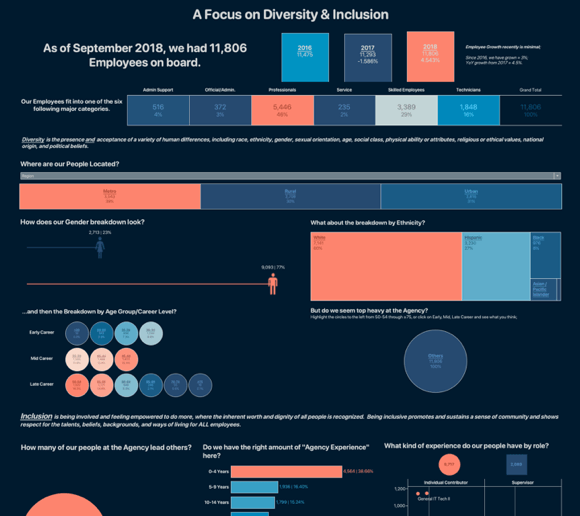
Imagine if you could actually answer multiple questions in combination, and not piecemeal as you normally do. Imagine if you were able to just promote thoughtful design and end up with a unified dashboard such as the one in Figure 5 to narrow the organizational divide and bring tangible business value to your organization.
The path is hopefully clearing for you. You need well defined outcomes and decisions, along with people that are data literate and ready to fluidly respond to change your business. I hope you can also see that this two-part strategy of leading, inspiring, and motivating people, and then for those people to lead with thoughtful design, vs. that which has always been done with little to no value to your organization is a better option for success.
This blog is part of a series for state, local, and education data rock stars who are interested in gaining deeper insights about how to leverage data to improve results and build a culture of analytics within their organizations. To learn more about what Tableau can do for your organization, please visit our State and Local Government Analytics page.