Tutte le storie di Visualizations
 Visualizations
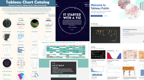
What is Tableau Public?
Get started with Tableau Public, a free online visual analytics platform that allows you to learn data skills, create and explore data visualizations, discover data stories, and create your own portfolio of work to share with your network.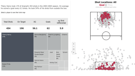 Visualizations
How to Get Started Analyzing Football Data in Tableau
 18 Dicembre, 2022
The Tableau Community has a wealth of resources to accelerate your football and soccer analytics journey.
18 Dicembre, 2022
The Tableau Community has a wealth of resources to accelerate your football and soccer analytics journey.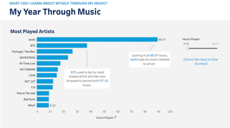 Visualizations
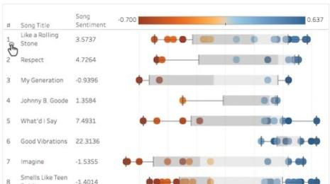
How to Visualize Your Music Data
 19 Novembre, 2022
Step by step instructions to see and understand your music listening data using Tableau.
19 Novembre, 2022
Step by step instructions to see and understand your music listening data using Tableau.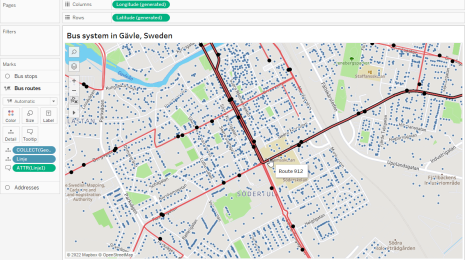 Visualizations
Exploring Spatial Relationships in Tableau
 13 Ottobre, 2022
Maps are a great tool to visually analyze spatial patterns. In Tableau, it’s simple to add multiple layers of data on top of a custom base map to easily see patterns.
13 Ottobre, 2022
Maps are a great tool to visually analyze spatial patterns. In Tableau, it’s simple to add multiple layers of data on top of a custom base map to easily see patterns. Visualizations
Come trovare le migliori origini per accedere a dei set di dati pubblici gratuiti
 26 Febbraio, 2019
Jacob Olsufka ci propone alcuni suggerimenti per trovare il set di dati perfetto per il prossimo progetto di visualizzazione.
26 Febbraio, 2019
Jacob Olsufka ci propone alcuni suggerimenti per trovare il set di dati perfetto per il prossimo progetto di visualizzazione.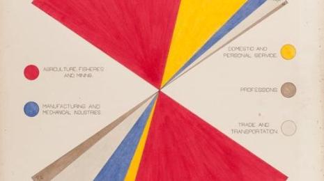 Visualizations
How W.E.B. Du Bois used data visualization to confront prejudice in the early 20th century
 20 Febbraio, 2019
In celebration of Black History Month, we're taking a closer look at how Du Bois’s visualizations for the Paris Exposition were innovative.
 Visualizations
Using Python for sentiment analysis in Tableau
 16 Dicembre, 2016
If you haven't used Python before, have no fear—this is definitely achievable for novices. Read on!
 Visualizations
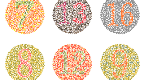
5 Tips on Designing Colorblind-Friendly Visualizations
 20 Aprile, 2016
Examine the issue of using red and green together in data visualization.
 Visualizations
6 tips to make your dashboards more performant
 15 Gennaio, 2016
We here at Tableau are very proud of how easy it is to see and understand data with Tableau. Once you get started, it’s intuitive to dive deeper by adding more and more fields, formulae, and calculations to a simple visualization—until it becomes slower and slower to render. In a world where two-second response times can lose an audience, performance is crucial. Here are some tips on making your dashboards more performant.
 Visualizations
Tableau on Tableau: 5 ways we look at our sales data
Like any company, Tableau needs to make decisions about sales data. And as a data company, we’re always on the hunt for the best way to look at sales information. Here are five ways we look at our own operations to help make decisions about quota, territory management, and must-win deals.
 Visualizations
Top 15 LOD Expressions
Tableau's features are carefully designed to help people transform data into meaning. The easier it is to express ideas in a calculation language, the more meaning people can generate. Level of Detail (LOD) Expressions allows people to express powerful concepts using simple statements.
Subscribe to our blog
Ricevi via e-mail gli aggiornamenti di Tableau.