What can data-viz authors learn from punks?


A punk approach to data visualization, inspired by Sideburns magazine, January 1977.
This piece first appeared in ComputerWorld.
"The skills required for most effectively displaying information are not intuitive and rely largely on principles that must be learned," says Stephen Few in his excellent book Show Me the Numbers.
In principle, I agree.
But there is a problem: Some of the skills can only be learned by practice. Knowing what makes a purely functional chart doesn't teach you about human psychology and the need to engage as well as inform. Experience of failure and success, learned early on, teaches you as much as books.
Unfortunately, I see many people intimidated by other experts and fearful of getting involved. They feel like they need to reach a high bar before they get going (see the comments on this post as an example).
I'd rather people get going the moment they know the bare minimum, then learn by doing as they go.
In 2012, Simon Rogers, now data editor at Google, advocated a punk ethic to data journalism: "Anyone can do it." Knowing just three preattentive attributes doesn't mean you'll make great pieces of work, but it gets you started and brings about more benefits than problems.
Data starts conversations
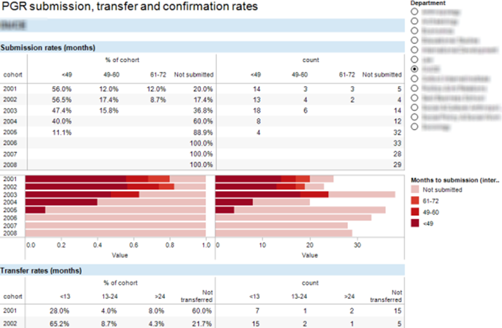
Here's one of my first dashboards, built in 2008, showing student progression through postgraduate courses.
I started making charts as an analyst at the University of Oxford. My first charts were pretty poor. They didn’t change the world as I expected they would. However, being able to see something for the first time was enough for my colleagues to say, "Well, that's OK, but instead of the data shown like that, I'd rather see it like this."
Together, we then iterated and worked together to build dashboards which worked for everyone. The punk approach enabled prototyping. I learned at the same time as the academics.
Sharing your early work makes you improve quickly
Sharing your early work creates virtuous feedback loops. Makeover Monday, the community-led data-visualization project that ran throughout 2016, proves this. In the project, we share a new chart and its data each week and ask people to remake the original chart. There have been over 3,000 makeovers from nearly 500 people.
The punk side of the project lets people grow. The tweet below shows one of the first makeovers from Tom O'Hara, an analyst in New York. It's not great. The story isn't clear, and the use of color isn't ideal. Do I care? Not greatly; I'm delighted he got involved.
Little late to the party, but my attempt at #MakeoverMonday. https://t.co/yNfg5q768V #tableau #dataviz @VizWizBI pic.twitter.com/JOQylCeU1c
— Tom O'Hara (@taawwmm) May 4, 2016
Over the year, Tom's skill developed hugely. Below is one of his latter makeovers. You can see a huge difference in the understanding of the skills of design and storytelling. "Before coming into Makeover Monday, I didn't know how to tell a story with data," he told me. "I would build random charts with no regard to the effect on the end user. Makeover Monday helped solidify my storytelling techniques."
#MakeoverMonday with lots of hover action filters! https://t.co/NzaCVxg5wi @VizWizBI @acotgreave #tableauu pic.twitter.com/NYJTvToL6a
— Tom O'Hara (@taawwmm) November 23, 2016
If we had framed Makeover Monday as a project with a high bar of entry, we'd have created an elitist, intimidating experience. Tom is just one of many people who dove in and then received feedback on his work. This iterative, public learning improved his skills. Would I rather only the data-viz elite got involved in this project, or that it inspired many people?
Messy and ad hoc visual exploration has its place

As you home in on the best articulation of your data, what you build on the way can be as messy as you like.
Too many people think visualizations must be polished, print-ready pieces of work. No, messy visual exploration of data is as important as presentations of data for the executives. It's OK to throw data around on a canvas, making a mess, in order to make discoveries.
Kirill Andriychuk of Aeria Games in Berlin knows this: "We were one evening sitting with the CEO of Aeria Games, and we were just throwing together some visualizations by country, seeing where our most profitable customers are. As we were doing it, he said, 'Stop, stop. Let's have a look at this. What's up in Singapore?' We have some really profitable customers, but we didn't know that before."
Punk work that's iterative, messy, and sketchy can provide just the insights you need. They don't need to be kept, or shared; it's just a case of throwing around the basic data to discover the insight within it.
This article was inspired by the Data Debate I recently hosted with Andy Kirk of VisualisingData.com. For an argument in favor of a more academic approach, go check out the debate!
Storie correlate

5 Ways to Use Tableau Public to Achieve Your Goals
 11 Gennaio, 2025

World Mental Health Day: Elevating Awareness Through Data Visualization
 10 Ottobre, 2024

From TV Screens to Tableau: Visualize Your Favorite Shows with IMDb
 31 Agosto, 2024