
NYU Langone Health builds a data-driven culture featuring Tableau visual analytics
Ranked as a U.S. News Honor Roll Top 10 hospital the past four years (#3 in 2022-2023 rankings) based on multiple specialties, procedures, and conditions
Improved national medical school ranking from #35 to #2 by establishing a data-driven culture of accountability, efficiency, and high-quality care
Boosted NIH research funding portfolio ranking from #38 in the mid-2000s to #1 in 2021 by making data clear and available to researchers and executives
Trends in healthcare have pushed the boundaries of technology in recent years. New levels of treatment capacity, advancements in research, and evolutions in consumer demand—not to mention the urgency of a global pandemic—have all required an intentional response from health systems seeking to remain effective and competitive. At NYU Langone Health, an academic medical center located in New York City, Tableau plays a key role in providing platform support for the institution’s larger mission of promoting a data-driven culture that empowers every person to make decisions that support the business and advance improvements in quality of care.
NYU Langone operates in more than 320 locations around the New York region and in Florida. It comprises Tisch Hospital, Kimmel Pavilion, NYU Langone Orthopedic Hospital, Hassenfeld Children's Hospital, NYU Langone Hospital‒Brooklyn, and NYU Langone Hospital‒Long Island, along with the NYU Grossman School of Medicine, NYU Long Island School of Medicine, and Rusk Rehabilitation Center. Throughout this widespread healthcare enterprise, care teams, administrators, data teams, executives, clinicians, and other staff have worked together to put data at the foreground of operations and innovation.
The best way to change behavior is to show data that illustrates where the issues are, and where we have opportunities to improve.
“Having ways to make data accessible and applicable to physicians and clinical leadership is really one of the fundamental driving forces for us,” says Dr. Ilseung Cho, NYU Langone's Chief Quality Officer. “Our dashboards are really at the heart and soul of how we drive change in our organization.”
We took a closer look into the many ways NYU Langone achieves success with its data-driven approach to healthcare, across multiple areas of business that include quality control, financial management, research management, and payor network operations. Key professionals at the health system shared with us the many ways they're benefitting from the latest data technologies—not just how they're using Tableau, but how they put data front and center in maximizing productivity and collaboration across daily operations, and how this approach helps them achieve better outcomes for patients, as well as for NYU Langone itself.
Building a quality-driven care culture based on empathy, data, and a shared mission
For the past 15 years, NYU Langone has followed a vision to transform itself “from a distributed and ad-hoc management and decision-making organization” to one that is “centralized, planned, and data-driven.” Among the tenets of this vision are achieving quality improvements throughout the organization and democratizing access for all users. In these areas and many others, visualizing data plays an important role.
“I learned from my years as a researcher about the importance of using data to tell stories,” said Cho. “In research, you often use storytelling to make your findings more engaging with people who aren't familiar. This skill has translated well to the hospital, where we look at data to tell us stories about how each patient is doing, and what trends we're facing on the macro level.”
The continuous development and refinement of Tableau visualizations at NYU Langone has yielded powerful tools for analyzing highly relevant clinical data, such as the High Risk Care Coordination dashboard shown in Figure 1, which reports on cases for patients with at-risk conditions. More than 100 dashboards use over 800 key performance indicators to track a variety of measures, from operational analytics and hospital resource capacity, to patient census and lengths of stay, to employee safety metrics and patient experience factors, to COVID-19 leadership scorecards and detailed financial performance. These dashboards represent a myriad of data sources, which the NYU Langone team has expertly wrangled over the past decade to yield meaningful, actionable results.
Every time we meet a patient or encounter their case, we're reminded: Somebody loves this person, and they've entrusted us with their care. So we have an obligation to listen to the patient experience and achieve equity in treatment wherever we can.
In all instances, the dashboards present the vital capability of drilling down from high-level analysis to various case-level and demographic details. This capability is especially important to one of the hospital's data culture goals: scaling down analytics capabilities to make them truly accessible to all. The trends shown at the top level of a dashboard might not resonate with users whose focus is on operating a smaller facility, for example, or catering to a specialized area of disease. By enabling users to easily sort and filter the analytics, NYU Langone's dashboards provide insights at all necessary levels of engagement.
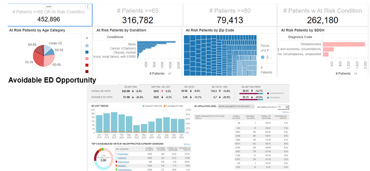
Figure 1. The NYU Langone High Risk Care Coordination dashboard reports on cases for patients with at-risk conditions.
According to Cho, a key value that data visualization provides is positioning every employee at NYU Langone to do even better work in pursuit of the overall mission. When all users can see and relate to data, they are in the best mindset to fine-tune the ways they perform so that they can achieve better outcomes for patients and for the health system overall.
“Based on what we see in our dashboards, we've started putting together process measures that help inform us as precursors of bad events,” said Cho. “We have measures for how our teams can best manage patients, all the way down to things like hand hygiene and timely anticoagulation. If compliance starts drifting down, we can predict that we might see more infections or other issues.”
I was recently a patient of another hospital in a different system, and over the course of my visit, six people asked me the same exact questions about my health data. Because our data is so integrated at NYU Langone, that would never happen here.
In the course of pursuing these data-driven process improvements, NYU Langone also prioritizes its response to healthcare equity disparities with targeted health initiatives, better competence around language barriers, and other solutions. Cho works with the data and analytics team and others to overlay various social determinants of health factors with the process measures that drive effective clinical care, so that the health system's reach is expanded to address many areas of need, not just the ones that are most apparent.
In these ways, clinical quality improvement efforts at NYU Langone are connected by another prime motivator within the health system's mission: empathy. “Like many people in healthcare, I know about the importance of hospital work from personal experience with loved ones,” said Cho. “Every time we meet a patient or encounter their case, we're reminded: Somebody loves this person, and they've entrusted us with their care. So we have an obligation to listen to the patient experience and achieve equity in treatment wherever we can.”
Another important vector for quality management has been the integration of technology, including metric definitions and data systems, into shared platforms across departments. Jeff Shein, Senior Director of Data and Analytics, has been instrumental in promoting multiple cross-functional, data-driven initiatives, including a decision support and value improvement team for driving operational, financial, and clinical value through data and collaboration; and a reporting and metrics subcommittee for ensuring consistent, accountable data governance.
“Empowering everyone at the hospital to be familiar with the data really streamlines the sharing of information and knowledge, both generally and on a case-specific basis,” said Shein. “I was recently a patient of another hospital in a different system, and over the course of my visit, six people asked me the same exact questions about my health data. That doesn't happen here at NYU Langone.”
Tracking to goals and opportunities in financial and research management
Data analysis also plays a key role in managing financial activities at NYU Langone, including tracking ROI, providing executive visibility into financial performance, and predicting caseloads and other economic drivers. The fiscal health of the organization depends on the well-rounded collection and analysis of financial data, including payor receivables, revenue cycles, purchasing, payroll, contractor relations, and clinical activity.
Tools such as the One Finance: Enterprise to Department dashboard, provide summary and detailed information to all organizational levels, from executives down to individual care team members, enabling insights into operating margins, revenue, expenses, and service volume. NYU Langone also uses Tableau to predict future readings of this data so that leadership and other decision makers can plan and adjust their budgets accordingly.
“Our organization has a real thirst for using data to drive decisions, and at the same time, we're hyper-focused on performance,” said Steve Chatfield, Assistant Vice President in Finance, reporting directly to the Chief Financial Officer. “So it's a cultural thing that you're expected to know the data in order to stay on top of expenses and trends, and to be accountable for knowing about issues before the people higher up ask questions. Jeff's team does a great job in providing the data sources so our Finance team can develop the dashboards.”
Some of the dashboards help to further promote this accountability by ranking physician performance. Among other benefits, this tactic helps identify opportunities for documenting patient conditions, which in turn ensures accurate reimbursement and quality rankings. Visual analysis in Tableau enables this to be a much more dynamic, proactive process than it was in years past.
“Previously, we'd produce all these ad hoc reports,” said Chatfield. “At meetings, we'd identify a blip or a bubble, and everyone would sit around and wonder: What's behind that? We'd have to take it away, investigate it, and then meet again one week later to discuss. Now, we simply click on it, and there you go—the discussion can continue in real time.”
Our organization has a real thirst for using data to drive decisions, and at the same time, we're hyper-focused on performance. So it's a cultural thing that you're expected to know the data in order to stay on top of expenses and trends.
At the most basic level, Chatfield says, the successful use of his organization's Tableau dashboards boils down to two things: ease of adoption, and using the data to set near-term goals. “Make the dashboard so easy that a five-year-old would understand it,” he recommends. “Someone shouldn't have to spend more than a minute looking at it to understand what it's saying. Then, figure out how the data you're seeing will help you explain your progress toward certain financial or other performance goals, such as a physician's clinical documentation target, or contribution margin goal.”
During the COVID-19 pandemic, data visualization was critical for tracking to unique variables that were often difficult to predict. These included such phenomena as baby deliveries, which most personnel expected to spike but which actually receded as families reexamined their priorities; and deferments of elective procedures, a necessary capacity measure with tricky consequences for NYU Langone and its patients, and with very little certainty around duration. COVID-19 also brought about radical swings in payor mix accounting, as patients left jobs, went on unemployment, or transferred to Medicaid. Dashboards at NYU Langone carefully tracked these trends as well.
Research is another key area where data is crucial for the accurate tracking, development, and management of funds. NYU Langone is a national leader in clinical, computational, and basic science research, and uses Tableau dashboards to track research finances for three main purposes: managing resources, measuring productivity, and targeting growth. On the growth side, making data clear and available to researchers and executives has produced highly positive results, boosting NYU Langone's ranking within the National Institutes of Health (NIH) funding portfolio from 38th in the mid-2000s to being the top-ranked School of Medicine for NIH funding in the country in 2021. (Part of this increase was due to an unusually large $448 million grant for running a national post-COVID-to-long-COVID program, but even without this grant, their ranking would have been 16th.)
With constant visibility into the data, we can manage our research resources effectively, measure the performance of our facilities and people, and then fund projects and compensation based on performance relative to our goals.
The correlation of research growth to data analysis comes from using dashboards to visually track performance at the facility and faculty levels, which can then be used to deliver compelling reporting on that performance in order to seek more funds. In this way, the data culture in NYU Langone's research community is comprehensive throughout all activities they pursue.
“Along with tracking the performance factors that drive our institutional growth, we're also using Tableau to steward all of our resources effectively,” said Laura Boughton, Senior VP for Research. “With constant visibility into the data, we can manage our research resources effectively, measure the performance of our facilities and people, and then fund projects and compensation based on performance relative to our goals.”
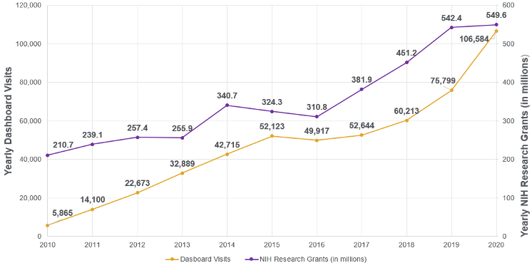
Figure 2. This graph shows the ten-year correlation of increased Tableau dashboard adoption tracking to increases in public funding.
This data-driven model helps to maintain alignment with NYU Langone's success overall, by staying focused on the larger mission while cultivating growth, accountability, and innovation in its research arm. “It's about culture change, essentially,” said Boughton. “Traditionally, academic funding has followed a more old-fashioned model. Now, we're using data to help clarify expectations for faculty—the people who actually generate research growth—and giving each of them visibility into where their individual performance stands relative to those expectations.”
Closing gaps in payor data-related communications
Population health management and payor network integration represents yet another area where finances, operations, clinical activity, and patient outcomes intersect over the thoughtful management and presentation of relevant data at NYU Langone. NYU Langone’s clinically integrated network, NYUPN, actively manages more than 500,000 lives through shared savings contracts with seven managed care plans including commercial, Medicare Advantage, and Medicaid product lines.
The task of managing the health of a population and associated financials is complex, given that the data takes many forms: claims data, patient rosters, contract and eligibility details for all patients in all plans, pharmacy files, and quality files that reference potential and actual gaps in care. Differing file formats, data schemas, and naming conventions for each payor add further complexity, as does the reality of different payors providing information on different cadences at different times of each month.
In the past, manual juggling of all this data made for chaotic, often unproductive, payor operations. To address the need for clarity, and to put the health system in a proactive stance for addressing communications and performance, NYU Langone embarked on a multi-year, in-depth strategic initiative focused on using payor data in better ways to make more informed decisions.
“The old way was not sustainable, especially considering we're always growing, we're engaging in new contracts with payors, plus taking on more patients and more providers—and so the complexity continued to grow,” said Carrie Rooke, Senior Director of Operations for Network Integration. “We needed a better way of linking things on the back end, and getting accurate, workable data in front of us every day. That's where the IT and business teams really came to the table and said: How do we get this done?”
The solution was to devise better ways of aggregating and normalizing the multitude of data types and formats, and then build dashboards in Tableau that enable visual analytics to drive action. The project involved not only cleaning up the payor data, but also overlaying it with clinical data in Epic in order to drive insights on the level of individual patients. For example, if a patient recently had a mammogram, this fact would show up in the data immediately, and the system wouldn't trigger an unnecessary reminder to reach out about the test being due.
This level of data integration at both the software interface and human interface levels generates new kinds of efficiency for Rooke's team when conducting outreach activities across the payor and clinical networks. Tableau dashboards produce accurate summary views and action lists based on timely, paid services patients might need. Precision in the data roll-ups that enable drill-down capability into details help the staff hit strategic targets and track both patient and in-house communications such that no cases get missed. Having data and insights readily at hand also confers greater authority on NYU Langone as an organization, positioning them to hold payors accountable for errors or omissions in the data they provide, as well as to pursue more relevant conversations with the patients themselves.
Rooke cited a few recent examples. “In 2020, we identified a massive data gap with one of our payors, and because we were organized on our side and could visually present our data, we were able to make them clearly accountable for correcting the situation,” she said. “On the flip side, we recently attracted the attention of executives at one of our health plans based on how we use Tableau, and that has generated a lot of excitement about new use cases that we can all apply to achieve even greater levels of collaboration and measurable improvement.”
We needed a better way of linking things on the back end, and getting accurate, workable data in front of us every day. That's where the IT and business teams really came to the table and said: How do we get this done?
The ability to drive changes in the quality of payor-side data structures while continuing to improve payor operations internally has put NYU Langone on the path of getting to the new levels of efficiency and effective operations they seek. Feedback loops, data-driven conversations, increased precision, and the chance to innovate better outcomes using data analysis have all helped to transform the health system's culture into an environment where every person uses data to improve outcomes while constantly becoming better at what they do.
Adopting and governing a data culture for the future of healthcare
To the leaders we've met here, the future looks bright as NYU Langone continues the journey of scaling its analytics, improving quality and ratings, and sustaining a fully data-driven culture. Progress in areas like quality management, finance, research, and payor relations shows how democratic, curated data analysis offers new levels of efficiency and productivity for the health system by enabling insights that drive smarter decisions and help identify new opportunities for improvement and growth. As ranked across 16 specialties and ten procedures and conditions by the U.S. News Best Hospitals Honor Roll, NYU Langone has been in the top ten hospitals in the country for the past three years. NYU Grossman School of Medicine is now ranked as #2 medical school in the United States, up from #34 in 2007.
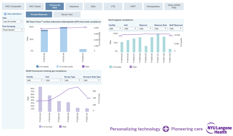
Figure 3. Several dashboards use data from across the health system to identify opportunities for improvements.
To help drive the infrastructure of this change, Shein's data and analytics teams have carefully focused on the governance factors that contribute to this success, including the clear definition and ownership of data metrics and the ongoing management of centralized data systems that propagate these metrics to downstream tools throughout the organization. The governance bodies Shein has helped to spearhead ensure that every metric in every Tableau dashboard has a single, published definition, with a business owner and technical owner clearly attached and accountable for maintaining the metric's calculations, as well as answering questions about its use.
In other words, there's more to changing the culture than simply making vast amounts of data available to users. Unless they consistently recognize, trust, and understand the data they see, people won't buy into the changes. NYU Langone has remained aware of this fact throughout their journey, and made it a priority to always seek buy-in from the executives, clinicians, and other staff that use their Tableau dashboards and other tools.
“The easy part has always been just putting the data out there,” said Chatfield, the finance executive. “The bigger challenge is getting people to understand the data and use it to achieve what they want to achieve. Creating Tableau dashboards and making them easily accessible and relevant to all users has been crucial for changing NYU Langone into a more data-driven culture.”
Rooke's focus on payor network integration leads her to be optimistic about the future applications of Tableau and other related technologies. “Predictive capabilities are a huge area we have yet to fully explore,” she said. “Our next wave of innovation is likely to be focused on applying more predictive logic across a larger scope of patients, so we can conduct outreach that connects with patients in the right way at the right point in time. When it comes to that kind of predictive analytics, we've only touched the surface of what we can do.”
Cho, the quality executive, agrees. “The best way to change behavior is to show data that illustrates where the issues are, and where we have opportunities to improve. The next mountain we have to climb is finding ways to make these opportunities more predictive in nature, so we can use data analytics and visualizations to keep us charging ahead and becoming the highest-performing, highest quality health care organization we can possibly be.”