From a Dashboard Zoo to Census: Understanding Dashboard Design at Scale


Dashboards sit at the intersection of analysis and communication—they’re used for monitoring, exploration, and storytelling. When it comes to understanding dashboard designs, much of the work has focused on using hand-picked examples (“a zoo”) of well-crafted dashboards to explore “what makes a great dashboard” or “best practices for layout.” This limits what we learn about typical dashboard design practices, however. What if we step back and ask: what do real-world dashboards actually look like, how are they composed, and what design patterns are people using in practice?
Analyzing dashboard designs in the wild helps us gain a richer view of how people actually build them and how we can design tools and guidance to better support dashboard authors. To this end, at Tableau Research, we took a “distant reading” approach, analyzing a collection of 25,620 Tableau Public dashboards quantitatively and at scale to uncover broad patterns, rather than closely examining a few examples in detail, forming what we call a dashboard design census.
Deriving a dashboard census
To create this census of dashboard design patterns, we developed a graph-based representation that decomposes each dashboard into blocks (content elements like charts, text, filters, legends, or images) and connections content elements like charts, text, filters, legends, or images). This enables a consistent, scalable description of dashboard composition and interactivity.
Using this representation, we analyzed the 25,620 dashboards to i) characterize the types and proportions of blocks used, ii) explore patterns of interactivity between them, and iii) identify high-level design clusters across the corpus.
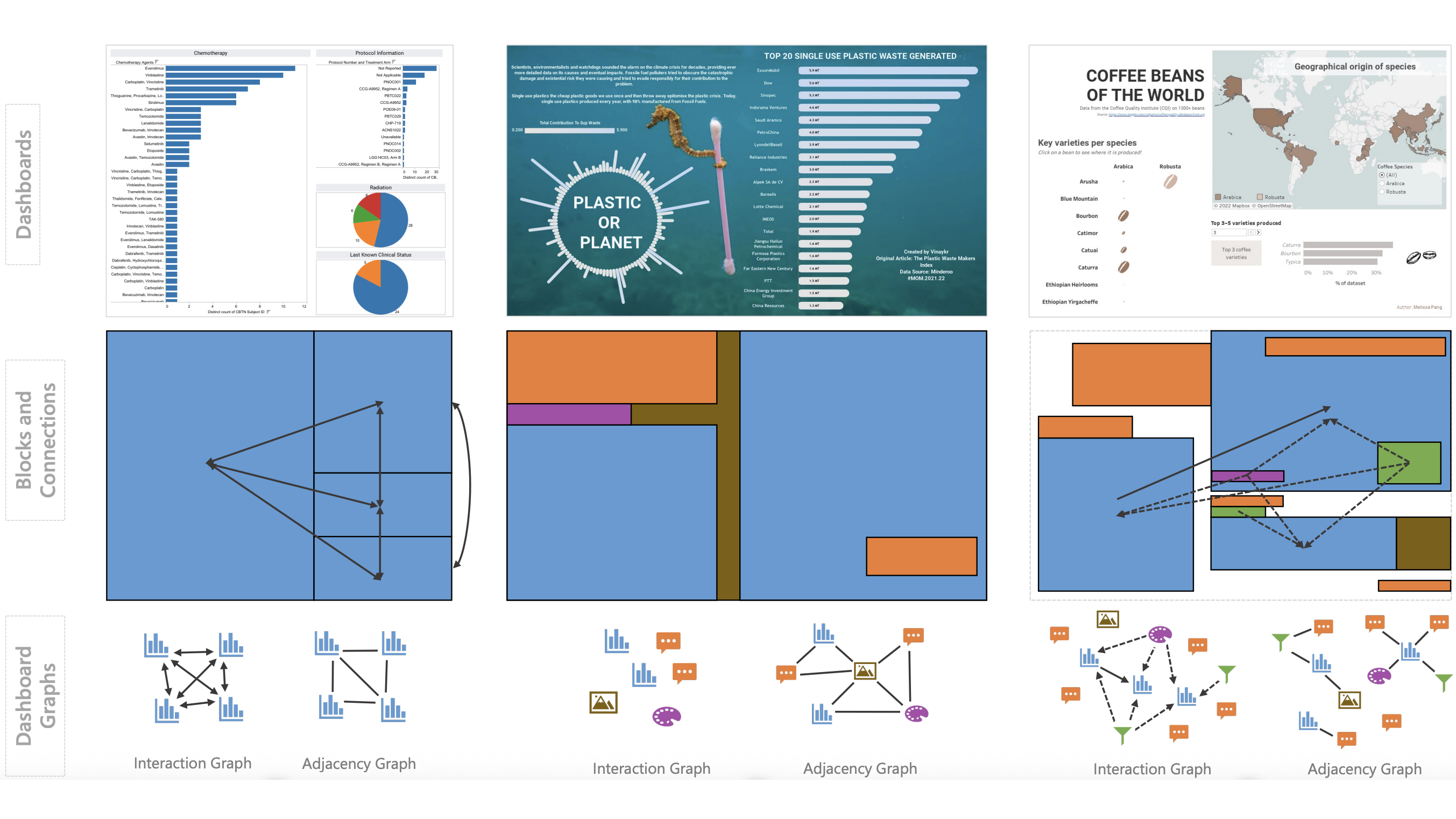
Examples of blocks and connections extracted from Tableau dashboards (source dashboards: 1, 2, 3)
Key findings and implications for dashboard authors
The findings highlight several patterns that are useful to consider when designing dashboards.
1. Text matters more than you might think
After charts (which made up almost 50% of all blocks), text blocks were the second-most common, accounting for about 21%. Together, charts and text comprised over 70% of dashboard content, underscoring that text is central and not supplementary to dashboard design.
Implication: Treat text as a first-class design element. Beyond titles or captions, text plays an important role in framing, labeling, and storytelling. Additional recommendations on designing text for dashboards can be found here.
2. Simple chart types dominate
Bar charts appeared in 60% of dashboards, followed by line charts (25%) and maps (25%). Bespoke charts like Sankey diagrams or waterfall charts only appeared in 116 dashboards, making up less than 0.5% of the corpus.
Implication: Familiarity and simplicity are key. Before opting for complex visualizations, consider whether a clear bar or line chart paired with strong annotations can do the job better.
3. Interactivity is common, but often spatially decoupled
About 75% of dashboards were interactive, featuring one or more connections between blocks. The most frequent were widget-to-chart filters (69%), chart-to-chart crossfiltering (46%), and legend-to-chart filtering (43%). Yet, only 30% of interactive links occurred between blocks that were spatially adjacent.
Implication: Place interactive controls (e.g., filters, legends) thoughtfully. If controls aren’t near the charts they affect, make their relationships visually clear through color, labeling, or explanatory text.
4. Dashboards cluster into three broad design archetypes
While not an exhaustive list, a clustering analysis revealed three high-level design clusters among the dashboards: analytic, magazine, and infographic. Analytic-style dashboards were the most common design pattern and composed predominantly of charts, widgets, and terse text blocks. Magazine-style dashboards were generally static and made more prominent use of text to provide commentary around chart blocks. Finally, infographic-style dashboards were fewer in count but typically contained a rich mix of block types, including at least one multimedia (e.g., image, embedded web page) and text block.
Implications: These archetypes suggest recognizable design “genres” that authors can reference or build upon, depending on their communicative goals.
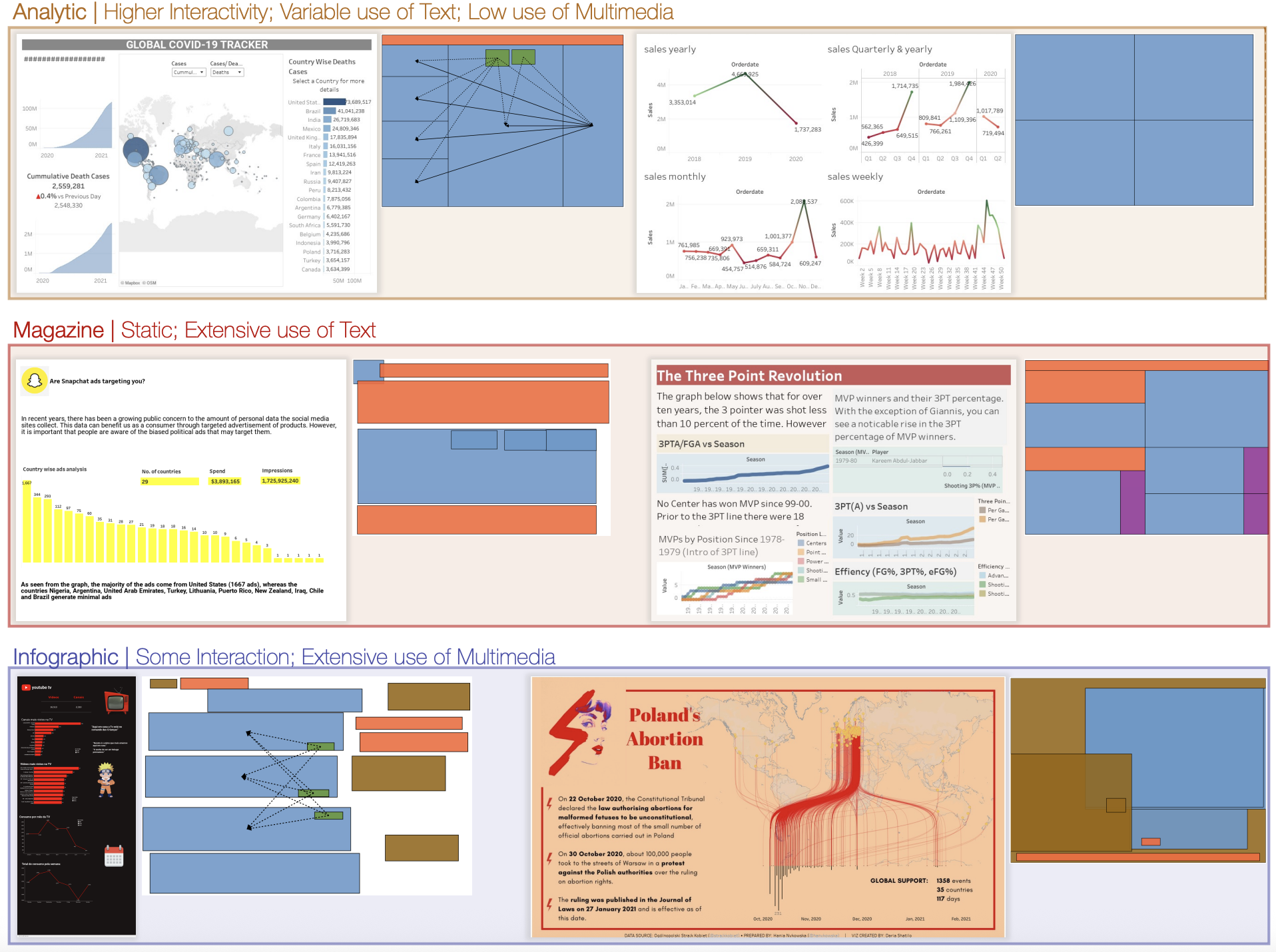
Examples in different clusters of Analytic dashboards (sources: 1, 2), Magazine-style dashboards (sources: 1, 2), and Infographic-style dashboards (sources: 1, 2).
Implications for dashboard authoring tools
The findings from our analysis and the underlying dataset also highlights considerations and presents opportunities for dashboard tool design.
1. Elevate text to a first-class element
Given how prevalent text blocks are, dashboard authoring tools should provide richer text authoring, layout, and interaction capabilities.
2. Supporting intelligent dashboard recommendation and reuse
Using block-and-connection graphs, tools can suggest similar dashboards and recommend layouts and interactions based on common design patterns.
3. Meeting users where they are
The popularity of familiar chart types and interaction patterns in our corpus reinforces that simplicity is key for most authors as it helps make their dashboards more accessible to end users. Before expanding into more chart types or automation features, it is valuable for tools to make it easier for authors to configure and format dashboards with basic elements.
This post summarizes the research paper “From Dashboard Zoo to Census: A Case Study with Tableau Public,” co-authored by Joanna Purich from the University of Maryland, Leilani Battle from the University of Washington, and current and former members of Tableau Research including Arjun Srinivasan, Michael Correll, Vidya Setlur, and Anamaria Crisan. The paper was presented at the IEEE VIS 2025 conference held in Vienna, Austria from 2–7 November 2025.
The dataset used for the research paper is made available at: https://osf.io/r5cfk/files/osfstorage to promote further research and development.
To learn more about the Tableau Research team and other research projects, visit research.tableau.com.
Articles sur des sujets connexes
Once Again, with Style: Understanding and Supporting Partial Reuse in Dashboard Authoring
 juin 5, 2026
From ‘Here’ to ‘There’: Exploring Proximity Semantics in Multimodal Data Exploration
 juin 3, 2026

Which Model Speaks Your Data Language? A User-Centered Approach to Evaluating LLMs for Conversational Visual Analytics
 avril 14, 2026