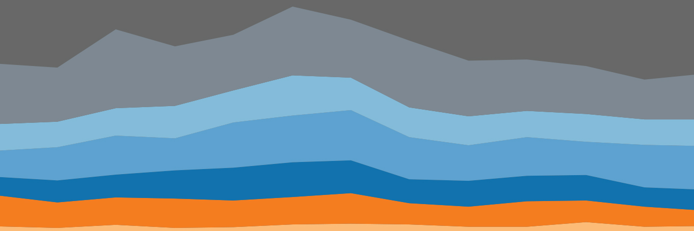
Which chart or graph is right for you?
Free white paper
Explore thirteen different types of visualisations and learn when to use them.
You’ve got data and you’ve got questions. But which chart or graph helps you maximise insights?
Use this quick guide to learn how to start creating the best type of chart for your data and questions. You’ll quickly find that you’re not only answering your initial questions, but you're also asking more questions and telling amazing stories with your data.
The charts and graphs described in the paper include:
- Line and pie charts
- Heat maps and geographical maps
- Scatter plots, Gantt and bubble charts
- Histograms and highlight tables
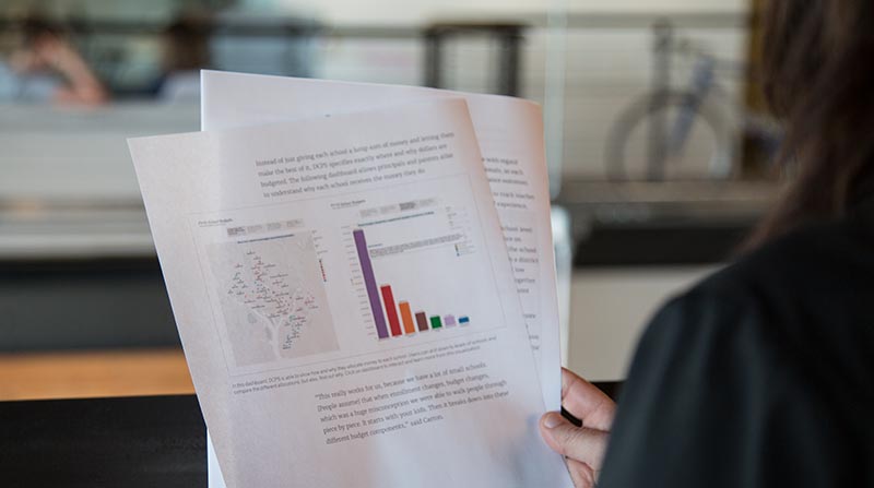
A well-crafted, thoughtful visualisation makes the light bulb go on. You just don't get that with a spreadsheet.
Tableau is trusted by: