Whether you’re a massive non-profit that depends on major gifts or a small organization where no gift is too small, being smarter with data can make a difference. Tableau can help you find insights in your donor data and set your entire organization up to achieve great things.
Solutions
Non-profit fundraising
Cultivating and stewarding donors
The relationship between a nonprofit and donors shouldn’t be taken for granted: it’s a complex, emotional relationship that needs upkeep and support. However, diving deeply into data on donor behavior can make it clear how supporters are interacting with your organization: Which newsletters did they open? Which posts did they respond to? When did they tend to give, and in what amount? All this data can be used to help keep the donor engaged and happy.
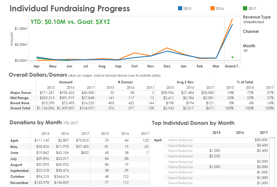
At Grameen Foundation, the development team uses several retention dashboards to track donors. Whether directors and board members want to look at major gifts, mid-range gifts, or annual giving, the dashboards allow for a quick look at individual transactions. The dashboard can aggregate a wide range of donor information—with the click of a button—to help keep donor retention at desirable levels.
And the value is far more than just thinking about managing individual relationships. The data helps development teams communicate is also helpful internally, when program teams and fundraising teams may disagree. Hayley Mickelson, head of Business Intelligence at Grameen, says that having such a clear presentation of data gets everyone on the same page: “There’s no arguing at that point, because you see the facts.”
The quantity and the quality of donor data we’re able to turn out has increased significantly. I set it up once and now I can look at the retention rate for any segment.
Getting the most from your events
From black tie galas to pancake breakfasts, non-profits are critical for funding important work.They’re also costly in terms of time, money, and effort. Better analytics allow organizations to delve into the various data on events past and present—with an eye toward more efficient events in the future.
The Pike Place Market Foundation (PPMF) underwrites several food banks, pre-schools, senior centers, and other community services around one of Seattle’s most iconic attractions.
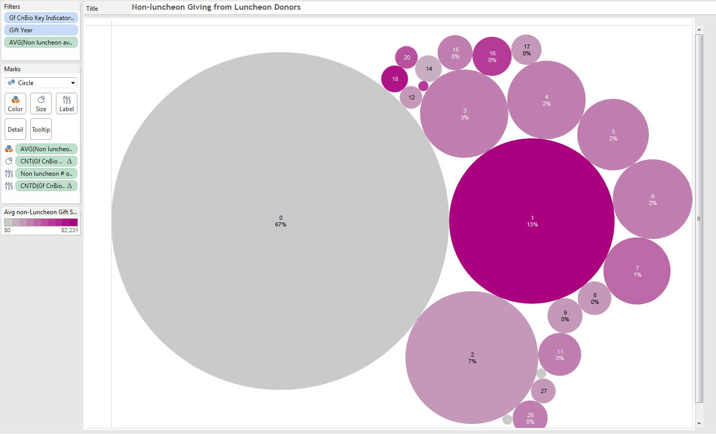
And as Donor Relations Coordinator Ali O’Neil described, Tableau visualizations help the organization plan its events--including its annual luncheon--smarter. One simple visualization allowed O’Neil to discover that 67% of luncheon donors never made another donation outside the luncheon—and 13% only made one additional donation. That’s very little traction for 80% of attendees of a luncheon that is costly to put on and is the only event to take place outside of the iconic market. Based on this information, PPMF decided to end its annual luncheon and re-direct its time and efforts to smaller events that create more lasting relationships.
Maximizing year-end giving
It’s an understatement to say the end of the year is crucial for nonprofits: this is when 20-50% of revenue is typically raised. Using data on previous years, individual donors, past events, and more, organizations can paint a clearer picture of how to make the holidays as successful as they should be.
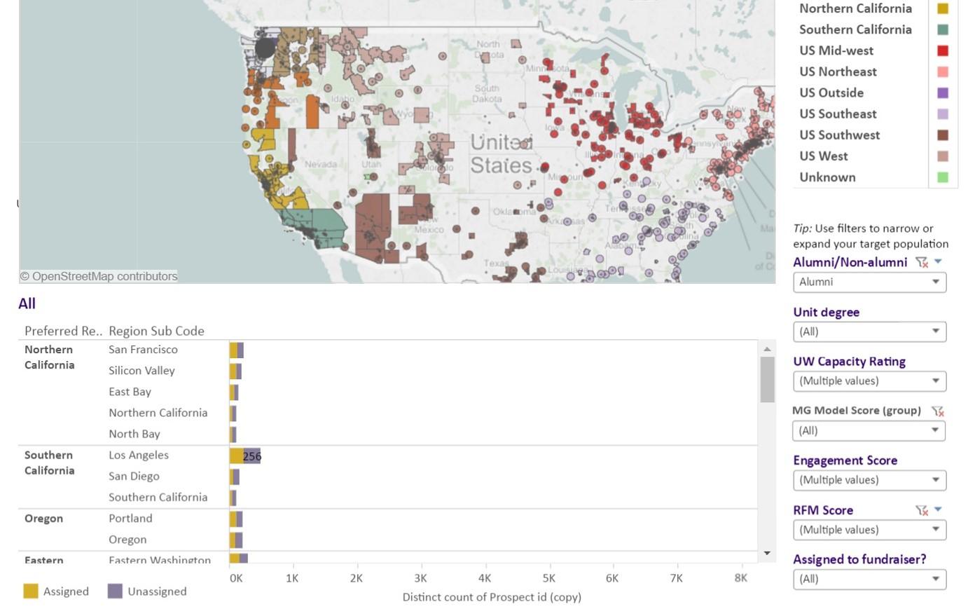
At the University of Washington, the Purple People pyramid is a useful way for the fundraising team to segment donors and calculate the potential of a gift minus the staff time to obtain it.
The visualization allows fundraisers to see which donors have the most promise based on factors such as zip code, gender, income, and other factors. It’s easy to dive in and see who’s an alumnus or who has children at the institution, and what they’ve given in the past. This kind of segmentation is particularly invaluable during the high-pressure end of the year. It’s easier to hit a difficult target when you can see the target clearly.