Vizzing Euro2016: Highlights from the Tableau Community


Over the last five weeks, 24 national teams competed in the Euro 2016 tournament. To our delight, many football (soccer) fans also took the time to explore the data. We've gathered your vizzes on the tournament, the participating teams, and the players in this gallery.
As player-captain-coach Ronaldo and his Portuguese colleagues bask in glory of their triumph, let's look at some of these vizzes by you, our talented community. Not surprisingly, the majority of these are by European authors. But we did come across vizzes by American, Peruvian, and Australian authors as well.
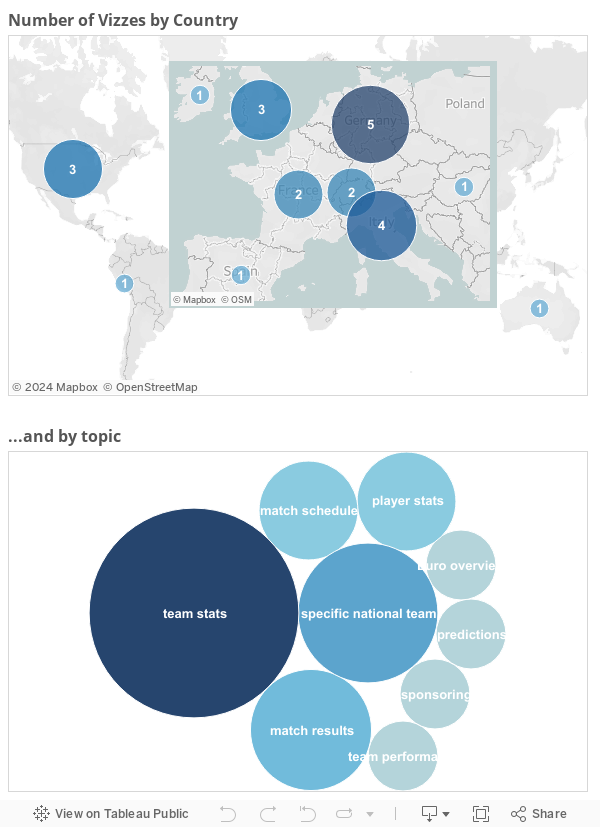
While the Geman “Mannschaft” went out in the semi-final against hosts “Les Bleus,” Germany tops our list of vizzes followed by Italy and the UK. (Full disclosure: The author of this blog post and curator of the aforementioned list is from the country that is the current football world champion, so we can’t guarantee that we were completely neutral when putting together this list. In fact, he even managed to sneak one of his own vizzes into it.)
More interesting perhaps is the subject of the vizzes themselves. This month is Sports Month on the Tableau Public blog—a great time to explore various ways to analyze data for major sports tournaments.
Comparing Various Teams
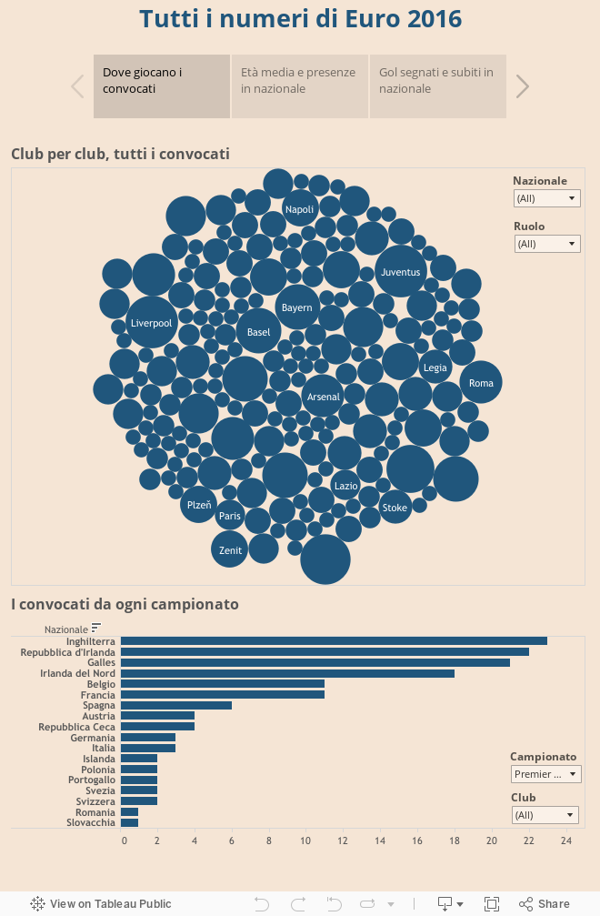
The majority of vizzes in our gallery explored the stats of the different teams and players going into Euro2016. Nowadays, even before the start of a tournament, you can find a wealth of data on the teams and players on the official website (e.g. the UEFA website) as well as on Wikipedia, GitHub, or Digg. Data sets like these allow people to answer questions like: Which is the youngest team, and which the most experienced? In which leagues do these players earn their money during the rest of the year? How tall and heavy are the players?
The advantage of working with these kind of player stats is that we have enough time to prepare the vizzes ahead of the tournament (although we have to be careful to update the data when injured players are replaced on short notice).
Here's an example from this category:
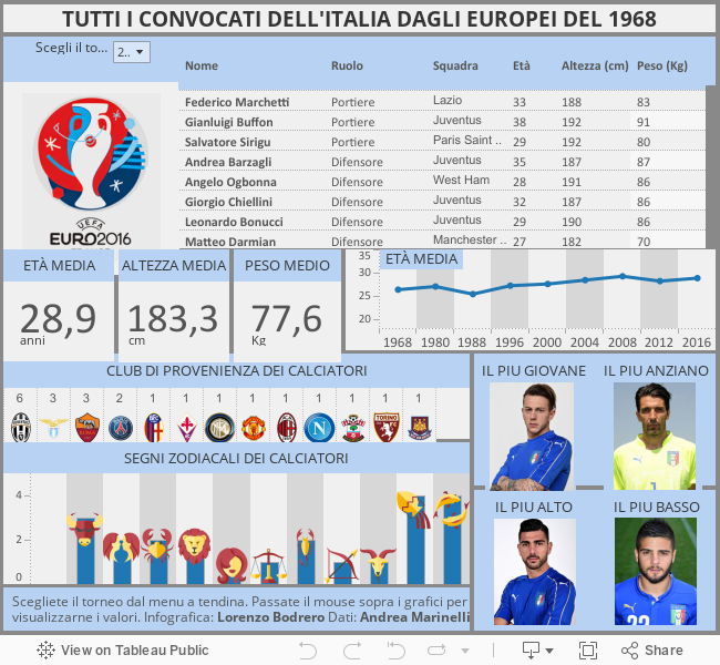
Exploring One Team
Instead of player stats, some authors focused on a particular team, presumably their home team. These vizzes compare current players to former players of the same team. That makes sense, because if you focus only on one team, you no longer have any reference points to which you can compare your team. As I've said elsewhere, data visualizations can bring out (or allow users to discover) meaningful comparisons between different entities.
Check out this example:
Tracking Match Results
The third biggest group of vizzes explored match results during or after the tournament. This is a little more difficult to do as you'll have to keep updating the data set after each match.
Another challenge can be the structure of the data set for this type of analysis. UEFA typically provides tables with each row showing the data for one match, with the stats for the home and away teams in separate columns. If, as is often the case, you want the unit of analysis to be the teams (irrespective of whether they are the home or away team), you need to pivot the data so that the stats are all in one column.
Here’s an example of this third type of viz:
These are just three popular types of sports vizzes. With an abundance of sports data available nowadays, there are many other things that one can look at, from fan sentiment on Twitter to the economics of player transfers and everything in between.
Stay tuned for more sports fun on the blog this month. And share your own vizzes in the comments below. If you're vizzing the Olympics, share your work with us on Twitter @tableaupublic using the hashtag #OlympicsViz.
เรื่องราวที่เกี่ยวข้อง

Iron Viz 2026: Read Between the Data
 May 28, 2026

Tableau's Iron Viz Winners

Explore the 2026 Iron Viz Entries
 ธันวาคม 15, 2025