Using Tableau to help the natural world


Jonni Walker, a 2017 Tableau Ambassador and frequent collaborator in the Tableau Community, shares his thoughts about using Tableau to drive positive change in the natural environment.
When I saw the latest Iron Viz Feeder theme pop up on my Twitter feed I was thrilled as it’s a topic that’s very close to my heart. Most people know me because of my Tableau Public work on animals, birds and the natural environment – the nature of our world is something I find both fascinating and stunningly inspiring.
However, so much of it is currently under threat that I always hope that through my visualisations I can create something that is not only visually attractive and informative, but may also catch people’s attention and encourage them to help protect the vulnerable inhabitants of our planet.
When I create a Tableau Public visualisation I hope that it can make an impact, inform or inspire; isn't that point of what we do as “visualisers”? However, it’s very difficult to tell if it has actually made a difference which can be disheartening but as a very wise man once told me: “If one person learns something from your visualisation then it has achieved its goal” - Dr. Alberto Cairo (many congratulations by the way!).
I find animals and nature amazing. I find the impact that humans have had, and are continuing to inflict on the natural environment, amazingly devastating. I also find the efforts that humans are going through to reverse our effect on species, like the Kākāpō, amazing and inspirational.
This is highlighted in a recent visualisation I have worked on in collaboration with the brilliant Rody Zakovich and Chris DeMartini who are both Zen Masters for a reason! This visualization could not have been achieved without their talents so thank you both for donating your own time to this project.
The bird behind the viz
The Kākāpō is a flightless, nocturnal parrot found only in New Zealand. I couldn't believe it when I read that they were individually named? How is that even possible? A whole species? Sadly, it’s because less than 160 remain and an incredible conservation effort is being made to preserve this fascinating species.
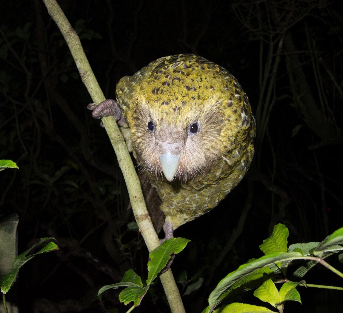
I found a list of Kākāpō through a link on the internet, name, gender, date hatched etc and I thought this could be amazing displayed in a visualisation. This is where the genius of Rody,Chris and Tableau came in! A family tree and a population pyramid of the population of a whole species? Just think about that!, It’s a terrible shame it’s even possible and let’s hope that one day so many of these wonderful birds exist that they don't need to be individually named. And the population pyramid shows that the species, with the help of the Kākāpō Recovery, has a brighter future ahead of it.
Why Tableau?
Tableau’s purposefully open architecture, its ease of connecting to data, its analytical might, its ability to quickly gain insight and its ability to present information in a way I want it to, makes data easy to understand and visually impactful and gave us the ability to create the visualization below.
So how can Tableau and visualization make a difference and have an impact?
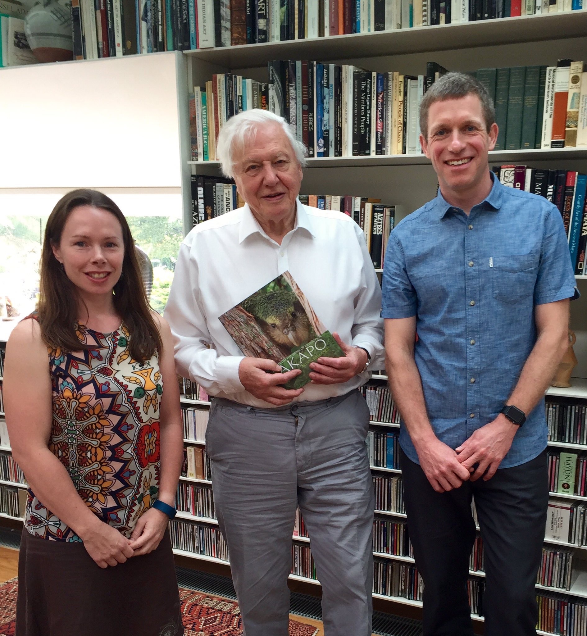
Enter Dr Andrew Digby and the team at the Kākāpō Recovery. Andrew, seen on the right of this photo with Kākāpō Recovery manager Deidre Vercoe and the living legend that is Sir David Attenborough, is a former astronomer and ecologist whose work focusses on researching and conserving New Zealand's endangered endemic birds. Deidre, Andrew and team concentrate on the conservation of two endangered birds: the Kākāpō and the Tākāhē (a future Tableau visualisation will focus on the Tākāhē).
After publishing the Kākāpō visualisation, it caught Andrew’s attention through the powers of the Twitter network and I’ve have now had the wonderful opportunity of communicating with him directly about his team’s work and the data behind the visualisation. Team Technical Advisor Daryl Eason has provided further data to refine the visualization. They are the experts on the ground and their knowledge is invaluable.
How can Tableau help a charity like the Kākāpō Recovery?
As a result of the visualisation we created, Andrew has told me he has started to use Tableau to help the organisation easily and quickly gain insight to help with their efforts to conserve the Kākāpō and the Tākāhē:
Making a kākāpō pedigree visualization has been on my ‘to do’ list for a while, so I was delighted to see that Jonni, Rody and Chris had made one – just using public data! I’m a strong believer that effective data visualisation is an essential science communication tool, but too often scientists don’t think it’s important, or use tools that make good visualisation difficult to achieve. Tableau makes the process enjoyably simple, and I’m excited to be now using it to display a wide range of kākāpō and takahē data. The ability to quickly explore our data visually is vital to ensuring that our conservation management of these endangered species is as effective as it can be. Experts like Jonni, Rody and Chris play a key role in showing scientists in other fields what can be done, and in communicating our work to the public.
To find out more about the amazing work the Kākāpō Recovery team do, and support their work, please visit the link below;
Please follow Andrew on twitter and Kākāpō Recovery on their Facebook page.
Making a difference
The opportunity to donate one’s own time to help raise awareness about the work that the Kākāpō team does is our pleasure and I know we will continue to aide in any way we can using Tableau. I personally feel very proud that through the Kakapo visualization, we’ve not only helped raise the awareness of the Kakapo and its plight, but also introduced a new team to a fantastic piece of software that they can now go on to use themselves in their vital work to protect the fragile future of these wonderful birds.
Whether your Tableau visualisation directly makes a difference may be difficult to ascertain, but, it might, just might, directly or indirectly make an impact, so carry on producing visualisations and sharing them via your networks - you never know who is watching and what may become of it!
The Iron Viz feeder has seen some amazing visualisations created and shows how very talented the Tableau community are! Best of luck everyone.
Jonni
*With extra special thanks to Nigel Hawtin, another Tableau user and a data visualisation inspiration to me. Check out his blog and I’m sure you will understand why!
เรื่องราวที่เกี่ยวข้อง

Iron Viz 2026: Read Between the Data
 May 28, 2026

Tableau's Iron Viz Winners

Explore the 2026 Iron Viz Entries
 ธันวาคม 15, 2025