SurveyMonkey and Tableau team up to track public opinion data on COVID-19 vaccines and more


Now that nearly half of the US adult population has received at least one dose of COVID-19 vaccine, the next question on everyone’s mind is: what about children? The Pfizer vaccine has been approved for use in children ages 12-15, and clinical trials are underway to test its efficacy and safety for younger kids. But a key component of rolling out COVID-19 vaccines to children is the opinion of their parents.
A new Tableau dashboard featuring data from a poll conducted by SurveyMonkey and Outbreaks Near Me, an initiative of Boston Children’s Hospital, captures parents’ opinions—and how they are changing over time. The dashboard shows the willingness of parents to have their children of different age groups vaccinated. The data can be filtered by a number of different demographic factors for parents, from their vaccination status to race to political party affiliation. The dashboard also captures sentiment around where parents would be willing to get their kids vaccinated—from whether at pharmacies, retail centers, or mobile vaccination sites, etc.—to provide another layer of useful information as decision-makers continue to strategize around vaccine access.
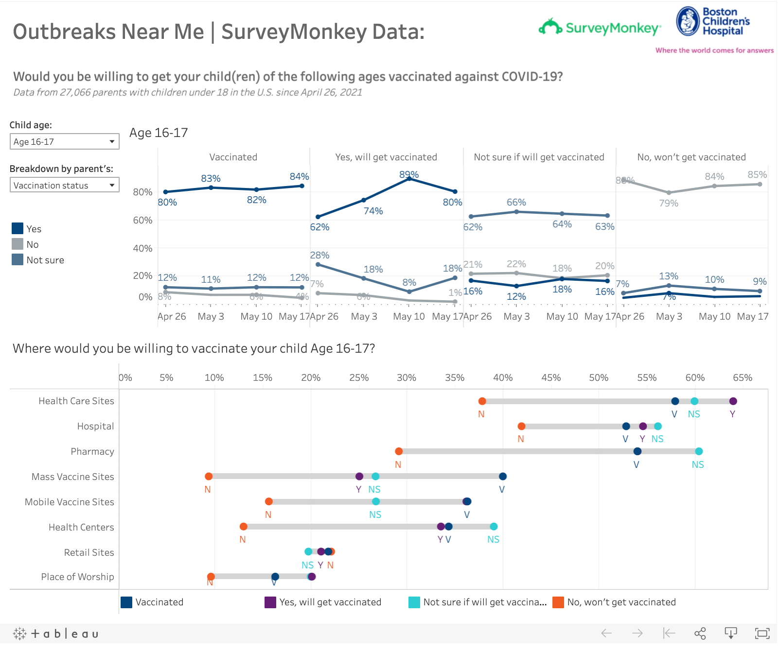
This Tableau dashboard featuring SurveyMonkey and Outbreaks Near Me poll data shows the willingness of US parents to have their children vaccinated, how these opinions are shifting, and where they’d be willing to vaccinate their children.
This dashboard is part of a larger effort by Tableau and SurveyMonkey to gather and visualize public opinion data on of-the-moment issues in the US. Last fall, we partnered on a series of dashboards revealing public sentiment on different aspects of the US election, including voters’ concerns about the pandemic. While the 2020 election is over, the need for broad, in-depth public opinion data is not.
“It’s so important to keep a continuous pulse on public opinion as the research on vaccines and people’s behaviors are changing pretty quickly,” says Laura Wronksi, research science manager at SurveyMonkey. “We want to give people the tools to understand changing opinions. That’s useful for the general public to see, and it’s also really important for people who are in decision-making positions around the pandemic. They want to have a good understanding of how everybody is thinking about these issues.”
We want to give people the tools to understand changing opinions. That’s useful for the general public to see, and it’s also really important for people who are in decision-making positions around the pandemic. They want to have a good understanding of how everybody is thinking about these issues.
It’s notable, Wronski says, that the data in the dashboard shows a difference of opinion between April 26, 2021—when SurveyMonkey first collected the data—and the following week. “There’s an increasing number of parents who say they will get their kids vaccinated, and an increasing number of parents who say they are not sure, but there’s been a decrease in parents who say no, they will not get their kids vaccinated.” This rate of change over a short period of time shows how rapidly opinions can shift, and provides a way, Wronski says, for people to understand their own opinions in context.
As the pandemic and the vaccination efforts continue, and the research and guidance from officials continues to evolve, “it’s important to assess if the public opinion is shifting along with all these changes,” Wronski says. SurveyMonkey is looking to track and visualize data on opinions around mask wearing, for instance, as official guidance from the CDC and many states and local governments quickly change.
To learn more about the value of data visualization during the pandemic, visit the Tableau COVID-19 Data Resource Hub.
เรื่องราวที่เกี่ยวข้อง
From Kidney Donation to Tableau Dashboard
 ตุลาคม 25, 2022

Using data to drive conversations about climate change
 เมษายน 28, 2022