Roundup: The Best of Your #TableauMobileTips to Follow—and Break



Ever since we introduced device designer as part of Tableau Public 10, you’ve been sharing your #TableauMobileTips.
Many of you shared variations of the same few popular tips, so I thought I’d share them here alongside some fantastic examples. I’ll also share some examples of vizzes that ignore those very same tips to great effect. (It’s as Picasso once said: “Learn the rules like a pro, so you can break them like an artist.”)
Tip #1: Choose Readability over Interactivity
If you tend to create exploratory dashboards—those with lots of filters and parameters—you might have to shift your approach when thinking mobile-first. Dropdown menus aren’t the easiest to open and close, and hovering actions aren’t even possible on a phone. Mobile users will thank you for clean fonts and simple layouts, but they’ll cheer you for a well-told story that honors the phone’s capabilities.
Rody Zakovich created a fun dashboard to explore Matt Damon and Ben Affleck’s movies, but his mobile dashboard was even cleaner and simpler.
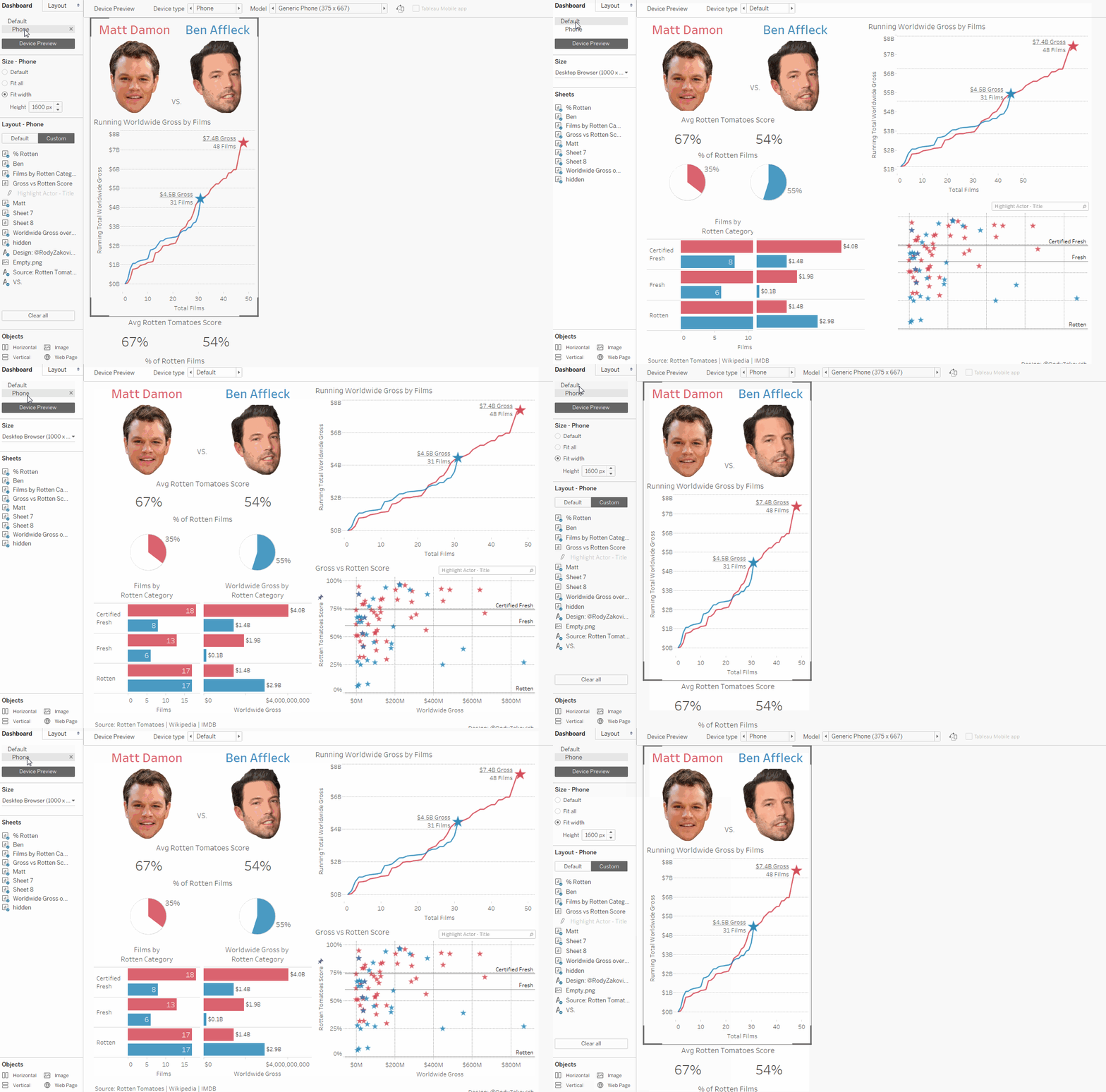
Don't forget to check Rody's viz on our phone to see the mobile design in action!
Of course, there are exceptions to every rule.
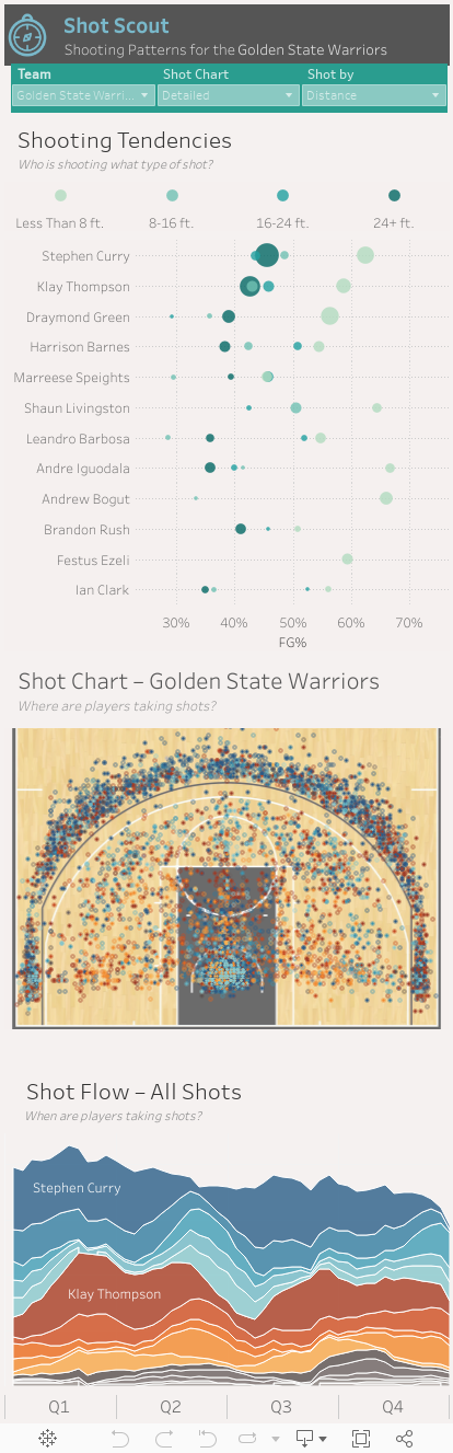
Luke Stanke’s NBA shot analysis is a fairly complex viz that renders beautifully on the phone—and includes interactions and not-so-simple charts. How did he pull this off? His filters are tidy and the options are limited. And they update all of the charts at once, instantly changing the story for the reader.
Tip #2: Avoid Maps
Many people shared this tip over the last two weeks, and for good reason. Maps take up a lot of real estate on very small screens, plus you can’t hover to see tooltips. Add that to the maddening behavior of scrolling down a page and getting stuck when you scroll over a map, and you know why people make this suggestion.
But maps are compelling. Rather than avoiding them completely, think about them carefully before you use them in a mobile viz. Design your map so that it makes sense with very little text to explain it.
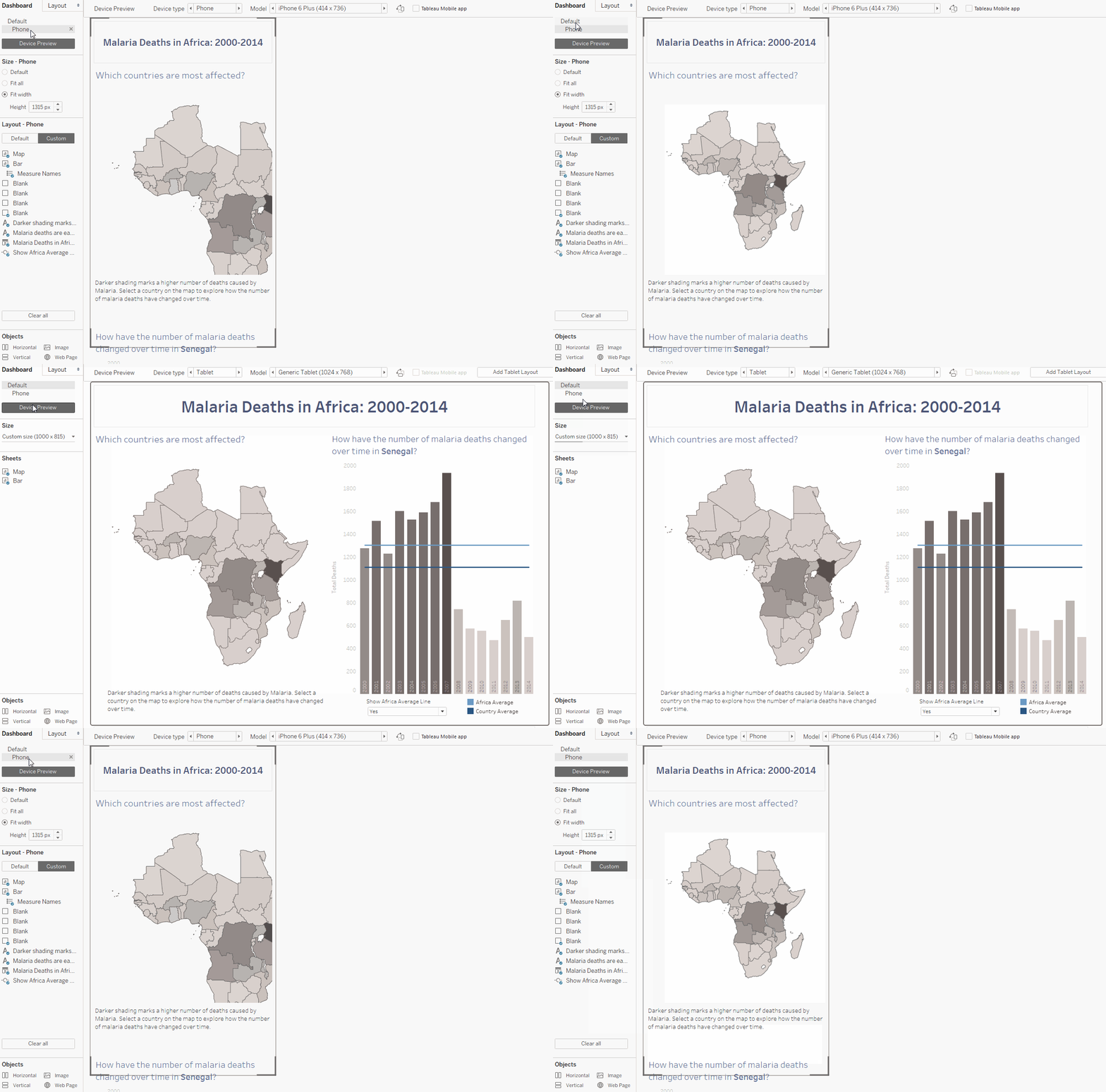
Naledi Hollbruegge created a dashboard to track malaria deaths in Africa. Its mobile version has one interaction: Tap on a country. Up pops the name of the country with a few statistics included in the tooltip. That’s it, and it works. Again, don't forget to open this viz on your phone to explore the mobile dashboard Naledi has created.
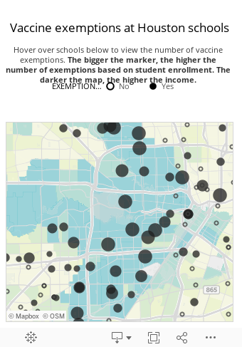
Rachael Gleason took another approach with her one-click interaction map. In this viz, she’s encoded crucial details as both size and filled-in circles. The reader already has more information before she taps a location on the map.
Tip #3: For Single-Chart Vizzes, Move the Filters and Legends Below the Chart
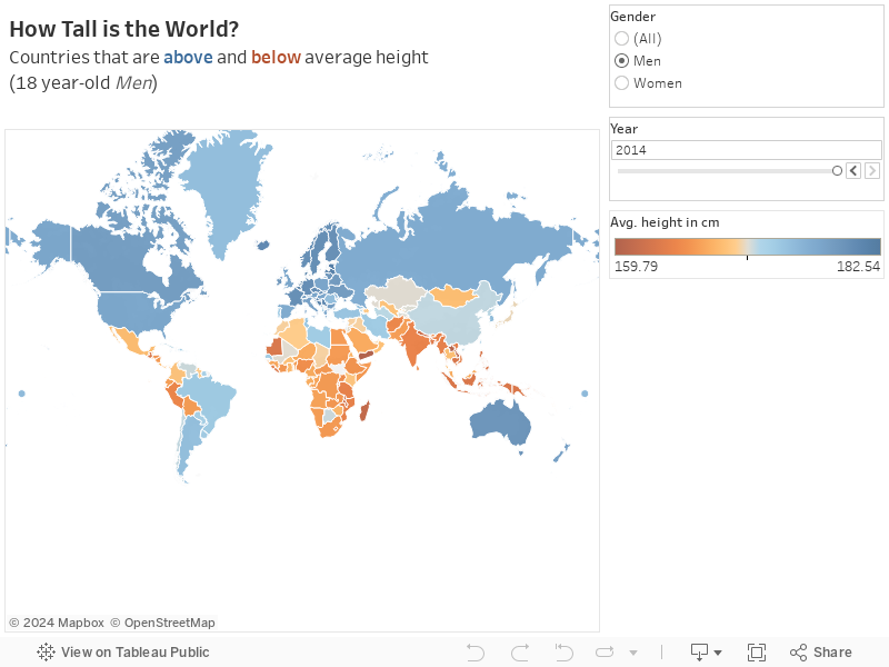
Tableau Public’s own Florian Ramseger shared this little trick for single-chart vizzes. By moving the filters and legends below the chart, you give the viz more room to render. Check the before and after vizzes on your phone to see how much the layout changes with this simple tip.
Before:
After:
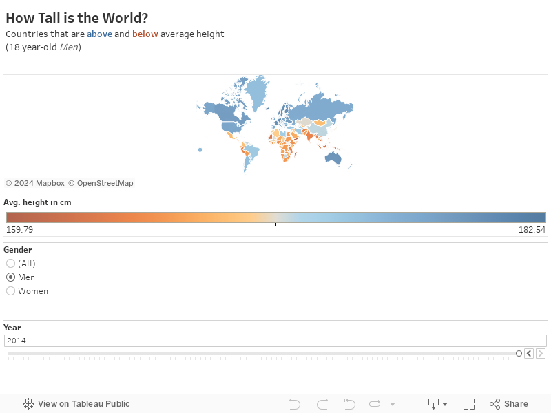
This is so useful, we haven’t seen anyone break this rule to great effect yet!
What rules are you following—or breaking—when making mobile vizzes? Is anything off-limits? Tweet your #TableauMobileTips to @tableaupublic to add to the conversation! You can also join the conversation on our Facebook page.
เรื่องราวที่เกี่ยวข้อง

Iron Viz 2026: Read Between the Data
 May 28, 2026

Tableau's Iron Viz Winners

Explore the 2026 Iron Viz Entries
 ธันวาคม 15, 2025