A data journey inspired by trees and hand-drawn maps


Taha Ebrahimi was born and raised in Seattle. After living in New York City for a decade, she’s back in her hometown. She started her career as a journalist, taught writing at a university, then started getting into marketing—now, Taha is the Director of Tableau Public.
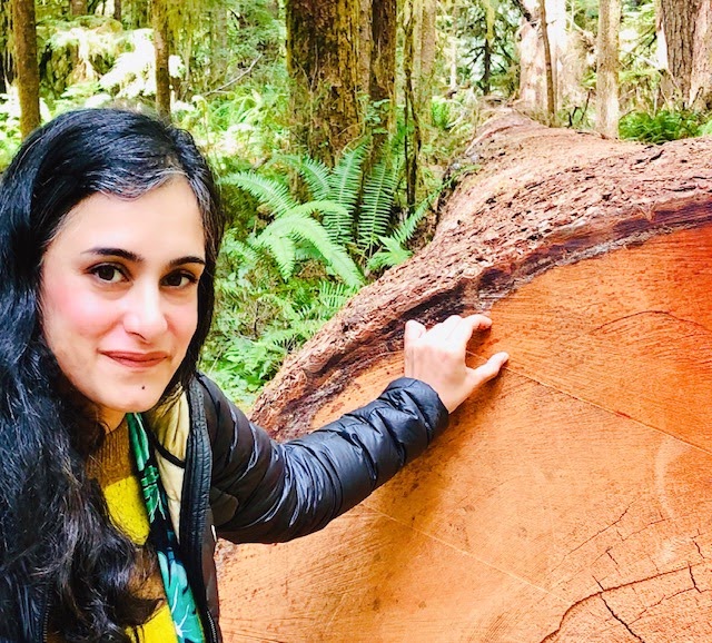
Taha standing next to a tree trunk. The section she's pointing out depicts 41 years!
Like many of us during the pandemic, Taha started spending a lot of time outside taking long walks around her neighborhood. These walks sparked some curiosity, and Taha got inspired to learn more about the different types of trees she encountered. This was the beginning of an incredible passion project which resulted in a series of hand-drawn neighborhood “tree maps” visualizing the data she was learning about.
The project evolved into Taha authoring a book published in 2024 called “Street Trees of Seattle: An Illustrated Walking Guide.” This book and Taha's recently-updated Street Trees of Seattle visualization are based on City of Seattle data about their right-of-way trees, dating back to 1950.
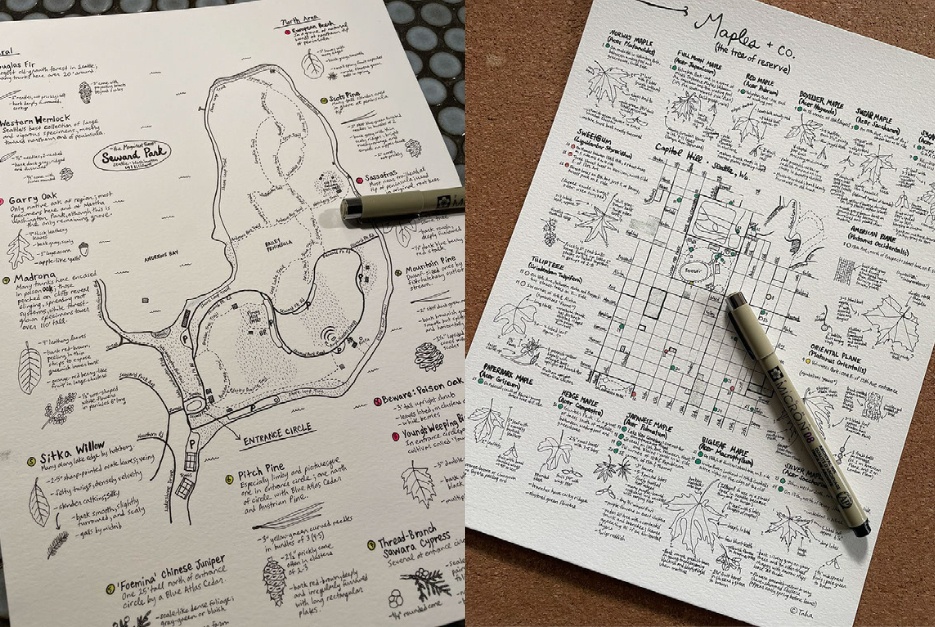
Taha's "tree-maps"
Read on to learn more about Taha’s process, outcomes, and learnings as she collected data by hand-drawing to explore the world of trees!
So let’s start from the beginning—what got you interested in learning more about trees and what attracted you to hand-drawing?
I’ve always felt a connection with trees and admired people who could point out trees by name, so when the pandemic started and I had some free time, I thought it was a perfect time to learn more. I’ve also always learned best visually, so organizing things by sketching them came intuitively at first. There’s something about drawing that makes me feel like I’m understanding and absorbing information more deeply. I find it useful for understanding things spatially—what is different and how things relate to each other. When I started this project, I didn’t know it was going to be a drawing project. I was only trying to learn more about how to identify trees.
Where did it go from there? What was the process like when you started to learn, understand, and visualize your data?
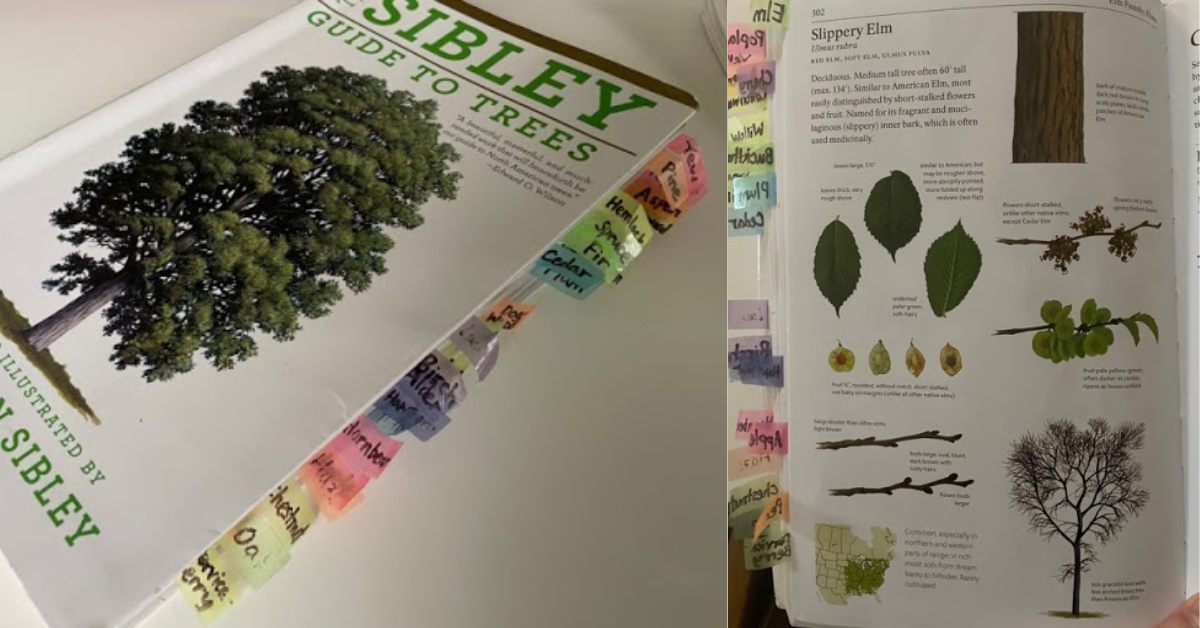
Sibley’s Guide to Trees by David Allen Sibley
I started out by buying a basic illustrated book about trees, Sibley’s Guide to Trees by David Allen Sibley. It has detailed color illustrations of tree species that include their leaves, bark, branches, fruit, and other characteristics. At first, I was trying to understand how to “bucket” the types of tree genus, so I started trying to draw a “key” to the leaf shapes. As it turns out though, trees don’t all follow consistent “rules” unfortunately. Different species of Oak trees, for example, have wildly different shaped leaves and there isn’t really a core “pattern” you can memorize about them. So the leaf key I drew was actually only minimally helpful at helping me identify trees in the real world.
It wasn’t enough to just have the illustration of the tree to find it in the field either. As a beginner, I needed some sort of confirmation that what I was identifying was correct and, because of the pandemic, I was doing this all alone and I couldn’t invite a tree expert for an in-person confirmation. This happens in real life also: with any data task, you have to find out what the data actually means before you can visualize it in any meaningful way, and sometimes you might even have to validate the data.
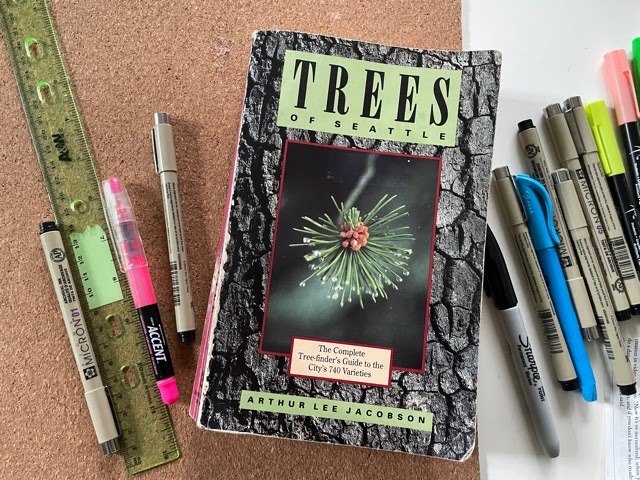
Trees of Seattle by Arthur Lee Jacobson
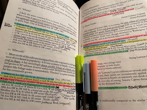
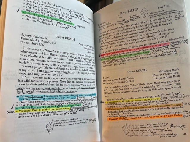
Luckily, I found this out-of-print book published in the 1980s called Trees of Seattle by Arthur Lee Jacobson that lists exact addresses and locations of different types of tree species in Seattle. Unfortunately, it had no illustrations though, but as long as I took both books with me—one with the illustrations and one with the addresses—I was now at least able to confirm that what I was seeing was actually the right tree. I could now physically go to a specific address and find the tree and check against a list of characteristics—like size of needles or types of cones—and actually confirm that what I was identifying was the right tree. I knew I was on the right track.
What roadblocks did you face, and how did you solve for them?
Copying drawings from the illustrated book, Sibley’s Guide to Trees, into the text-only book, Trees of Seattle
Data is rarely ever in the form that you want it to be in for a specific task. In my situation, in order to identify trees on my walks, I had to carry around two different books with me, plus I didn’t know the streets well, so I was constantly taking out my phone to check GoogleMaps--a third set of data. One of the next things I found myself doing was copying drawings from the illustrated book into the text-only book, essentially “joining” the data to create a single book I needed to carry around instead of two, but even that was hard to do while also juggling a phone. That’s when I got the idea to consolidate and join my data even more by drawing maps that included the locations of the trees and illustrations of the tree characteristics on a single page, helping me take the most efficient routes. The one single visualization helped me free myself to actually be able to recognize and “collect” the data instead of having to hold everything in working memory. Instead of finding and identifying just three trees per walk, I could now do ten trees.
You mention having to refer to three separate data sets—your two books on trees (one with Seattle addresses and one with illustrations) and GoogleMaps, how did this make you rethink the way you were visualizing your data?
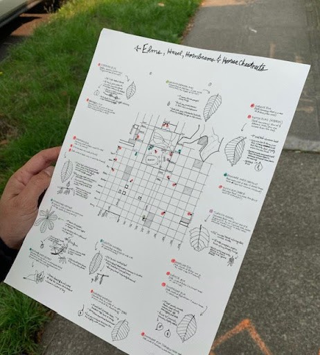
Consolidating data with the locations of the trees and illustrations of the tree characteristics on a single page
Out of sheer necessity, I was physically forced to think about the user experience and how the data could be combined, consolidated, and visually presented for easy access. One thing I learned quickly was that it was easier to limit my maps to a single tree species instead of trying to look at a bunch of different species at the same time. When you’re looking at essentially similar data (i.e. Elms), it’s easier to see the outliers and what might be unique. Limiting the scope of my visualization to just one tree genus helped me more easily compare the characteristics and relationships of each data point. I ended up drawing only the most important outlying identifying information.
After you started creating hand-drawn visualizations maps with the locations of the trees and illustrations of the tree characteristics on a single page—where did you go from there?
The next thing I found myself doing was “validating” the data by systematically surveying my neighborhood to see how many trees were still there from when the book was published. I put a check-mark next to trees that I found and I noted when a tree was no longer there. I’d say about 40% of the trees were gone, on average. After I was done validating addresses of a tree genus, I would only then create a clean “final” tree map. Every time I went into the field, I thought of new ways I could improve the visualization to make it easier for me to use in real life, so it was really an iterative process to get to the final visualization. I found that the act of hand-drawing forced me to have an inner dialogue with myself on how to more precisely capture characteristics for an actual user trying to find the tree. Revising the way the visualization was shaped was really an evolution of my own learning.
What part did Tableau Public play in this project?
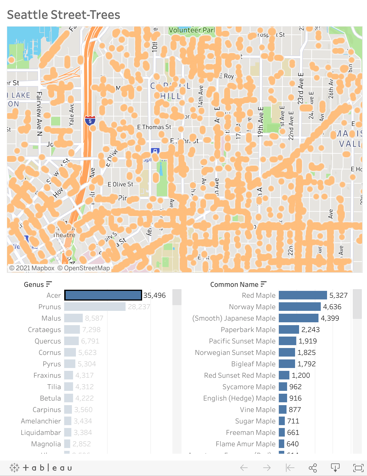
I recently found some data about city-owned street-trees in Seattle and I put it into Tableau to take a look and really had a new appreciation for how important it is to understand your data. I’m not sure I would have been able to create a meaningful visualization or that I would have been able to see the data insights in Tableau if I didn’t understand what the data meant first. We can sometimes forget that understanding our data is the unseen task behind designing a meaningful data visualization.
You can also use the search function on Tableau public to see what others have built on Tableau Public.
When looking back at this project, what are you most proud of?

Some of Taha's maps of trees
I now have a bunch of maps of trees of my neighborhood that I’m excited to take friends on once we’re all vaccinated. I’m really curious to see if other people can identify and learn about trees using my maps and what else I can tweak to make it easier.
What advice would you give someone who wants to potentially embark on a similar project to learn and visualize something new?
I think many people don’t fully understand that a final visualization is just the tip of an iceberg. There is so much work that goes into a visualization before you even get to that part of it--whether that’s collecting the data, validating or cleaning the data, understanding the data, or figuring out the most efficient way to visualize it. It should be a journey and there should be lots of messy edits. If you’re not iterating on the design, you’re not having the “conversation” you need to be having.
Lastly, I have a couple of quick fun questions! The first is, what are the best tools for hand drawing and organizing data?
Pigma Micron pens!!!! Specifically, the one with a “005” pen tip. I also prefer a nice thick paper stock like 140lb.
What is your favorite tree and why?
Ooh, that’s a hard one. Maybe it’s just because it happens to be spring right now and we have a lot of these trees in bloom in Seattle, but I think my favorite is the Cherry tree. After this past dark winter, it gave me such hope to see them blooming again.
เรื่องราวที่เกี่ยวข้อง

Iron Viz 2026: Read Between the Data
 May 28, 2026

Tableau's Iron Viz Winners

Explore the 2026 Iron Viz Entries
 ธันวาคม 15, 2025