Data Journalism at La Nacion: the Riachuelo Pollution Investigation


Editor’s note: This blog post was co-written by Tableau Public Ambassador Gabriela Bouret, responsible of database analysis in the LNData team, and Mariana Trigo Viera, graphic designer at La Nación. They agreed to describe their workflow for World Press Freedom Day, and hope it will help other newsrooms get started with data journalism.
A lot has been said, written and promised regarding the pollution and potential cleaning of Argentina’s Matanza River (often referred to as River Riachuelo or simply Riachuelo in Spanish). Yet, years pass and the pollution keeps increasing without any sign of a slowdown. Diseases multiply and touch thousands of people living in the 15 surrounding districts.
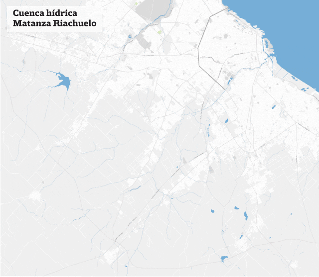
Geography of the Riachuelo/Matanza Basin
S.O.S. Riachuelo is a special multimedia report using Open Data to inform Argentinians on the Riachuelo river pollution and related diseases.
Data source and Data analysis
We looked for indicators published by ACUMAR, the authority regulating the Matanza-Riachuelo Geographic Basin, and we downloaded the data in order to assess which indicators were relevant for our investigation. As it is a topic that has been discussed a lot in the press, we wanted to find unique data that were new to the audience.
Journalism Focus
After having analyzed the various indicators, hand in hand with journalist Laura Rocha, we observed that children were among the most vulnerable populations, with high chances to catch diseases related to pollution. We decided to make it the focus of this special report.
We decided to work with the following indicators:
- Disease rate, the age of the affected population (a majority of which are children), and its evolution over time.
- Location of plants that contaminate the basin: plants generating pollutants, restructured plants and closed plants.
- Evolution of the water oxygen level: its various levels measured over the years.
Data visualization
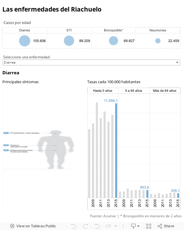
1. Disease rate
The goal was to show the number of sick neighbors, and in this way, reveal the true consequences of living in a polluted area. While the volume of data was huge, the main challenge was to simplify the interface so that the audience could easily understand the problem at hand.
In this viz, when you select a disease, the body chart gives you a list of the main symptoms, and the bar chart shows the incidence rate per 100,000 inhabitants by age category. The contrast in the length of the bars uncovers the higher vulnerability of younger ones in terms of incidence.
2. Plants location
The main cause of air and water pollution are the 16,267 industrial plants located within the water basin.
On a single map, we mapped every single plant listed by ACUMAR, rendering both the huge amount of plants along the Matanza River and their exact locations. Then, we used an animated format to show how many of them are generating pollutants, how many of them were restructured or modernized, and how many were closed.
The GIF automatically plays while the reader navigates the report, so that the relevant information appears without the need for mouse interaction.
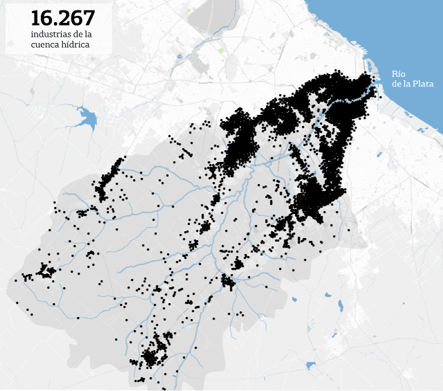
Mapping the plants in the Riachuelo/Matanza Basin
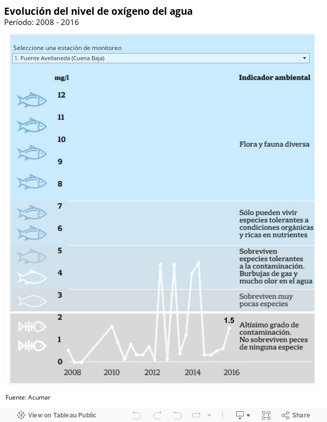
3. Evolution of the water oxygen level
In the last data visualization element, we selected some of the water monitoring stations listed in the ACUMAR dataset to display the evolution of measurements over time. Depending on the oxygen level, the flora and fauna are more or less impacted, and the graphic helps the reader to understand the problems.
This blog post was first published in La Nacion Data's blog.
เรื่องราวที่เกี่ยวข้อง

Iron Viz 2026: Read Between the Data
 May 28, 2026

Tableau's Iron Viz Winners

Explore the 2026 Iron Viz Entries
 ธันวาคม 15, 2025