Affective Colour Palettes in Visualization (poster)
IEEE Visualization Conference (Baltimore, October 23-28, 2016)
The communication of affect, a feeling or emotion, is central to creating engaging visual experiences. We report research into how different colour properties (lightness, chroma and hue) contribute to different affective impressions in information visualization applications.Our results provide initial evidence for how colour properties can be manipulated. This poster shows some experimental results that indicate which colors are most common in different affects.
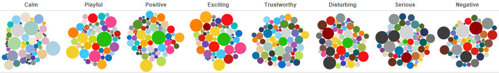
Tableau 작성자
작성자
Abhisekh Patra (SFU-SIAT), Lyn Bartram (SFU-SIAT)