Get insights faster with Explain Data


Turning your data analysis into a compelling story can be energizing, but sometimes you can get hung up on just exploring and understanding the data without ever getting to an interesting insight.
Let’s say you have found the juiciest data set, all of the columns and rows you could ever dream of, perfectly clean and beautifully structured. How do you discover interesting stories? Well, your exploration may go something like this:
- Create bar charts to see distribution of data for each variable, one-by-one (univariate analysis)
- Make scatter plots to see relationships between variables (bivariate analysis). You may be lucky and find strong correlations.
- Look for patterns, trends, or outliers. Fantastic! You’ve found what appears to be an interesting outlier! But what’s causing it?
Say hello to Explain Data
Explain Data is a new AI-driven feature in Tableau 2019.3 that aids data exploration, helping you go from the “what” to the “why” faster. It proposes statistical explanations for a selected mark, and visualizations from which you can open for further exploration.
Example: Why are homes so expensive?
Let’s see how Explain Data can be used in an example looking at home prices. I’m trying to create a story about the Seattle housing market, so I’ve downloaded a data set about house sale prices for King County from kaggle.com. It contains a bunch of information for each house, including:
- id: Notation for a house
- date: Date house was sold
- price: Price is prediction target
- bedrooms: Number of bedrooms/house
- bathrooms: Number of bathrooms/house
- sqft_living: Square footage of the home
- sqft_loft: Square footage of the lot
- floors: Total floors (levels) in house
- waterfront: House which has a view of a waterfront
- view: Has been viewed
- condition: Condition of the home
- grade: Overall grade based on King County grading system
- sqft_above: Square footage of house apart from basement
- sqft_basement: Square footage of basement
- yr_built: Year the house was built
- yr_renovated: Year the house was renovated
- zipcode: Zipcode of the house location
- lat: Latitude coordinate of house location
- long: Longitude coordinate of house location
- sqft_living15: Living room area in 2015
- sqft_lot15: Lot area in 2015
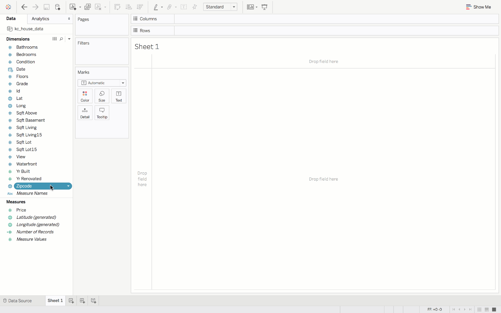
The data is in csv format, so I open it in Tableau Desktop Public Edition as a text file. I should make sure my ‘Date’ field is converted to a Date & Time data type, and change all of my categorical fields to Dimensions.
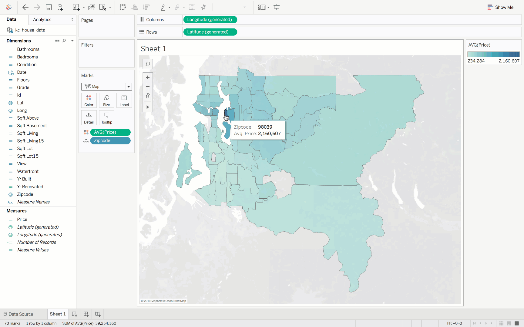
Next, I want to see where houses are the most expensive based on zipcode. To do this, I double-click on ‘zipcode’, change the chart type to map, drag ‘price’ onto color, and change price aggregation to average. The map created shows that homes in zipcode 98039 are the most expensive at $2.16 million on average.
But what is it that makes homes in this zipcode so expensive? Is it because they are waterfront properties, or do homes in this zipcode tend to be larger? This is where I can use Explain Data. Click on the 98039 zipcode, and a lightbulb icon will appear in the tooltip. Click that icon and you will see Explain Data in action, using AI to provide potential explanations for higher home prices in this zipcode. In this case, homes in the 98039 zipcode tend to have more bedrooms, higher grades, more bathrooms, and more views than homes in other zipcodes, which is likely driving up the average home price.
Try it out for free! Explain Data is available both in Tableau Desktop 2019.3 and in web editing. Download Tableau Desktop 2019.3 and create your next data story.
Along with Explain Data, Tableau 2019.3 comes with more features including parameter actions improvements and Italian product language. Members of the Tableau Community are sharing their favorite features on Twitter using #DataFamFav. Jump into the conversation—share your favorite feature using #DataFamFav!
관련 스토리

Iron Viz 2025: Where Data Took Flight
 2025/05/06

Meet 2025 Iron Viz Finalist Bo McCready
2025/04/08

Meet 2025 Iron Viz Finalist Kathryn McCrindle
2025/04/06