How this young Trekkie is finding stories in his data


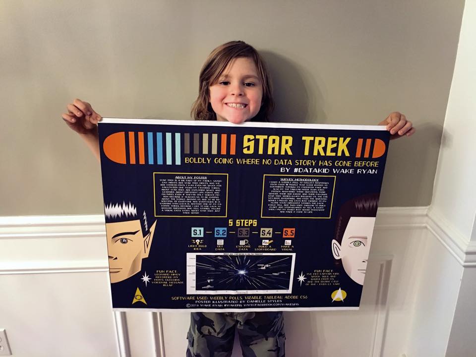
Wake Ryan poses with a poster he designed with the help of a family friend.
As he puts it, 9-year-old Wake Ryan is “boldly going where no data story has gone before.”
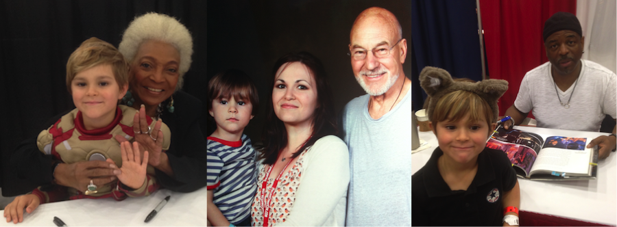
Wake wants to be an astronaut when he grows up, and, as you might have guessed, he’s also a serious Star Trek fan. He’s met Kirk, Spock, Sulu, and Uhura. He and Q once shared a fist bump. And Geordi La Forge sang his name.
Wake recently found himself wondering: What’s the most popular Star Trek series? He himself is an Original Series fan, but he wanted to know what other people like.
So with the help of his mom, he created a survey to ask people three questions: What’s your favorite Star Trek series? What’s your age? And what’s your gender?
“I got over 100 data points!” says Wake.
Wake collected the responses in a spreadsheet. He then pulled it into Tableau and quickly found the answer. The most popular Star Trek series? Not Original Series.

The Next Generation appeared to be the crowd favorite. But when he dug deeper, he saw that it’s not everyone’s favorite.
“I found out that if I look at it by male and female, the male people love TNG and the females love Original Series. And I think that’s because Captain Kirk is so handsome,” says Wake.

When he filtered the data by age, Wake saw that millennials really like Star Trek, especially TNG. (He thinks this might be because they grew up watching TNG with their parents, who grew up watching Original Series.)

What began as a simple question quickly turned into a whole story.
“He had a one question and found the answer,” says Wake’s mom, Lindy Ryan. “But when he visualized the data and started playing around, something as simple as rotating an axis gave him more ideas.”
Wake got so into his analysis that he even made a video to share with his class.
‘That’s the power of visual data literacy’
So how is it that Wake knows so much about data? For starters, he began using Tableau when he was just 7.
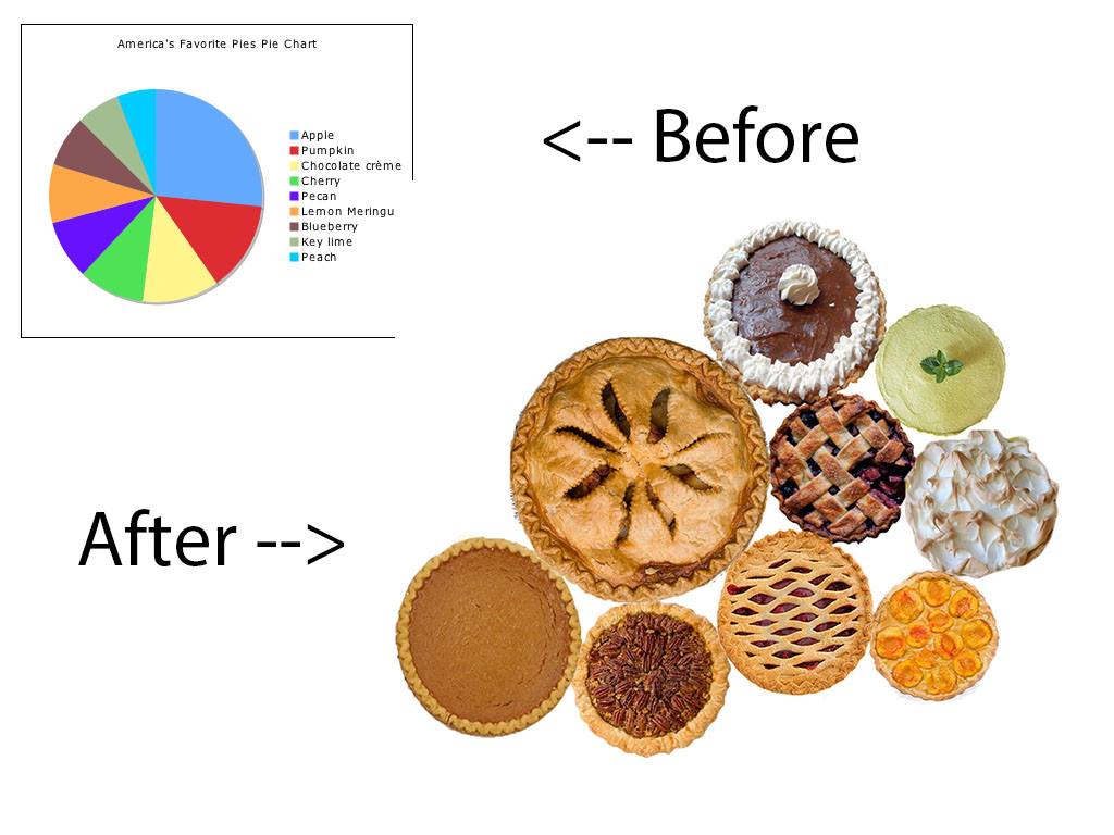
It all began while he and his mom were making a pie in the kitchen. Wake began thinking about everyone’s favorite pies. He likes apple, but his grandpa likes chocolate while his mom prefers coconut.
“And he said, ‘I wonder what the most popular is.’ And I said, ‘I don’t know, but I bet there’s a way to find out,”’ says Lindy.
Lindy seized the opportunity to show Wake how to ask and answer questions of data. And as an academic researcher herself, she wanted to answer a question of her own.
“I also wanted to see just how intuitive Tableau was for the business user. We always talk about it in the community, in the self-service conversation. And I thought if a 7-year-old can do this, anybody can do this,” she says.
They hopped on Google and came across a Schwan's survey listing people’s favorite pies. But in list format, the answer wasn’t so obvious.
“He read the survey, but he didn’t get it,” says Lindy.
So Lindy helped Wake pull the data into Tableau. And she walked him through the steps as he dragged things into view and clicked around the Show Me box.
In just minutes, Wake could see the insights that had been hiding in his data.
“When he put the data in the visual format, he immediately got the answer,” says Lindy. “I think that’s the power of visual data literacy.”
Wake saw that the most-loved pie is apple pie, his personal favorite. To visualize his finding, Wake chose a bubble chart, and, with his mom’s help, added custom shapes of pies in Photoshop.
“He was able to take this boring file and transform it into a buffet of pies. And I think that’s how he fell in love with the idea of telling delicious data stories,” says Lindy. “It took something boring and plain-text, and brought it to life in a real way that was much more engaging for him to work with.”
And since that first pie chart, Wake has learned to visualize data on his own.
"Sometimes my mom helps me with ideas, but I do all the work by myself," says Wake.
On a path to viz long and prosper
Wake says his favorite part of the Star Trek project was “talking about Star Trek.” (His favorite character? “Hmm, that’s hard, but I guess Spock because of his ears,” he says.) But it’s clear Wake also enjoys exploring data.
“He’s talked the neighborhood kids into data activities,” says Lindy. “He’s collecting apple seeds and measuring weight and different things to chart them visually. We planted some strawberries and he’s measuring how they grow.”
From Star Trek to strawberries, one thing seems clear: Wake is determined to viz long and prosper. His next project: “The world's biggest data ice cream cone” that tells the story of everyone's favorite flavors, scoop by scoop.
Data kids and parents, we invite you to join our data-kids community group! Please sign up here to request access.
관련 스토리
DataFam Roundup June 2026
DataFam Roundup May 2026

Iron Viz 2026: Read Between the Data
 2026/05/28