Tableau Research Explores Using Generative AI to Create Data-Driven Articles


Editor’s Note: For more details on this work from the Tableau Research team, check out the paper and video, which will be presented at the 2023 IEEE Visualization Conference.
For many data professionals, their work doesn't end with just creating a dashboard, but rather sharing their findings to an audience with a data story. Data stories—which can come in many forms, such as presentations, videos, articles, blog posts, and even infographic dashboards—are narratives built around data to inform, guide, and persuade the audience, walking them through specific insights and perspectives in an engaging way. They contain a narrative, often drafted in text, such as a script for a video or presentation delivery; and supporting data visualizations that provide support to the points being made in the narrative.
However, crafting a narrative for a data story is not a simple task. Apart from the data analysis skills needed to reach relevant insights, storytelling skills are also needed to walk an audience through data insights in a cohesive and engaging manner. Between writer's block, finding the right tone, and polishing delivery, it is notoriously hard to get a narrative right. At the same time, data stories play an important role in making data insights easier to consume and there is great demand for more data stories out there. So what can we do to make the data story authoring process less onerous for authors?
But. Now there are these new large language models
Most people not living under a rock have seen how powerful prompt-based generative AI models have become. In particular, large language models such as ChatGPT and Bard are incredibly good at generating text of all kinds from a single prompt. It is natural to think they would be perfect for this task, providing authors with the ability to generate not only one but multiple versions of a data story.
Alas, it's not that easy. As powerful as these technologies can be for data story generation, from extracting insights to organizing findings and exploring different story framings, they also introduce significant noise via hallucinations and biases. Many of these errors are subtle enough to escape human oversight, which makes them particularly dangerous: partially correct inferences written in assertive language are likely to be taken at face value, adding more fuel to the misinformation dumpster fire.
Another challenge is that prompting is hard, and makes for terrible, unnatural interfaces: they are hard to control, its capabilities hard to conceptualize, and its output hard to reliably predict. On the other hand, the open-ended nature of prompting that makes them so hard to use is also what allows author intent—ranging from precise (e.g., "here are the top three underperforming areas") to nuanced (e.g., "what are contextual factors that contributed to underperformance")—to be more faithfully captured.
In an ideal world, a solution to this problem should provide authors with plenty of authoring support while minimizing issues that arise from direct prompting. This calls for a thoughtful interface design solution that affords a broad range of expression while providing sufficient guard rails to control the direction of the story and mitigate generation errors in an intuitive manner.
Interaction guides the story
At Tableau Research, we developed a research prototype called DataTales to answer this call. DataTales is a tool that simplifies the authoring process by wrapping around a large language model to help authors create and verify multiple versions of a data story in the context of a given chart. Authors can (i) interact with the chart to fine tune focus of generated stories and (ii) verify the validity of generated content in a more assisted manner.
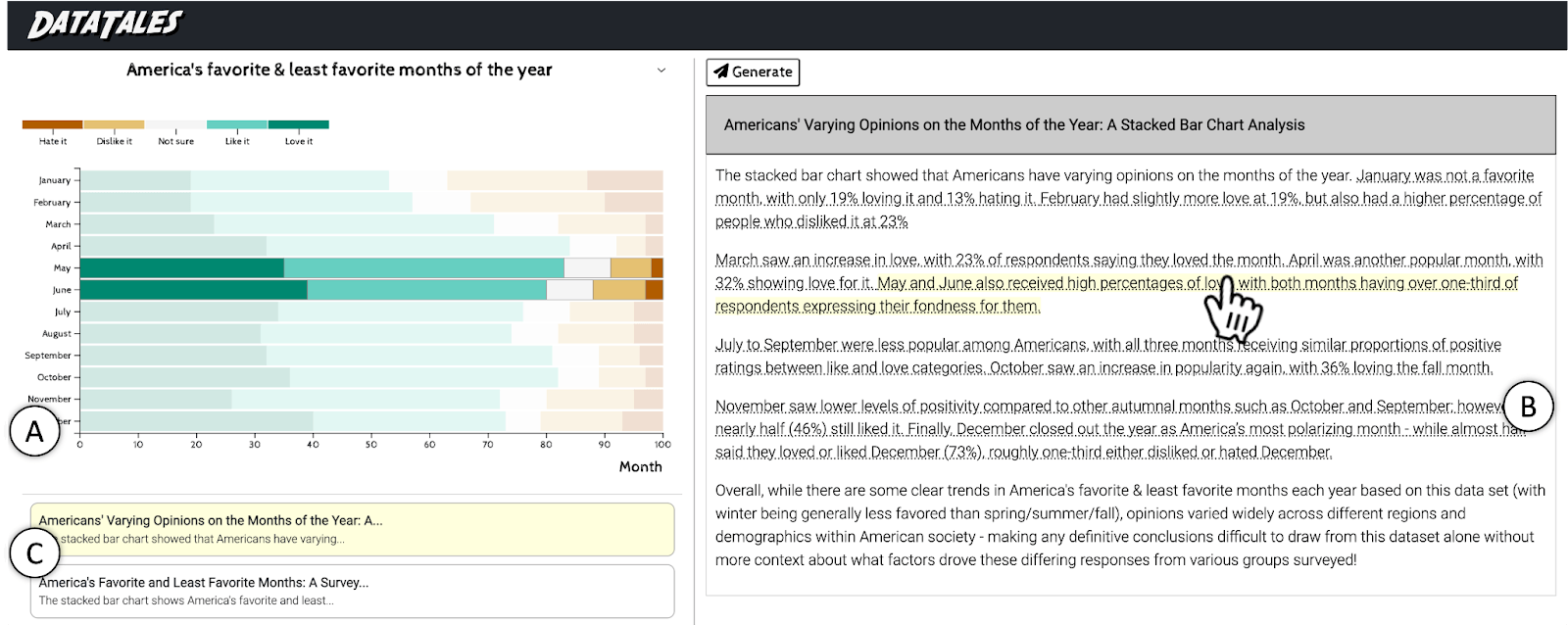
DataTales is simple to use. For a given chart, content can be generated by clicking the "Generate" button. The system provides the full context of the chart in question—the data and the title—and generates a complete and self-contained data story, with opening and closing statements plus high-level data insights featuring relevant context.
To control the focus of the story, authors can annotate the chart to select data ranges and elements of interest. In Figure 1, which depicts results from a poll on America's favorite and least favorite months of the year, an author may want to focus on the most loved month, December, by selecting the corresponding bar in the chart. They may also want to contrast the two ends of the spectrum—the "Love it" and "Hate it"—by selecting the corresponding labels on the color legend. Or they may choose to focus on the summer months, by selecting the months of June thru August on the Y axis. These chart annotations help provide more context to the language model, which in turn helps guide the content generation to something closer to the author's intent.
Authors can use the generated text as-is, edit portions of the text, or generate multiple instances to pick and choose what they like. Some parts of the story may make questionable claims that need to be fixed. To help authors navigate the multiple generated stories and to fact-check generated content, DataTales detects text passages associated with data points, and links them to the corresponding data marks in the chart. When hovering over linked text, the corresponding data marks are highlighted (Figure 1), which helps reduce the cognitive burden on reading and fact-checking.
Now, how is this different from Tableau Data Stories and Tableau Pulse? While these features focus on generating a list of data facts or metrics-based insights, DataTales aims at helping people write full article-style narratives while embedding external context (i.e., "human knowledge") that is pertinent to the data.
So, how well does this tool work?
We wanted to understand if data communicators found value in this approach, and how the "DataTales way" of creating stories may support or hinder their authoring practices. We thus invited 20 data professionals, including content writers, project managers, Tableau visionaries, and Tableau customers, to try out DataTales and provide feedback. Eleven of them also used DataTales in the context of a data story authoring task, giving us a concrete understanding of how DataTales may fit into authoring workflows.
Despite the early proof-of-concept state of the tool, feedback was very positive and suggests DataTales may help data communicators in multiple stages of the authoring process. While very few generated stories were used as-is, they provided ideas and starting points to help authors kickstart their own stories and overcome writer's block. Many folks we interviewed reported on the communication burden they faced in their organizations, with different stakeholders wanting different perspectives from the same set of dashboards which demanded personalized feedback and support. Communicators believed a tool like DataTales could help them significantly expedite the more routine data communication work that takes up so much of their time.
A surprising, unintended benefit of the tool was that it actually encouraged authors to reflect more deeply about their data. The addition of external historical and cultural context and other higher-level insights into the stories provided new framings that authors did not consider in their initial analysis. The chart annotation mechanics played an important role here, as their ease of use made it possible for authors to generate multiple story versions at a time. In a way, DataTales supported not only data story authoring but also data exploration and analysis, by nudging authors to go back to their data and consider additional insights.
What's next?
DataTales showcased a promising example of how large language models can be incorporated into authoring workflows in an intuitive way. However, we are still left with many open challenges on the overall impact of using generative AI technologies in everyday tasks. Important questions such as how to mitigate bias from generated content to seep into author's stories, and how to empower authors with greater critical thinking and data literacy skills to better guard against auto generated misinformation are challenging but essential problems to consider.
Autres sujets pertinents
Once Again, with Style: Understanding and Supporting Partial Reuse in Dashboard Authoring
 5 juin, 2026
From ‘Here’ to ‘There’: Exploring Proximity Semantics in Multimodal Data Exploration
 3 juin, 2026

Which Model Speaks Your Data Language? A User-Centered Approach to Evaluating LLMs for Conversational Visual Analytics
 14 avril, 2026