Tableau Desktop
Explorez, modélisez et visualisez des données en tout temps, même hors ligne.
Faire un essai gratuit Acheter maintenant
Regarder la vidéoModélisation et analyse de données en libre-service
Découvrez plus rapidement de l’information exploitable grâce à de puissantes fonctionnalités offrant flexibilité et contrôle. Des relations multifaits aux thèmes personnalisés, en passant par les extensions de visualisation et l’accessibilité améliorée, Tableau Desktop vous place aux commandes et facilite l’utilisation de données pour prendre des décisions judicieuses.

Obtenir une licence Creator
Une licence Creator donne accès à Tableau Desktop et à Tableau Prep. Informez-vous au sujet de Tableau+ pour savoir comment accéder plus rapidement à de l’information utilisable avec une IA fiable.
Caractéristiques clés
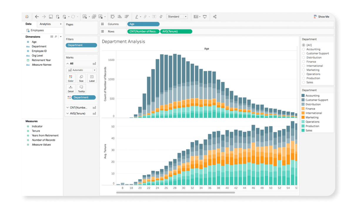
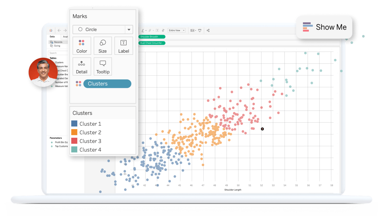
Exploration illimitée des données simplifiée
De la préparation des données à leur utilisation, Tableau Desktop vous offre tout ce dont vous avez besoin pour fournir des renseignements pertinents en temps réel. Connectez-vous simplement à des données de partout, puis combinez-les et nettoyez-les avec des clics, et non du code. Posez de nouvelles questions, trouvez des tendances, découvrez des occasions et prenez en toute confiance des décisions basées sur les données.
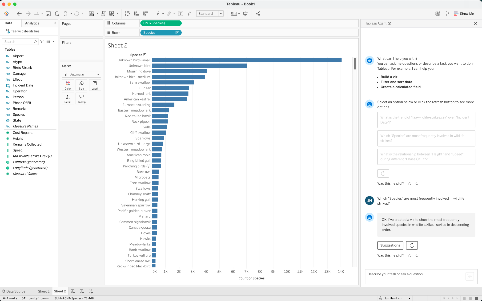
Décisions plus éclairées prises grâce à l’IA
Améliorez les résultats de votre entreprise grâce à des renseignements pertinents auxquels vous pouvez vous fier. Des fonctionnalités d’agents transparentes sont intégrées à la plateforme pour démocratiser la planification de scénarios de simulation, l’élaboration de modèles guidés, les prédictions alimentées par l’IA et d’autres techniques de science des données. Intégrez et visualisez des résultats en direct provenant de R, Python, MATLAB et d’autres extensions pour étendre les analyses avancées qui transforment votre organisation.
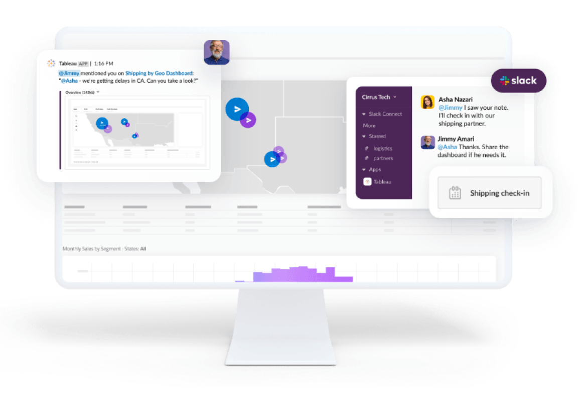
Collaboration et partage
Tableau fournit un environnement flexible et encadré dans lequel des équipes peuvent travailler ensemble sur des données fiables. Grâce à des intégrations pour Google Workspace, Microsoft Teams, Slack et bien d’autres logiciels, vous pouvez recevoir des notifications, poser des questions de suivi et supprimer les cloisonnements pour faire avancer votre entreprise. Augmentez la productivité avec des expériences utilisateur alimentées par l’IA et l’apprentissage automatique qui guident les utilisateurs vers les réponses dont ils ont besoin, communiquées d’une manière qu’ils comprennent.

L’intérêt de Tableau est que nous sommes en mesure de fournir un grand nombre de renseignements à un très large public, ce que nous ne pourrions pas faire autrement sans une vaste équipe.
Analytique augmentée
Nous investissons dans des fonctionnalités analytiques qui vous aident à obtenir des réponses et à découvrir des renseignements exploitables cachés plus rapidement grâce à l’IA, l’apprentissage automatique, les statistiques et le langage naturel.
Découvrir Tableau Agent pour Tableau Desktop
En savoir plus sur Tableau Agent pour Tableau DesktopDémarrez votre analyse en lion

Tableau Exchange est l’endroit où vous pouvez accéder à des ressources fiables créées par Tableau et ses partenaires tiers pour vous aider à obtenir rapidement des résultats, à aborder une grande variété de cas d’utilisation et à obtenir un meilleur rendement de vos investissements dans Tableau.
Accélérateurs
Créez des tableaux de bord adaptés à votre secteur ou à votre entreprise, à partir de vos données.
Extensions de tableau de bord
Ajoutez des fonctionnalités à vos tableaux de bord grâce à des applications Web.
Connecteurs
Rendez possible l’accès à des bases de données et à des applications supplémentaires avec Tableau.

Vidéos de formation
Regardez des vidéos de formation de Tableau gratuites pour vous aider à faire les premiers pas et à progresser rapidement.

Apprenez à votre façon
Accédez à des ressources correspondant à la façon dont vous utilisez (ou voulez utiliser) Tableau Desktop.

Joignez-vous à la famille des données
Apprenez, partagez et créez des liens avec d’autres passionnés des données.
Assistance pour Tableau Desktop
Obtenez de notre équipe d’experts le soutien et les services dont vous avez besoin.