Visualize, Narrate, Repeat: Closing the Loop on Data Storytelling


DataWeaver is an interactive data-story authoring tool created by Yu Fu (Georgia Tech and University of Central Florida, former Tableau Research intern) and Denny Bromley and Vidya Setlur from Tableau Research. DataWeaver will be shown at the EuroVis 2025 conference on June 4, 2025 in Luxembourg.
People thrive on narratives; as a result, data-driven story telling and data-driven journalism are important venues for disseminating information. However, data storytelling requires skills in both data and—wait for it—storytelling; it requires people to be polymaths who are not only skilled and engaging storytellers but also trained data analysts capable of handling anything from CSV files to Tableau to Python.
Fortunately for us, Yu Fu is such a person. Before Yu got his Ph.D. from Georgia Tech and began teaching at University of Central Florida, before coming and spending a summer with us here at Tableau, Yu was an NBA journalist who engaged millions of fans with super compelling and interactive data-driven stories (Figure 1). So when Yu showed up last summer with an idea for helping literally anyone create high quality data-driven stories, we got pretty excited; seriously, who better to create such a tool than an NBA journalist with a Ph.D. in interactive data analytics? And that’s when we—Yu Fu, Denny Bromley, and Vidya Setlur—created DataWeaver.
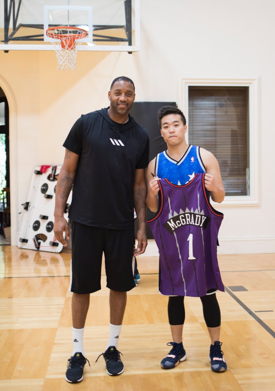
Yu with Tracy McGrady at his home.
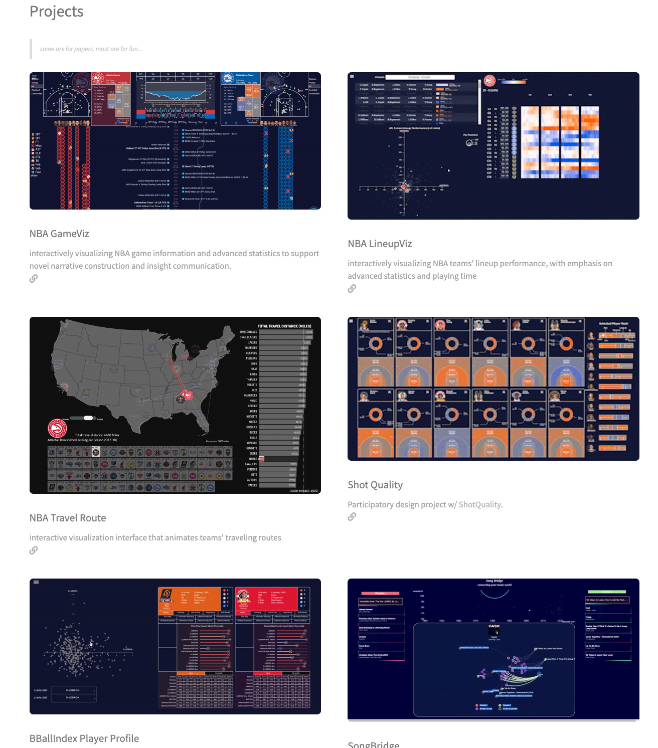
Figure 1: Examples of Yu Fu’s data storytelling interactives.
DataWeaver (Figure 2) is a bidirectional data-story authoring tool that leverages large language models (LLMs) like ChatGPT to do the work that you may not want to do, yet leaves you with agency to edit the final story as you wish. If you’re a data and visualization person, it can help craft your narrative (visualization-to-text). If you’re a story person, it can help you with the data and visualizations (text-to-visualization). And if you’re both, it can simply make your life easier by doing a lot of the data heavy lifting and logistical bookkeeping for you.
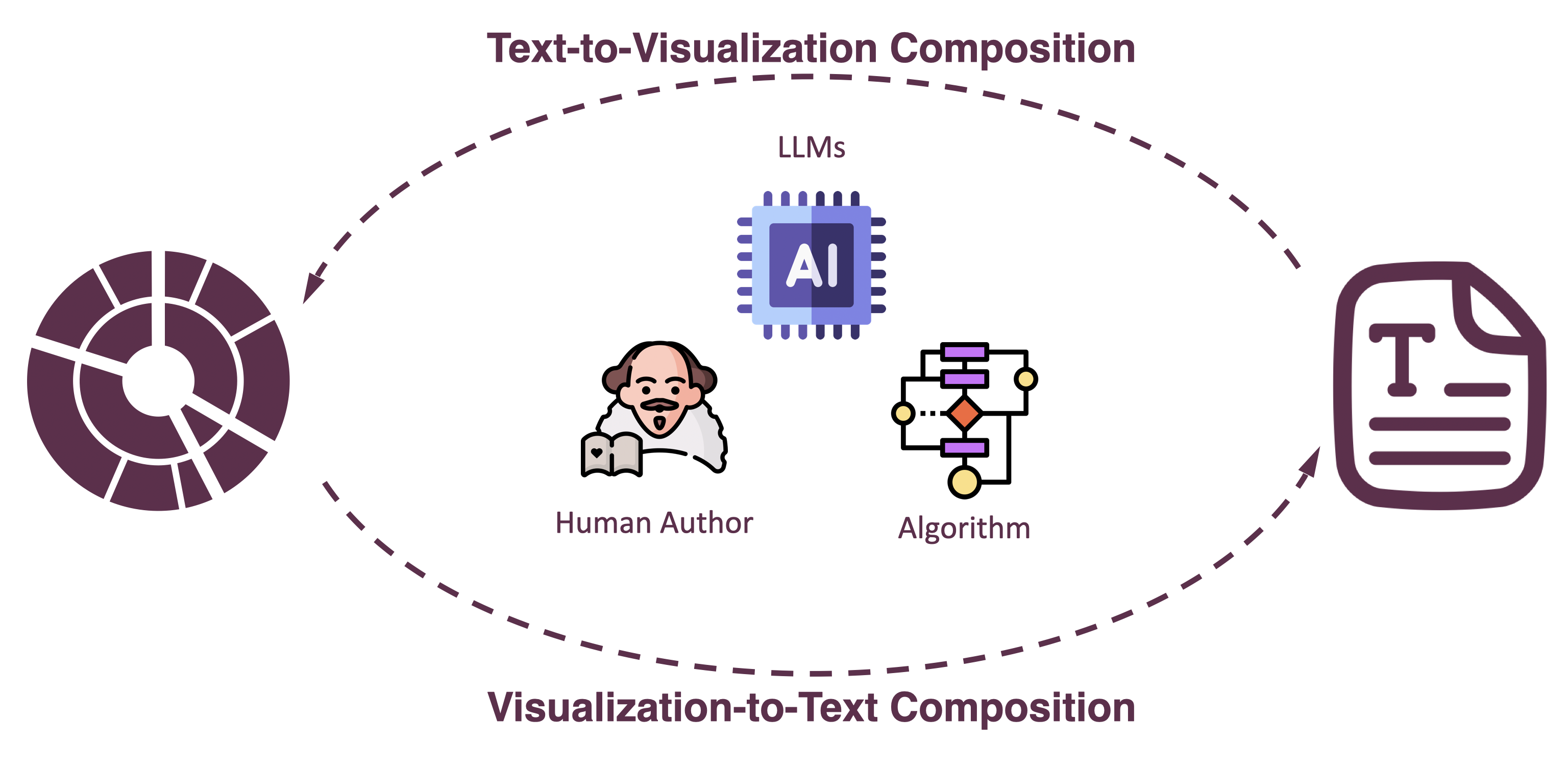
Figure 2: DataWeaver is a bidirectional tool that helps users create visualizations from text, and text from visualizations.
Before we began working on DataWeaver, we asked some data authoring experts to create visual data narratives based on some data findings, and then we watched how they did it. This study really helped focus our work. Specifically, we learned that:
- Precomputed facts can be helpful. That is, having the computer identify common data facts like outliers, averages, and trends is pretty nice.
- Manually transcribing data from visualizations is both tedious and error prone. It turns out that a computer’s vis-to-text temporary memory can be more reliable than ours, particularly when dogs, children, and hot coffee are in play.
- People have concerns about AI. Specifically, they worried about accuracy of the generated content and the privacy of the uploaded data.
- People wanted to be in the driver’s seat. If you watched a game last night and saw something amazing, then you already know your story. You just want the computer to help support your vision, not to try and override it.
- Even experts like tools that make their jobs easier, but they want the tools to be seamless and integrated.
With these in mind, we began prototyping DataWeaver, shown here in Figure 3. The first thing users do is upload their data, at which point they enter into the bidirectional text ← → viz loop. We’ll start here by illustrating the vis → text direction.
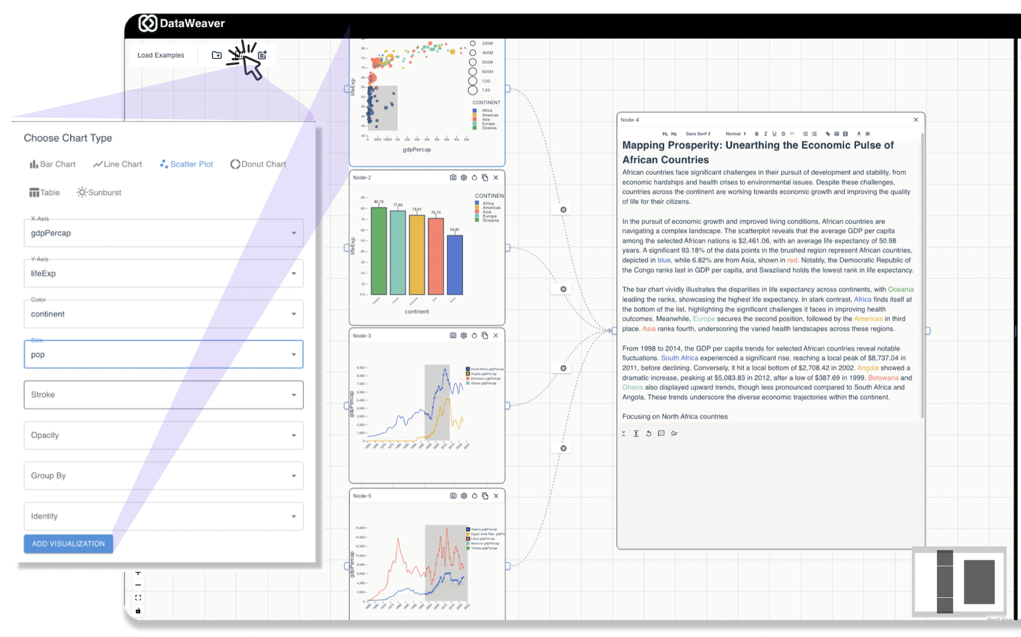
Figure 3: Creating a visualization from scratch in DataWeaver.
Users can create their own interactive visualizations by selecting the relevant fields, aggregations, and chart type (Figure 3, left side). These images are then added into the DataWeaver pipeline; as you can see, interactive visualizations on the left connect to the text panel on the right. As users interact with the visualizations, they trigger callouts e.g. mark and region selections. We developed an interaction:chart callout taxonomy that helped us map these callouts to user intent. For example, selecting a region of a scatterplot might indicate that a user wants to do a subset:whole analysis, whereas selecting a region of a line plot might indicate that the user wants to analyze the line trend or compare the region’s start and end values.
Now that images are in play, we can really enter into the bidirectional cycle. As you can see in Figure 4, beginning on the left, chart interaction triggers callouts, which help us understand the user’s intent. Given those callouts and the putative intent, we can then calculate appropriate data facts - statistics, comparisons, trends, differences—any kind of number crunching that will help us tell our story.
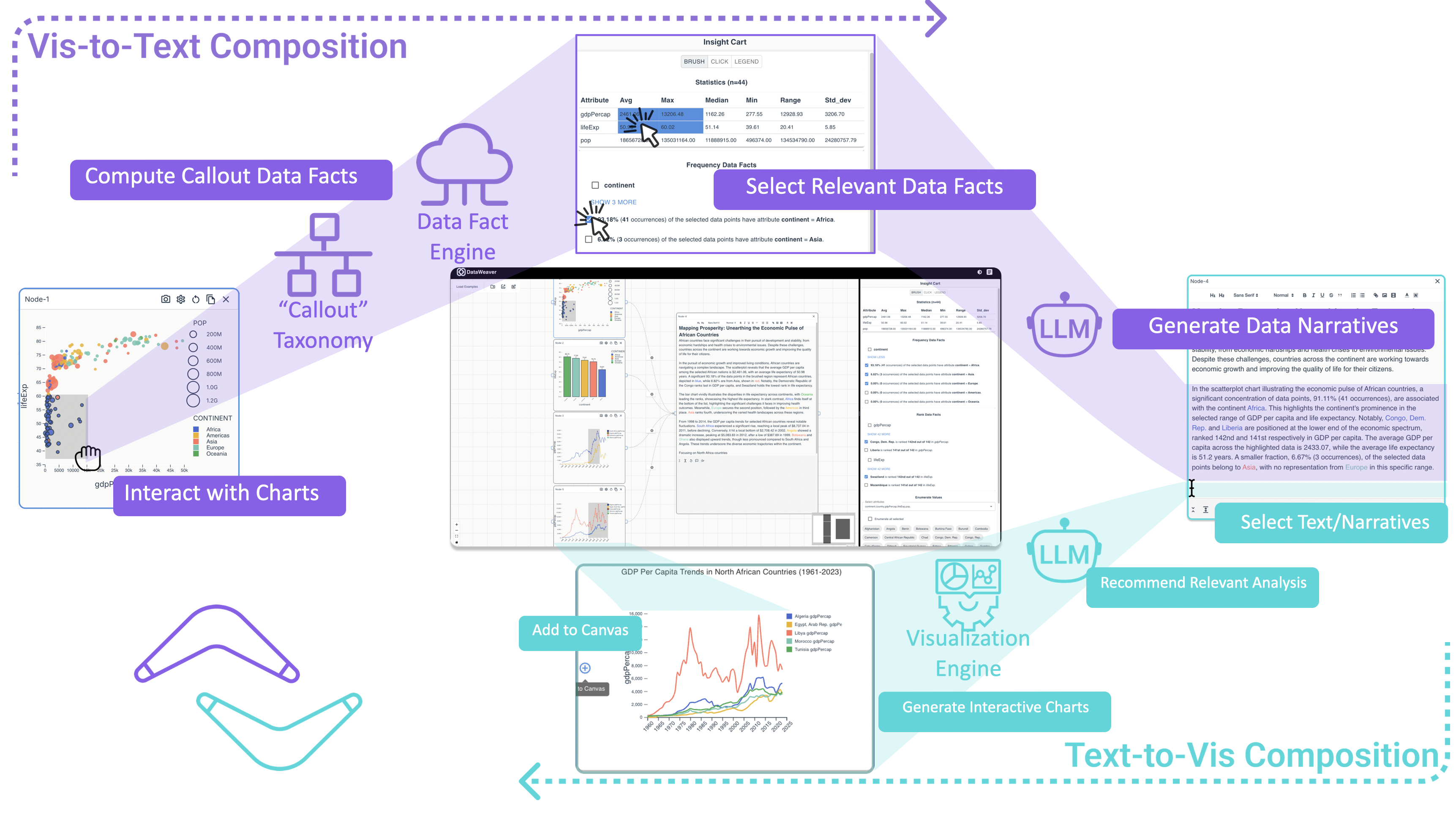
Figure 4: DataWeaver’s full vis → text → vis cycle.
The user can then select interesting and relevant data facts—maybe the fact that 41% of the selected countries are in Africa is relevant to the narrative, or perhaps you wanted to talk about Singapore’s outlier life expectancy relative to the rest of Asia. Whatever it is, DataWeaver automatically creates data facts inspired by your selection and presents them to you for consideration. If you don’t find anything interesting, you can keep exploring until you find what you are looking for. Finally, once you have accumulated some interesting data facts, you can ask the LLM to generate some narrative text for you. Being an LLM you can of course tweak all aspects of the generation from tone to Yoda-style sentence construction, or simply manually edit the text yourself.
But we don’t have to stop there simply because we’ve reached the end of our vis-to-text trajectory; now we get to boomerang back along the text-to-vis trajectory! We can select any text we like in the text window (Figure 4, right middle); it could be LLM-generated (“Growing with strength, North African GDP values are, hmmm…”), your own take on that big game last night, or even just a leading sentence fragment—“Shipping costs in the great lakes…”. The LLM will take these narrative prompts and generate multiple visualizations for your consideration. You can continue to generate visualizations until you find some that you like, at which point they join the existing interactive visualizations and we are back to the beginning, ready to run the loop again.
When you have created all of your content, you can move the narrative sections around to find the flow that you like and DataWeaver will maintain the proper text:vis linkages. And when you are finally ready to publish, you have the choice to save your story as a single linear page, a scrollytelling interaction, or a stepper presentation.
Once we implemented the initial DataWeaver prototype, we asked people to play with it and tell us what they thought. Overall, people liked the tool (Figure 5). People appreciated the fact that DataWeaver did all the bookkeeping for transcribing data facts into text. They also enjoyed the bidirectionality, the fact that they could focus on their own strengths and let DataWeaver pick up the slack, and the fact that they could generate bootstrapping text to get the initial story off the ground. With that said, there were definitely some areas for improvement particularly around data flow representation, data-fact filtering and organization, text-to-vis generation consistency when faced with data limitations, and a desire to customize the generated visualizations.

Figure 5: DataWeaver system usability questions, responses, and user quotes.
So there you have it. Tableau has always been about bringing data to the people, and people come in all types with different strengths and preferences and backgrounds. So as we look to the future of Tableau, and consider living in a data-driven world, we are super excited about tools like DataWeaver that help us throw our arms around people of all skills and passions and help them tell the stories that they want to tell.
We will be presenting DataWeaver at the EuroVis conference in Luxembourg on June 4, 2025, and have created a project page for DataWeaver with links to the paper and video. And of course, if you have questions, please reach out!
Related Stories
Stepping through Charted Territory: Creating Interactive Step-by-Step Dashboards Tours
 8 June, 2025
Co-Authoring Dashboard Text with AI
29 May, 2025
Unlocking Actionable Insights with Jupybara: A Multi-Agent AI Assistant for Data Analysis and Storytelling
 23 May, 2025