The do’s and don’ts for building a dashboard


A dashboard is your go-to tool for communicating data insights, but to build a great analytics dashboard—a truly informative and actionable one—it takes more than just putting all of your “aha moments” onto a canvas. Here are some best practices for where to start, what to include, and what to avoid, to make your dashboard stand out:
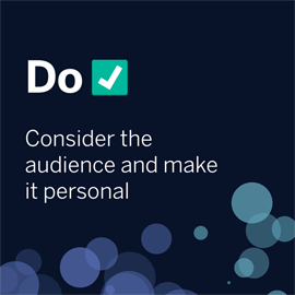
1. DO consider the audience and make it personal.
Create dashboards that are meaningful to users so they can relate to and internalize key information.
2. DO experiment, iterate, and, most importantly, get feedback.
Dashboards can take time to get just right, it’s often not a one-and-done process. Besides iterating to make it work for your needs, it’s important to get feedback from multiple people to make sure your dashboard is useful for others.

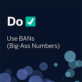
3. DO use BANs (Big-Ass Numbers).
Eyes are drawn to bigger numbers, so use them to grab the attention of your audience.
4. DON’T assume your audience knows where to start.
Provide directions in the worksheet or filter titles so the viewer knows how to better use your dashboard.

5. DON’T try to answer every question at once.
A dashboard is meant to deliver a couple of key messages—not necessarily all of the insights you’ve discovered at once. Putting too much content on one dashboard can result in information overload.

6. DON’T overdesign.
Prioritize functionality over beauty: Simplicity is your friend.

Read more dashboard best practices―and see visual examples―in the Do’s and Don’ts of Dashboards whitepaper.
เรื่องราวที่เกี่ยวข้อง

A Guide to Mapping and Geographical Analysis in Tableau
 พฤศจิกายน 15, 2024

How To Get Your Fitness Data Ready For Tableau
 พฤศจิกายน 3, 2024

How to Use the Intersects() Calculation in Tableau
 มีนาคม 27, 2023