3 Ways to Add Context to Your Vizzes


Data visualization is a powerful tool for communicating a wealth of information in just a few pixels. But on its own, you can’t always get the whole story. For a data viz to be trustworthy, you need to be able to cite the data sources and provide background and context for what it all means. The community has come up with some pretty cool ways to do this without taking up too much space and while keeping the data front and center.
1. The About Tab
One of the easiest ways to get all the context you need about a viz into the Tableau Public workbook is to make an “About” tab. This is a completely separate dashboard with all the additional information you want on it. Using this method is great as it allows you to put all kinds of additional media, pictures, videos, or anything else you can put on a dashboard on the About tab. Check out this example from David Murphy on his "Game of Thrones Deaths" viz:

Here’s how to make an About tab:
- Create an additional dashboard in your Tableau Public workbook. You will want to size it the same as your original dashboard.
- Add all the information you want to the dashboard
- Hide or delete all the additional sheets that you have in your workbook so that those tabs aren’t shown as well.
- After publishing, edit the details of your viz and make sure you check the “show workbook sheets as tabs” option.
2. The Hover-Help Menu
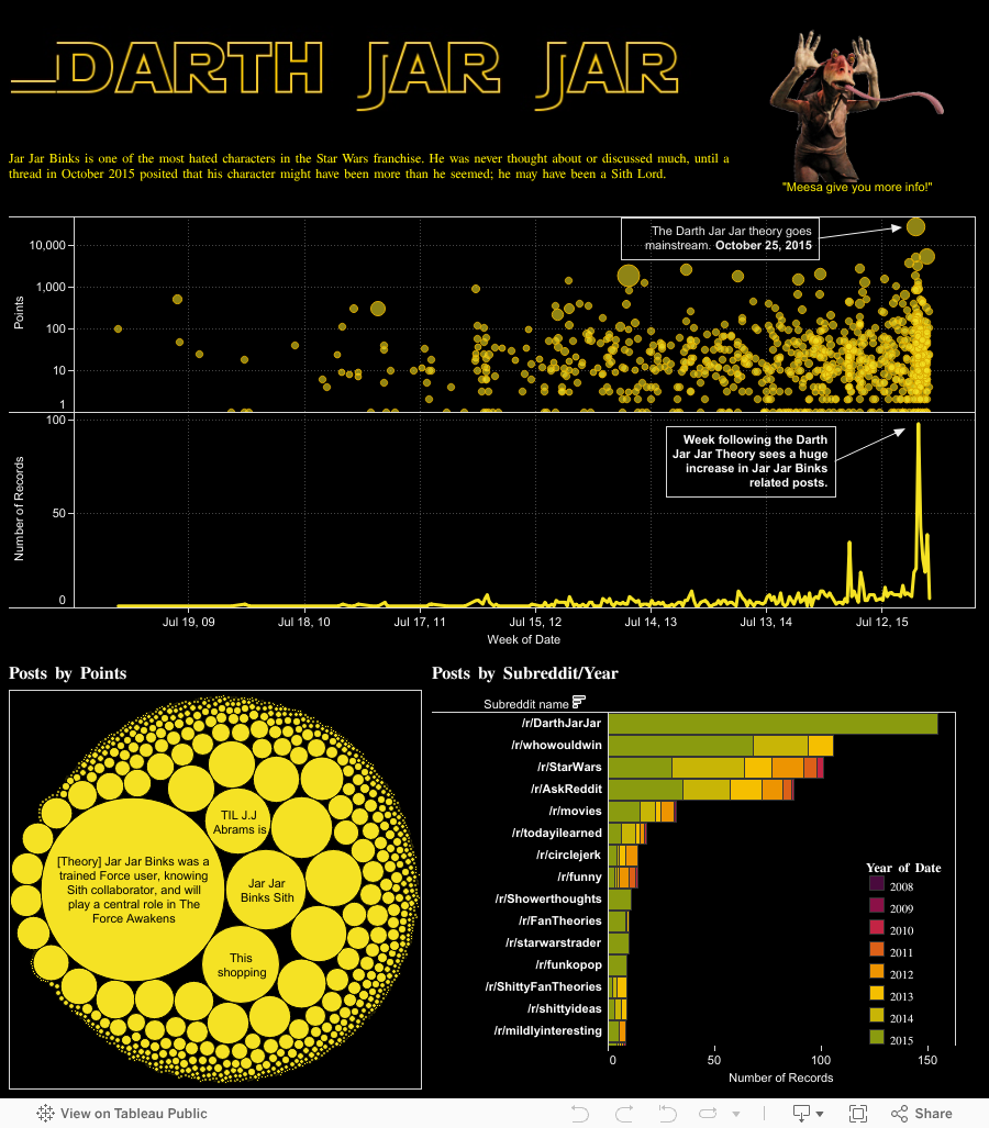
The "hover help" option is a good one if you want to save space and don’t have too much additional information to add. Hover-help menus are a great way to add instructions on how to interact with a viz since the user never has to click off of it. Because this solution relies on tooltips to deliver the information, you can’t use media the way you can on an About tab, but you can still do some interesting styling to the button itself. For this viz, I used the hover-help menu with a custom shape that looks like Jar Jar Binks:
The basic steps behind a hover help menu are as follows:
- Create a new sheet.
- Grab any measure (for example, number of records), and drag it to “text” on the Marks card.
- Click on "text" on the Marks card and edit the label to say something like “Hover here for help.”
- Add the additional info you want to share in the tooltip. You can delete anything else that’s in there.
- Optional: Change the mark type to shape and pick a shape to be the “button.” Another option is to choose a square sized really big to make a big, rectangular button. Custom shapes also work well here.
- Add the sheet to your dashboard and make sure that none of your dashboard actions affect it.
3. The Collapsible Shelf
A new trend among the Tableau gurus is creating a slide-out menu with all the additional information you want to add in it. This is slightly more flexible than the hover-help solution and can produce some really slick results. Check out what happens when you click on the exclamation point in the upper-left corner of this Super Bowl commercial viz:

This method is so flexible that you can put all kinds of things in that collapsible shelf, like David Pires did in this Kanji learning viz:

This is a somewhat more complicated solution to implement that I can’t really summarize in a couple steps. So instead, I’ll let Tableau Zen Master Robert Rouse explain it in this great write-up on the InterWorks blog.
Have another idea for a way to add additional context to a dashboard? Tweet us using the hashtag #TableauTipsMonth so we can share it!
Relaterade berättelser

Iron Viz 2025: Where Data Took Flight
 6 Maj, 2025

Meet 2025 Iron Viz Finalist Bo McCready
8 April, 2025

Meet 2025 Iron Viz Finalist Kathryn McCrindle
6 April, 2025