How visualizing quantified self data can help you find meaning in a quarantined world


What are people doing during quarantine to pass the time? According to a text mining analysis conducted by Feng Lim of Towards Data Science, people are using Tik Tok, playing games, and reading more in an effort to stave off boredom. Others have turned to data visualization.
Data is everywhere—our phones track our steps and screen time, our smartwatches track our heartbeat throughout the day and hours of sleep at night, and our apps track our spending, nutrition, and productivity. Many in the Community are using this “quantified self” data to better understand the effects of Coronavirus (COVID-19) on their day-to-day.
How have your spending habits changed? Are you tracking your exercise? Analyzing your personal data can help you to answer questions about your health, achieve your goals, or learn something new. Read on to see how Tableau Public authors are visualizing their own data and how you can find meaning in your personal data.
Explore quantified self visualizations from the Community
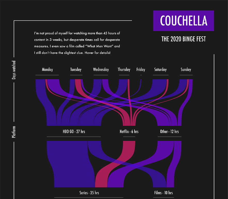
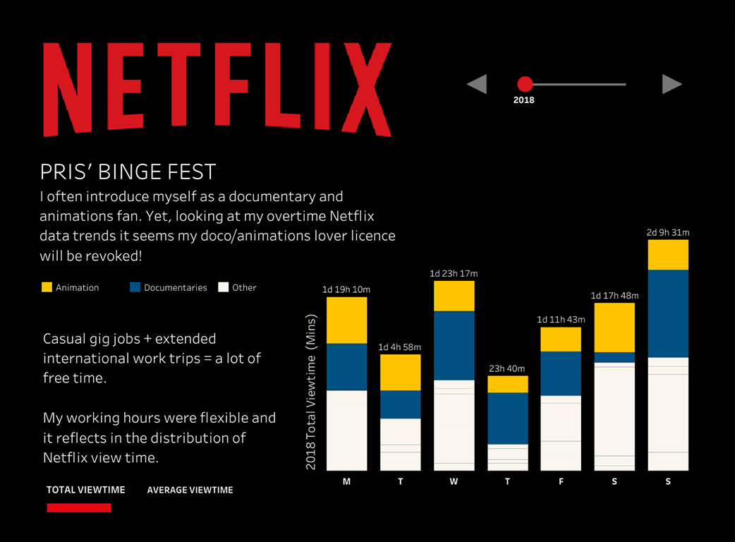
Visualizing your streaming data
Are you guilty of finishing an entire Netflix series in one day? In these quantified self vizzes, Judit Bekker and Pris Lam explore how their streaming habits have changed over time as a result of binge-watching some of their favorite shows.
Tracking your moods or activity
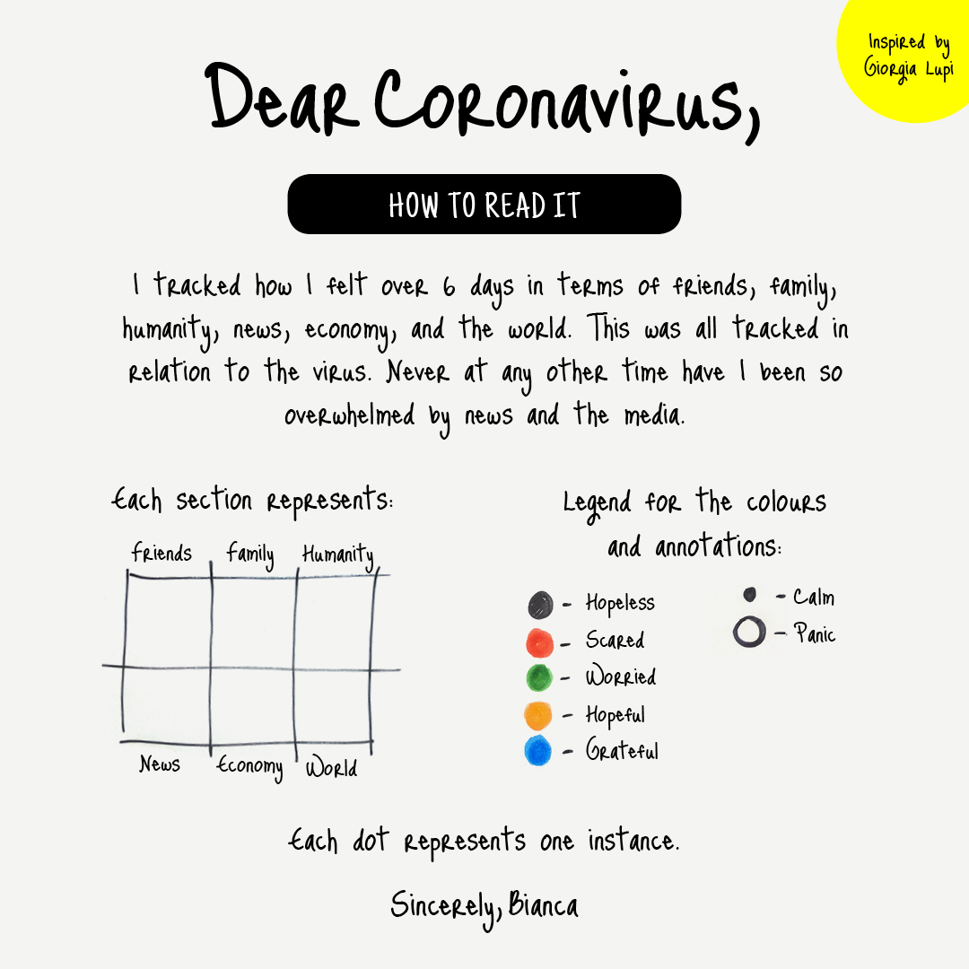
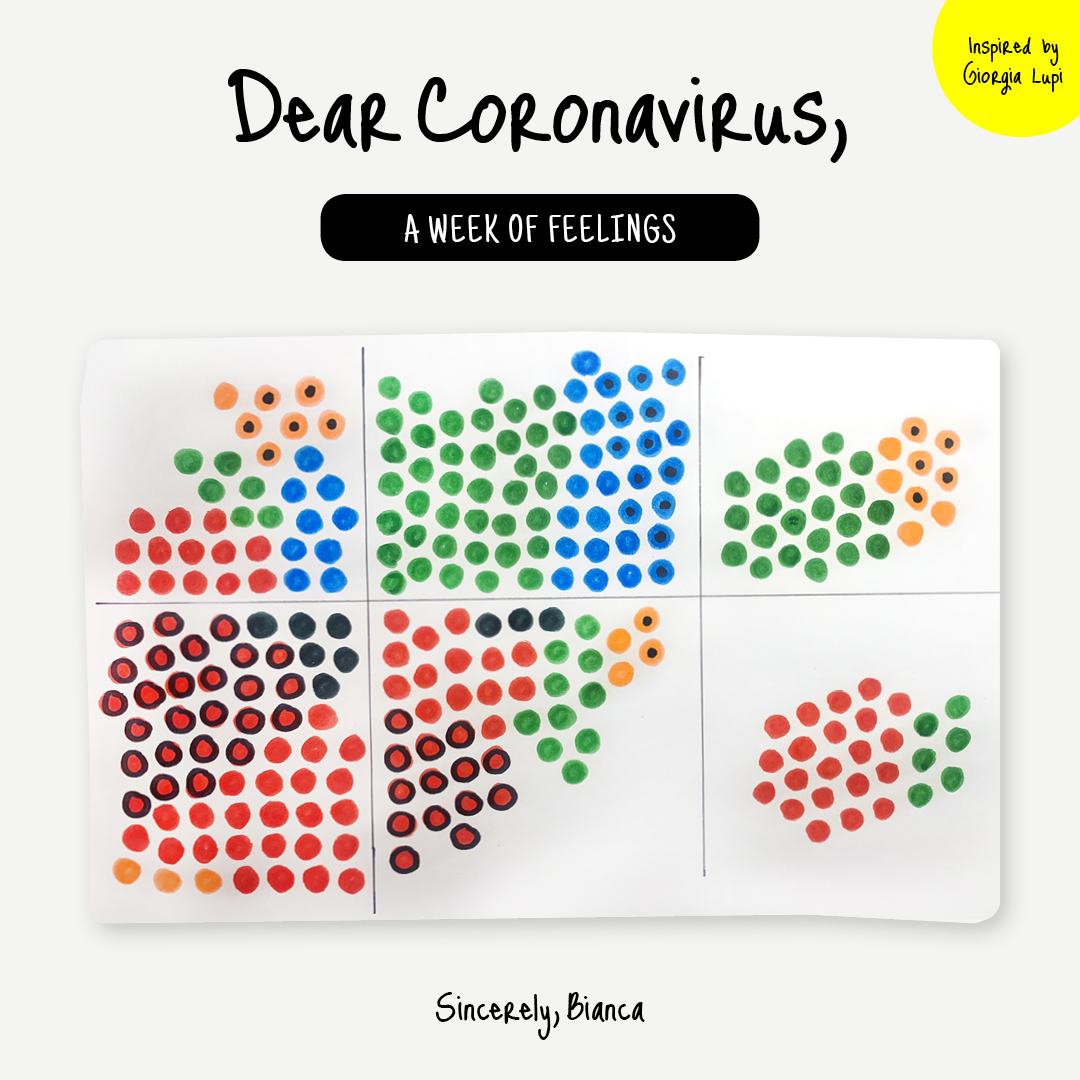
You don’t have to download your Netflix data to create a quantified self visualization. In this example, Bianca DiPietro tracked her feelings each day to see how her mood was altered when conversing with friends and family or monitoring the news. “Dear Coronavirus is a personal project I decided to take on during this very unprecedented time...this project aims to collect personal data at a time when things are not the ‘norm,” Bianca explained, “I’m hoping this project reinvigorates my creativity and teaches me something about an experience I’d never thought I’d live through. I hope that everyone can find a positive way to channel their stress, worries, and uncertainty.”
Analyzing your virtual communication
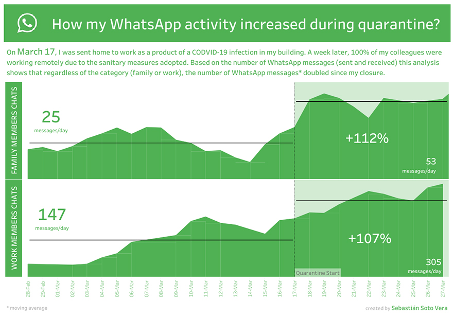
As social distancing continues, connecting virtually has never been more important. In this visualization, Sebastián Soto Vera illustrates how his WhatsApp activity has skyrocketed as a result of self-quarantining.
These are just a few ways that people are attempting to understand how the current situation is impacting their behavior, emotions, and more. How are you trying to make sense of everything during this unusual time?
Check out these resources for analyzing your own data
It can be difficult to find data sets that you care about. Listed below are a few resources to help you find data that’s relevant to your life, interests, or hobbies.
- Find and connect to data sets: Unlock your creative side by exploring data that you’re passionate about! Check out this blog post by Jacob Olsufka for tips on how to get your data from Twitter or Netflix.
- Download your music data: Explore how your listening habits have changed over time with this guide on visualizing your Spotify music data.
- Analyze your fitness data: Discover how to connect to and visualize your Strava fitness data in this blog post by Andy Cotgreave.
- Create your own data set: Read this blog post to learn how David Murphy created his own data set on the number of deaths in Game of Thrones. Get creative with your data—try tracking the number of pages you read, your mood throughout the day, or something that matters to you.
Share your quantified self vizzes
What are some things you’re doing to stay sane or entertained? Whether it’s FaceTiming your friends or trying out new recipes, we want to hear from you! Looking for a way to get involved? Check out Tableau Zen Master Sarah Bartlett's #IronQuest challenge on quantified self data.
Share your quantified self data visualization on Tableau Public and uncover new insights about yourself and the way life has changed as a result of this health crisis. Do you have a visualization that should be considered for Viz of the Day? Submit it here.
For trusted data resources on Coronavirus (COVID-19) head to the COVID-19 Data Hub.
Histórias relacionadas

Iron Viz 2025: Where Data Took Flight
 6 Maio, 2025

Meet 2025 Iron Viz Finalist Bo McCready
8 Abril, 2025

Meet 2025 Iron Viz Finalist Kathryn McCrindle
6 Abril, 2025