
NYC H+H draws on data fluency to make lifesaving decisions during the New York City COVID-19 surge
Rapidly built an emergency management landing page at the start of COVID-19 with multiple Tableau visualizations
Empowered a leadership “tiger team” to make real-time, data-driven decisions that helped save lives
Leveraged the NYC H+H data culture to support its ongoing population health mission to address avoidable human suffering
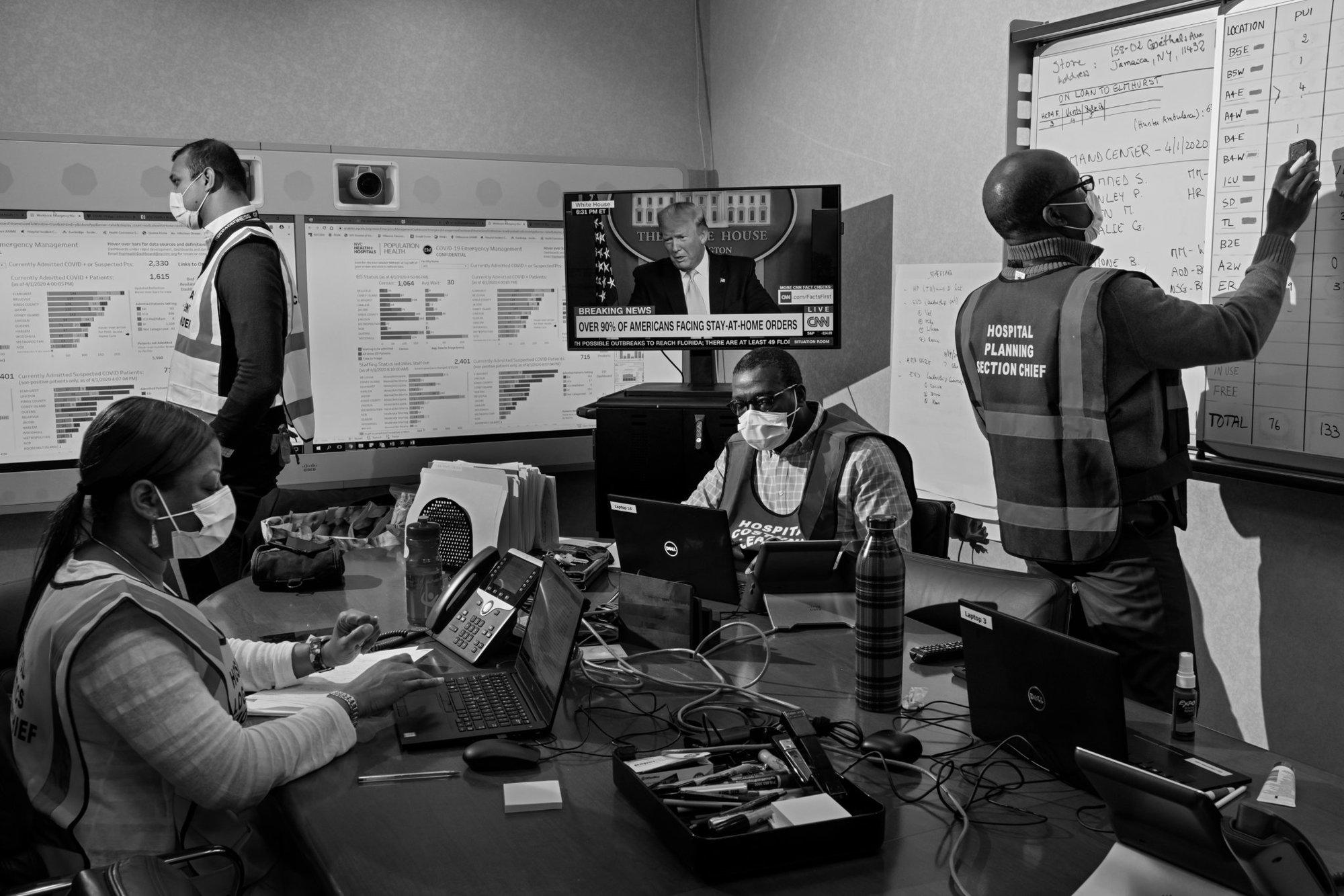
As the largest municipal healthcare system in the United States, NYC Health + Hospitals (NYC H+H) provides care to over one million New Yorkers annually, at more than 70 locations across New York City. NYC H+H was on the front line for one of the earliest and most severe surges in the COVID-19 global pandemic. To prepare for the surge, the health system activated its systemwide emergency response, and assembled a “tiger team” of operations and logistics personnel, medical and technical specialists, and hospital leadership, including the CEO. To support this team's daily meetings and throughout their roles, NYC H+H rapidly built a series of visualizations, starting with an emergency management landing page that showed up-to-the-minute graphs and tables of COVID-19 response information, from COVID admitted daily census numbers to ICU surge levels. This central landing page served as a hub for emergency response information by linking to multiple other dashboards, including a Patient Explorer that enabled users to ask questions and find answers about all COVID patients that had been admitted, such as demographic distribution, diagnosis history, ICU admittance and readmittance statuses, and trends in hospital admission dates and lengths of stay. Given the sensitivity of the data, access was limited to those who needed it for their COVID-19-related job functions. Other helpful dashboards included the Testing dashboard for seeing facility- and department-level data about the volume of confirmed, suspected, and negative COVID-19 cases, and the Beds dashboard, which provided invaluable insight into bed capacity and staffing levels at the height of the pandemic. Together, these dashboards helped NYC H+H make fast, informed, lifesaving decisions during a critical time by using data to guide leadership meetings and daily briefings. “We think of it as 'epidemic intelligence',” said Jenny Smolen, Tableau Manager at the NYC H+H Office of Population Health. “Bringing together on-the-ground operational information with high-quality data streams and clinical expertise through our Tableau dashboards enabled our care teams and administrators to take precise action in real time.” Many end users of the new platform agreed with this assessment. “The collaboration with our Population Health team and facility leadership was one of our greatest achievements during the COVID-19 surge,” said Gabe Cohen, NYC H+H Bellevue Associate Hospital Epidemiologist and Infectious Disease Physician. “We shared data broadly that was easy to interpret. Using the dashboards, our front line clinicians communicated their needs and the Population Health team translated this with incredible speed into flexible, usable, and meaningful metrics. This allowed us to make data-driven operational decisions in real time.”
*photo credit: Philip Montgomery, New York Times
The Patient Explorer dashboard enabled us to understand more about COVID-19 patient characteristics. When much was unknown about which patients were at greatest risk for complications, the dashboard allowed us to explore demographics, comorbidities, and clinical outcomes with ease.