Five things data storytellers can learn from 2020 US election poll trackers


In the latest episode of Chart Chat, Amanda Makulec, Steve Wexler, Jeff Shaffer and I discussed the lessons data storytellers can learn from 2020 US election poll trackers. Below are my five main takeaways that you can apply in your own analyses. To get the details, watch the full episode of Chart Chat.
Embrace uncertainty when making predictions

Predictions, even based on clean data sets, are uncertain. In 2020, many poll trackers emphasize this, possibly as a result of perceived errors in 2016. They do not want viewers to come away with an expectation that one candidate or another “will” certainly win.
Poll trackers are embracing uncertainty in various ways. The New York Times (NYT), CNN, and others, ask you to make decisions on the outcome. Instead of calling toss-up or swing states on your behalf, they force you to interact with the visualization and name discover these swing states for yourself. By engaging the user, they emphasize the fact that these are predictions—not mandated outcomes.
When you open FiveThirtyEight’s forecast pages, you see multiple US maps, each showing a different outcome. This is an arresting sight on first look that is, I think, very powerful. You can’t help but stop and process the meaning of what you’re seeing: multiple possible outcomes based on running multiple simulations. Further down the page, their main predictive plot is a chart with 100 dots showing representative outcomes of 40,000 simulations. You can’t come away from this without knowing you are seeing a range of possible outcomes.
Takeaway #1: When you communicate predictions in your organization, do your audiences understand the levels of uncertainty they contain?
Slow data adds context and fosters engagement
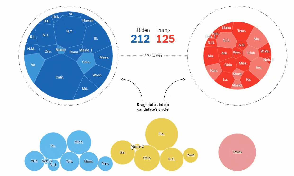
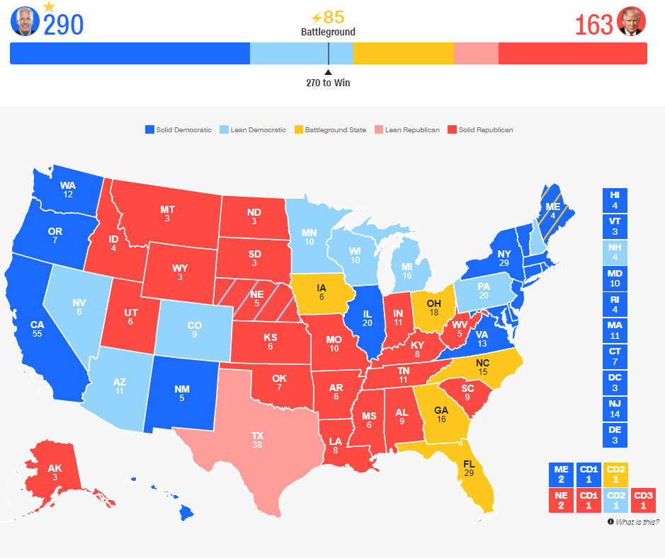
Figure 2: Visualization from the New York Times showing the swing states Trump and Biden need to win to reach 270 electoral votes.
When working with data, we are often too quick to jump to a conclusion and then share an insight, perhaps without really digesting the meaning. A clear trend for this election is how the trackers force a more meaningful engagement. “Slow data” as a concept was first proposed by the New York Times back in 2011, and further refined for the analytics industry by Stephen Few in 2013. More than ever it seems that these ideas are ones we should embrace.
Fiverthirtyeight first shows you an unusual set of maps. As you scroll, you start with a written analysis, not a chart. They are encouraging you to engage in the context of the data. Only after those two sections do you reach the predictive plot. In previous elections, this chart would’ve been at the top of the page, intended for your rapid consumption. The NYT’s drag-and-drop visualization that also forces you to interact is another example of engaging readers: you can’t reach a result until you have acted.
Although we didn’t discuss it in Chart Chat, the Financial Times also adds a lot of commentary among their poll tracker charts: As you look at their tracker page, each chart is interspersed by commentary that is updated regularly.
All these examples bring people back from the brink of making conclusions too quickly, and encourage people to engage more deeply with the information.
Takeaway #2: What ways do you provide additional context to your data displays? Do you encourage people to consider more than just the height of a bar on a bar chart or the slope of a line chart?
Cutesy or dry? Novel or complex?
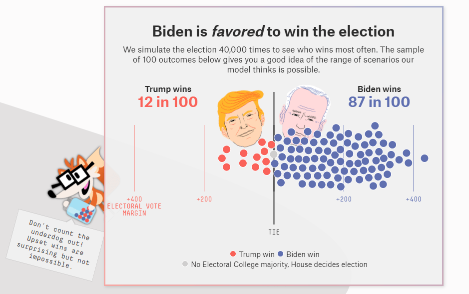
Figure 3: Visualization from FiveThirtyEight showing a sample of 100 outcomes of the 2020 US presidential election.
One of the biggest challenges for any data communication is whether to make it dry and functional, or cute and engaging? Both are valid choices, but you must have reasons for choosing either path.
FiveThirtyEight has leaned heavily towards a cutesy and engaging approach. The Fivey Fox mascot pops up next to most charts with call-outs to more further information. Their charts have a playful design, including caricatures of Trump and Biden.
We compared how CNN’s “Road to 270” tracker is essentially the same as the NY Times tracker In both cases, you choose how the states will cast their electoral votes and watch as progress towards one candidate having 270 electoral votes changes. The NY Times chart has bouncy circles that you drag into a cute Voronoi circle chart. The circles pop around and it’s fun to play with. CNN has you click on a map which changes colors of a horizontal stacked bar. Functionally, the two charts are the same, but one is playful while the other is functional.
I find the NYT’s draggable bubbles a middle ground between cute and dry. The way they bounce as you let them go is engaging. Most other organizations choose a more austere, dry path.
Is dry better than cute? I cannot answer that because it mostly comes down to personal preference. Personally, I’ve stopped noticing Fivey Fox now I’ve seen him many times, but Amanda said she likes him and thinks his inclusion brings a moment of levity to what is a very serious subject.
Takeaway #3: Which approach do you take for your internal or external data communications? Do you consider whether to bring levity to your insights, or stay austere and serious?
Geospatial data doesn’t have to be a map
There’s another reason to compare the CNN and NYT visualizations. CNN chose to encode their US state data on a map. NYT put them in circles based on whether they will vote Trump or Biden. CNN’s approach means you can readily find any given state, if you know US geography. If you want to look up a specific state, it’s easy. In the NYT chart, it is not easy to find any particular state, requiring you to read through state abbreviations.
This doesn’t mean the NYT got it wrong. By putting states beneath a candidate, and making the circle bigger or smaller, you can more easily see which candidate is more likely to win. A map doesn’t afford dynamic changes like that.
These are decisions we always have to make when working with geospatial data: a map is always tempting, but sometimes there are options that reveal different insights.
Takeaway #4: Before you make a map with your geospatial data, ask yourself if it’s the best way to share your insight.
Data geeks love to hunt for historical Easter eggs
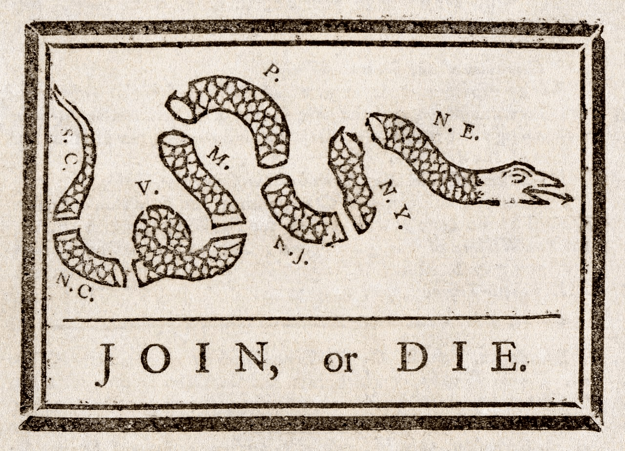
We talked at length about “The winding path to victory” snake chart on the FiveThirtyEight website. It’s an unusual method of displaying data. Personally, I find it a bit confusing, but during Chart Chat, others pointed out that the novelty is a good way to draw in beginners. I recommend watching that segment because the discussion was fascinating.
The snake chart has been a long-standing part of their poll tracking, but Steve called out its similarity to Benjamin Franklin’s Join or Die cartoon from 1754. A conversation on Twitter has, at time of writing, yet to determine if the similarity is by design. Either way, I hope it is. Our field of visualization sits on the shoulders of giants. The 18th century was a period of great experimentation in communicating data, and much that was developed then became part of what we now call “best practice.”
Takeaway #5: Go learn about the history of our field. It is fascinating to dig into!
That is the list of our takeaways from the election poll trackers we’ve been reviewing. I’d love to know what other lessons you’ve found.
If this is interesting, make sure to follow me on Twitter (@acotgreave) during the night of the US presidential and general election, when I’ll be doing live commentary of the best and worst data visualizations from TV networks: make sure to follow the hashtag #ElectionViz.
Also, check out the election projects Tableau has been doing with Survey Monkey and Axios.
Autres sujets pertinents

5 Ways to Use Tableau Public to Achieve Your Goals
 11 janvier, 2025

World Mental Health Day: Elevating Awareness Through Data Visualization
 10 octobre, 2024

From TV Screens to Tableau: Visualize Your Favorite Shows with IMDb
 31 août, 2024