Histograms
Understanding and using Histograms
How to read Histograms
Histograms split a single continuous measure into bins, or groups, that represent a specific range of values. Data points are then grouped into these equally sized bins. The bins are then displayed visually as bars stacked next to each other. To measure the scores of Olympic divers, one bin could contain scores between 2 and 4, the next between 4 and 6 and another the scores between 6 and 8.
Bins are measured by the number of occurrences within each range of values. This count will alter the appearance of the view depending on where the values from the data are concentrated. When the values are concentrated on one side or the other of the middle it is called skew. Other ways the data could display are called:
- Bimodal distribution - which has two peaks
- Plateau Distribution - which rises to a certain level and stays there for most of the bins
- Edge Peak Distribution - which looks like a normal frequency distribution, except one bin at the end is higher than the rest, serving as a sort of tail
The x-axis used on a histogram functions as the width of the bars, while the y-axis functions as the height. Unless a particular category has no frequency at all, there should be no spaces between bars.
There are two primary ways of displaying data in a histogram: Count of values within bins, and Density of values (% of Total).
What type of analysis do histograms support?
Histograms work best when displaying continuous, numerical data. If the user wants to analyze the average number in a group of measurements, a histogram can give a viewer a grasp of what to generally expect in a process or system. A restaurant that wants to display its busiest hours online might use a histogram. It would split the average number of customers that visit every day into bins that measure how many customers visit on average every hour.
Unlike bar charts, histograms do not support comparisons between two or more categories. These charts make it easy to analyze distribution of the numbers, and the largest frequencies. They make it easy to perform statistical analysis, especially when it comes to analyzing population data (Ex. age, sex, ethnicity).
Some other measurements that fit into a histogram might include depth of water or difference in temperature. A country’s census might also work in histogram form if the goal was to show the number of people who were born in a certain decade.
For data sets that impact customers, consumers, or clients, histograms can be used to measure satisfaction. Some customers may feel their needs aren’t being met and might score the process with a low number, while others score it with a high number. A histogram can help you find the average and determine if the process itself needs improvement.
How to use Histograms for Visual Analysis
To plot a histogram you need a continuous value and an axis starting at zero to properly display the count of values within each bin. While these counts can be zero, there won’t be negative values.
You should use a histogram if:
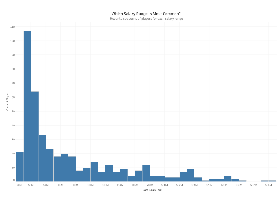
- You would like to explore how members within a category in a dataset are distributed. i.e. The breakdown of salaries within an organization with the ability to see how balanced your pay scale is, or the count of bank members that have X amount of dollars in their accounts
- You have one continuous, numerical value that can be split into multiple bins
- You are looking to understand the distribution of values within a single category
Avoid using a histogram if:
- You need to analyze multiple dimensions simultaneously
- Your data set isn’t scaled correctly
- You want to compare the specific values of individual data points
Great example of a Histogram
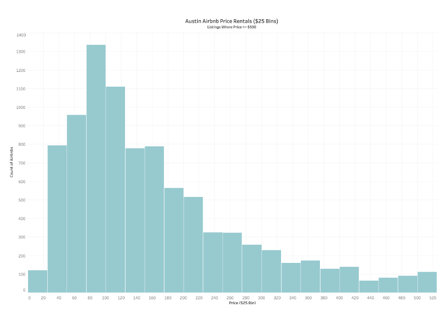
This histogram looks at Airbnb rentals in Austin, Texas, showing price per day in $25 bins. The chart has a right-skewed distribution, and the average price for an Airbnb seems to be between $50 a night and $150 a night.
- This histogram uses only one color
- It looks at one measure
- It has an easily estimated average