Enhancing Data Communication by Helping Authors Align Charts with Captions


In today's data-driven world, visualizations play a crucial role in conveying complex information to readers. Often, chart authors pair charts with caption text to enhance the comprehension of the data presented. However, recent research has shed light on the importance of ensuring that both the chart and its accompanying caption emphasize the same aspects of the data. When they do, readers tend to remember and grasp key takeaways effectively. But when there's a mismatch between the two, readers rely heavily on the chart and might miss vital information presented in the text. A paper presented at the IEEE VIS 2023 Conference in Melbourne, Australia, EmphasisChecker: Aligning Chart and Caption Emphasis for Effective Data Communication delves into this critical aspect of data communication.
The Importance of Emphasis Alignment
To understand the practicality of achieving alignment between chart and caption emphasis, the researchers conducted a survey of real-world publications. They analyzed 280 chart-caption pairs from diverse sources such as news media, poll reports, government reports, academic articles, and Tableau Public. The findings were revealing: professional authors managed to align chart and caption emphasis around 65% of the time, leaving mismatches in the remaining 35%. Interestingly, among the general public, mismatches were even more common.
To gain insights into whether charts and captions indeed emphasize the same information in practice, the research team conducted a comprehensive survey of chart-text pairs from a variety of real-world sources, including recognized publishing venues—New York Times, BBC, and Vox, as well as poll reports from organizations such as Pew Research and government reports from entities like the US Treasury and the International Monetary Fund, along with Tableau Public, a platform where authors, both professional and non-professional, share charts and captions created using Tableau.
The results of this analysis provide valuable insights into the alignment of chart and caption emphasis in real-world chart-caption pairs. In cases where professional authors were responsible for crafting both the chart and its accompanying caption, there was a noticeable trend—approximately 65% of chart-caption pairs successfully aligned their emphasis. This means that the chart effectively emphasized the author's message in the text, and the text provided a coherent explanation of the visually prominent features in the chart. However, it's essential to note that emphasis mismatches were still relatively common, occurring in 35% of the chart-caption pairs. In these cases, the chart emphasized a different data feature than the text. These findings suggest that even in professionally authored documents, there's room for improvement in aligning chart and caption emphasis.
Interestingly, when examining chart-caption pairs published on Tableau Public, a different pattern emerged. A staggering 93% of the text descriptions for charts on this platform were categorized as basic captions that did not describe specific features within the charts. The prevalence of basic captions in Tableau Public can be attributed in part to the default behavior of Tableau Software, which provides basic captions as a starting point. Authors often do not invest additional effort to discuss the specific features visible in the charts. Unfortunately, prior research has indicated that such basic captions are of limited use to readers and do not significantly contribute to their understanding of the key takeaways. This underscores the need for additional support and guidelines for authors on platforms like Tableau Public to enhance the quality and alignment of chart and caption emphasis.
Introducing EmphasisChecker
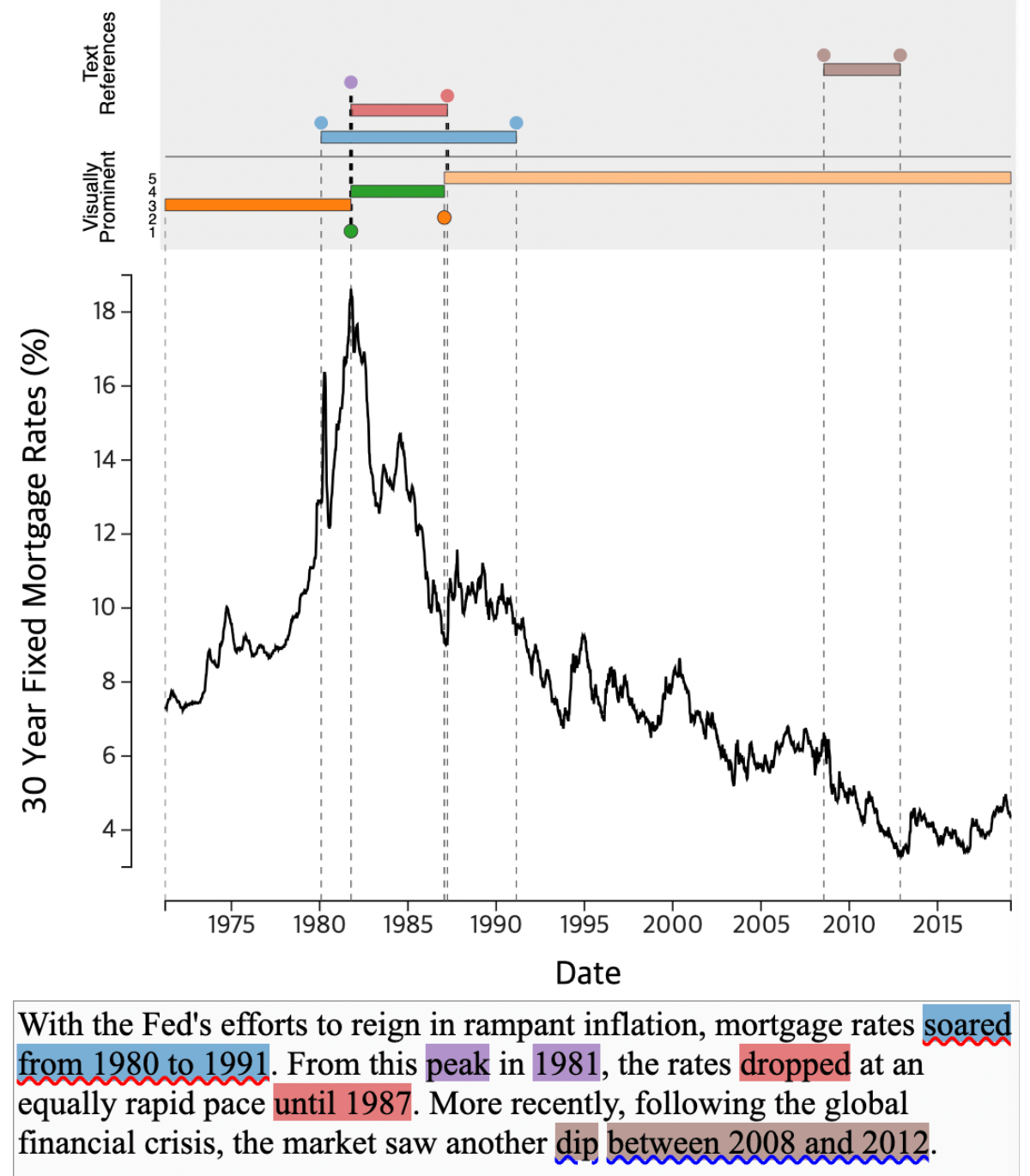
Fig. 1: As the author writes a caption about the chart (c) in the textbox (d), EmphasisChecker shows the chart’s visually prominent features in (b) and the text references to the chart features (a). The interface shows (b) visually prominent chart features (unmatched features in orange and matched features in green, marks above the chart). It uses circles to depict point features (e.g., local extrema; the peak around 1981) and bars to depict trend features (e.g., the rising trend up to 1981). In addition, it shows (a) references between the chart and the text (i.e., blue, red, purple, and brown marks at the top of the page and on the text). In the input text box (d), the tool adds a red squiggly underline on the phrase ‘soared from 1980 to 1991’, a typo of ‘soared from 1980 to 1981’ because the phrase does not match the data in the chart. The tool also adds a blue squiggly underline on the phrase ‘dip between 2008 and 2012’ because the phrase does not match any of the prominent chart features.
Motivated by these survey findings, the researchers developed EmphasisChecker, an interactive tool aimed at helping authors create charts and captions that align their emphasis effectively. The tool operates on time-series line charts, which are one of the most common types of charts found on the web and Figure 1 describes the interface.
Let's first dive into a real-world scenario where Tess is preparing a presentation for her fellow policymakers and intends to make a compelling case for the construction of more homes based on historical data related to real home prices. To ensure that her message is clear and impactful, Tess decides to use EmphasisChecker.
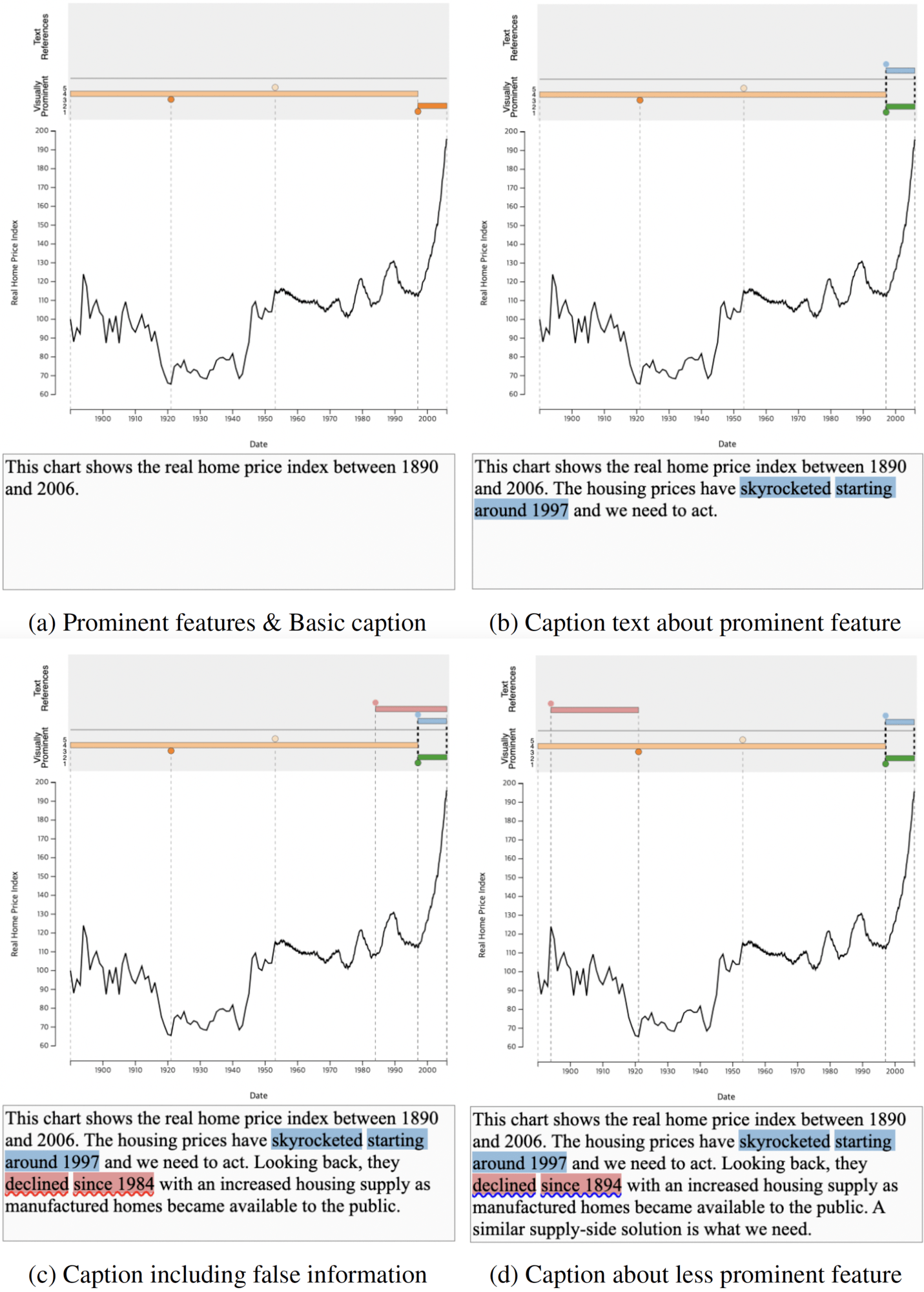
Fig. 2: Usage scenario for EmphasisChecker. The chart shows the real home price index between 1890 and 2006. (a) Prominent features are shown on top with a basic caption not describing any specific feature. (b) Caption text matches the most prominent visual feature (sharp rise on the right; blue highlight in the UI). (c) Typo in the caption text indicated by a red squiggly underline on ‘declined since 1984’. (d) Caption text matching a less prominent feature, indicated by a blue squiggly underline on ‘declined since 1894.
Step 1: Viewing Visually Prominent Features
As Tess begins her journey with EmphasisChecker, she first loads the relevant data into the tool. The time-series chart in front of her depicts the real home price index over time. EmphasisChecker swiftly identifies the visually prominent features within the chart, highlighting them as orange circles and bars just above the chart.
Upon analysis, EmphasisChecker identifies the recent low point in 1997 and the subsequent rising segment as the top two most prominent features, denoted by a darker shade of orange. It also recognizes the global minimum point around 1920 and two other less prominent features, represented by lighter shades of orange.
Step 2: Typing a Basic Caption
Tess begins crafting her caption text by describing the time range covered by the chart. She types, "The chart shows the real home price index between 1890 and 2006" into the text box below the chart. With her basic caption in place, she runs the text analysis by hitting [SHIFT-ENTER] (Figure 2a). However, after the analysis is complete, Tess notices that there is no change in the region above the chart. This indicates that her initial text lacks any reference to specific features within the chart.
Step 3: Typing a Caption that Matches Prominent Feature
Determined to enhance her caption and align it with the visually prominent chart feature, Tess turns her attention to the most noticeable element—the spike after 1997. She hovers over the orange circle closest to the bottom and the orange bar directly above it to understand their significance within the chart.
Observing the sharp increase after 1997, Tess realizes that this spike is not only visually prominent but also serves as compelling evidence of the housing market's dire situation. She decides to include this feature in her caption text.
Tess types, "The housing prices have skyrocketed starting around 1997, and we need to act." After running the text analysis, the interface highlights the phrase 'skyrocketed starting around 1997' in blue and displays a blue circle on the year 1997, the endpoint explicitly mentioned in the text. Additionally, a bar starting in the year 1997 establishes the reference between the chart and the caption. Furthermore, the interface highlights the top two prominent chart features in green, indicating that Tess has successfully matched the emphasis in her caption with these features (Figure 2b).
Step 4: Typing a Caption with an Error
As Tess continues to explore the chart, she identifies a declining trend between 1894 and 1921. Believing this information would strengthen her message, she begins to type, "Looking back, they declined since 1984 with an increased housing supply as manufactured homes became available to the public." However, this time, Tess notices a red squiggly underline beneath the phrase 'declined since 1984' in her caption after running the text analysis. Curious, she hovers over the text and realizes her mistake—she had mistyped '1984' instead of '1894'. Tess quickly corrects the error (Figure 2c).
Step 5: Pushing through with a Caption about a Less Prominent Feature
With the typo fixed, Tess proceeds to complete her caption with the sentence, "A similar supply-side solution is what we need." After confirming the change by pressing [SHIFT-ENTER], Tess notices that the detected time range has been revised to the one she initially intended. However, she also sees a blue squiggly underline beneath the phrase 'declined since 1894'. Although the red bars match with the phrase, they do not correspond to any of the top five prominent features. Tess reflects on the unmatched prominent features, still displayed in orange. She recognizes that the third most prominent feature, corresponding to the global minimum in 1921, serves as the endpoint of the downward trend she just described (Figure 2d). With her caption now crafted and aligned with the chart's visually prominent features, Tess is now ready to share her updated chart and caption with her team.
How Does it Work?
EmphasisChecker is a tool designed to assist users in aligning chart emphasis with caption text to effectively convey data-driven messages. It provides an intuitive interface that allows users to edit both the chart and the accompanying caption. Users can not only write captions but also modify chart dimensions and adjust the x- and y-axis ranges, ensuring that the visual representation of data aligns seamlessly with the intended message.
The tool consists of two primary components:
1. Time-Series Prominent Feature Detector: This component identifies visually prominent features within a time-series line chart by analyzing features that persist through different levels of detail. It leverages the Ramer-Douglas-Peuker (RDP) line simplification algorithm to compute ε-persistence, which measures the visual prominence of both point and trend features. By varying the ε threshold, EmphasisChecker captures features that persist through different levels of detail, effectively identifying visually prominent elements in the chart. These features are highlighted above the chart, with darker shades denoting greater prominence. Users can hover over these highlighted features to gain a sense of their significance.
2. Text Reference Extractor: This component analyzes the caption text to identify time references and data descriptions, aligning them with the corresponding chart data. The component first extracts time references from the caption text, including mentions of specific points in time or time durations. It then converts these references into a standardized format to match the granularity of the time-series data in the chart. The tool also identifies data descriptions in the text by searching for predefined keywords related to trends and extrema. These keywords are compared using BERT embeddings to capture synonyms and expand the scope of matching.
EmphasisChecker then pairs time references with data descriptions, ensuring that they are linked appropriately within the caption. Complex sentences referring to multiple time points and features are disambiguated to create accurate time ranges. Next, the tool matches the text references with the chart data by inferring the chart points being referred to based on the type of data description (e.g., maximum, minimum, upward trend, downward trend). Finally, the tool compares the referenced features with the prominent chart features detected earlier. If a match is found, it highlights the feature in green, indicating alignment between the chart and caption emphasis. Conversely, mismatches trigger blue squiggly underlines to alert authors to any discrepancies.
A preliminary evaluation of EmphasisChecker showed that all 12 participants who took part in the study, considered the tool to be significantly more useful than a baseline tool for authoring chart-caption pairs. Participants highlighted its role in aligning chart features with text descriptions and helping find errors in their captions during the authoring process. These findings suggest that EmphasisChecker shows promise in enhancing the authoring process and improving chart-text alignment, making it a valuable tool for effective data-driven communication.
Summary and Future Thoughts
In conclusion, the research presented in this paper highlights the importance of aligning chart and caption emphasis for effective data communication. EmphasisChecker enhances the process of authoring charts and captions by aligning text emphasis with chart features, providing valuable guidance for effective data-driven communication. Future directions include offering more information about detected features, applying natural language generation techniques, suggesting automatically generated captions, providing explanations for emphasis mismatches or factual errors, and integrating external information to improve guidance. The tool's guidance could be personalized and adjusted based on the caption authoring process to help mitigate biases. Expanding the tool to cover other chart types and features, such as seasonal patterns or multi-line charts, is also a potential future development. The code for this tool is available at: https://github.com/dhkim16/EmphasisChecker-release.
Autres sujets pertinents
Once Again, with Style: Understanding and Supporting Partial Reuse in Dashboard Authoring
 5 juin, 2026
From ‘Here’ to ‘There’: Exploring Proximity Semantics in Multimodal Data Exploration
 3 juin, 2026

Which Model Speaks Your Data Language? A User-Centered Approach to Evaluating LLMs for Conversational Visual Analytics
 14 avril, 2026