DataFam Roundup: August 14–18, 2023


Welcome! Dig into this week's DataFam Roundup—a weekly blog that brings together community content all in one post. As always, we invite you to send us your content—and the DataFam content from your peers that have inspired you! Find the content submission form here.
Community Highlight
To recognize new and consistent Tableau contributors—we’re excited to have a section within the weekly DataFam Roundup called the Tableau Community Highlight. Find out how to get involved.

Abhishek Nag, Data Visualization Engineer Haryana, India
Abhishek Nag is a Data Visualization Engineer I at Expedia Group. He started his Tableau journey last year motivated by a career shift to Data Analysis and Visualization. Through a Udemy course and resources on YouTube and Linkedin, Abhishek has continued to hone in his Tableau skills. He now shares his knowledge through his own YouTube channel.
On his YouTube channel, @Datavizard, Abhishek tries to cover a wide breadth of topics ranging from dashboard walkthroughs to tips and tricks to Tableau basics. He especially enjoys making videos that cover concepts that he found difficult to understand when he was learning Tableau. His goal is to inspire more people to get into the Data Visualization field.
Abhishek is also active on Tableau Public where he participates in community projects such as #MakeoverMonday and publishes vizzes on other topics of interest to him such as Steph Curry’s Popcorn Ratings, UK Religious Demographics, and the Fifa World Cup. He finds a lot of inspiration from other vizzes and tries to understand calculations and implement them in his own vizzes when possible.
Connect with Abhishek on Linkedin, X, Tableau Public, and on his YouTube channel.
DataFam content
Dive into content created by the Tableau Community:
-
CJ Mayes: Designing Better Maps with Dennis Kao
-
Adam Mico: Wearing My Tableau Colors: A Journey Beyond Software
-
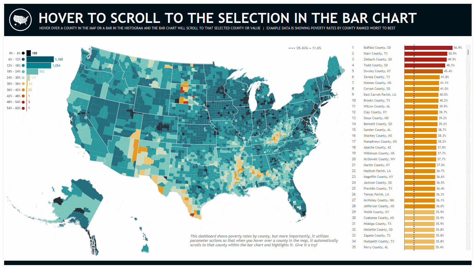
Kevin Flerlage, The Flerlage Twins: Hover to Scroll to the Selection in the Bar Chart
-
Andy Kriebel, VizWiz: An 8-Chart Guide to Dashed Lines in Tableau
-
Tim Ngwena, Tableau Tim: Length function to calculate lengths of spatial lines | New in Tableau 2023.2
-
Women in Data Viz: August 2023 Newsletter
-
Will Sutton: Charting Success: Becoming a rising star in the Tableau Community, Gbóláhàn Adébáyò | Behind the Viz
-
Seoyeon jun: Step-by-Step Guide to Designing an Ads Performance Marketing Dashboard with Tableau
-
Louis Yu: GNV Live Builds with Louis Yu | Pac-ful of characters
-
Heidi Lanford, The Data Leadership Collaborative: Transformational or Operational CDAO: Which One Are You?
-
Serios Group: The Benefits of Attending a Tableau User Group
-
Abhishek Nag, Datavizard: Workbook Walkthrough || Steph Curry's Popcorn Rating || #tableau
Team Tableau
Staying connected with the DataFam just got a whole lot easier! Log in to your Tableau Public account and explore the Recent Activity channel to find the latest updates from your network. With the Recent Activity channel you can:
- View recently published vizzes from the authors you follow
- Find recently favorited vizzes from authors in your network
- Discover new authors who inspire you
The more authors you follow, the more content you’ll see!
Upcoming events and community participation
-
Let’s Talk: AI Webinar Series Launch with Leah McGowen-Hare - 8/16 at 11am PDT Join us for the inaugural episode of Let’s Talk: AI webinar series hosted by Leah McGowen-Hare, SVP of Trailblazer Community. She will be joined by Paula Goldman, EVP, Chief Ethical & Humane Use Officer at Salesforce for a conversation on AI ethics and responsible use. Through fireside chats with thought leaders, this exciting new series aims to inspire curiosity, creativity, and critical thinking about AI’s potential. Come along as we embark on this transformative tech journey together!
-
Tableau Buddy for students and data aspirants (FREE) with Prasann Prem
-
Viz Collab is back: Hello everyone! I’m excited to be opening #VizCollab back up for another round of matches! In the last year I matched around 40 people for some amazing vizzes, including Viz of the Days and a viz that was featured in a local publication. So if you want to find a collaboration partner sign up.
-
VizIt Sydney is happening October 31 - November 1! A Tableau Community Conference, by the Datafam for the Datafam. Sign up to be the first to know when registration opens and submit to be a speaker now
-
Michelle Frayman, Zak Geis and Nicole Klassen: Viz Feedback Office Hours
-
Data Book Club: This summer, the Data Book Club is reading Living in Data: A Citizen's Guide to a Better Information Future by Jer Thorp.
-
Community Calendar and Upcoming Events: stay up-to-date on the latest Women in Dataviz events and other data visualization-related events. If you'd like to submit an event to the calendar, please fill out this form.
Vizzes
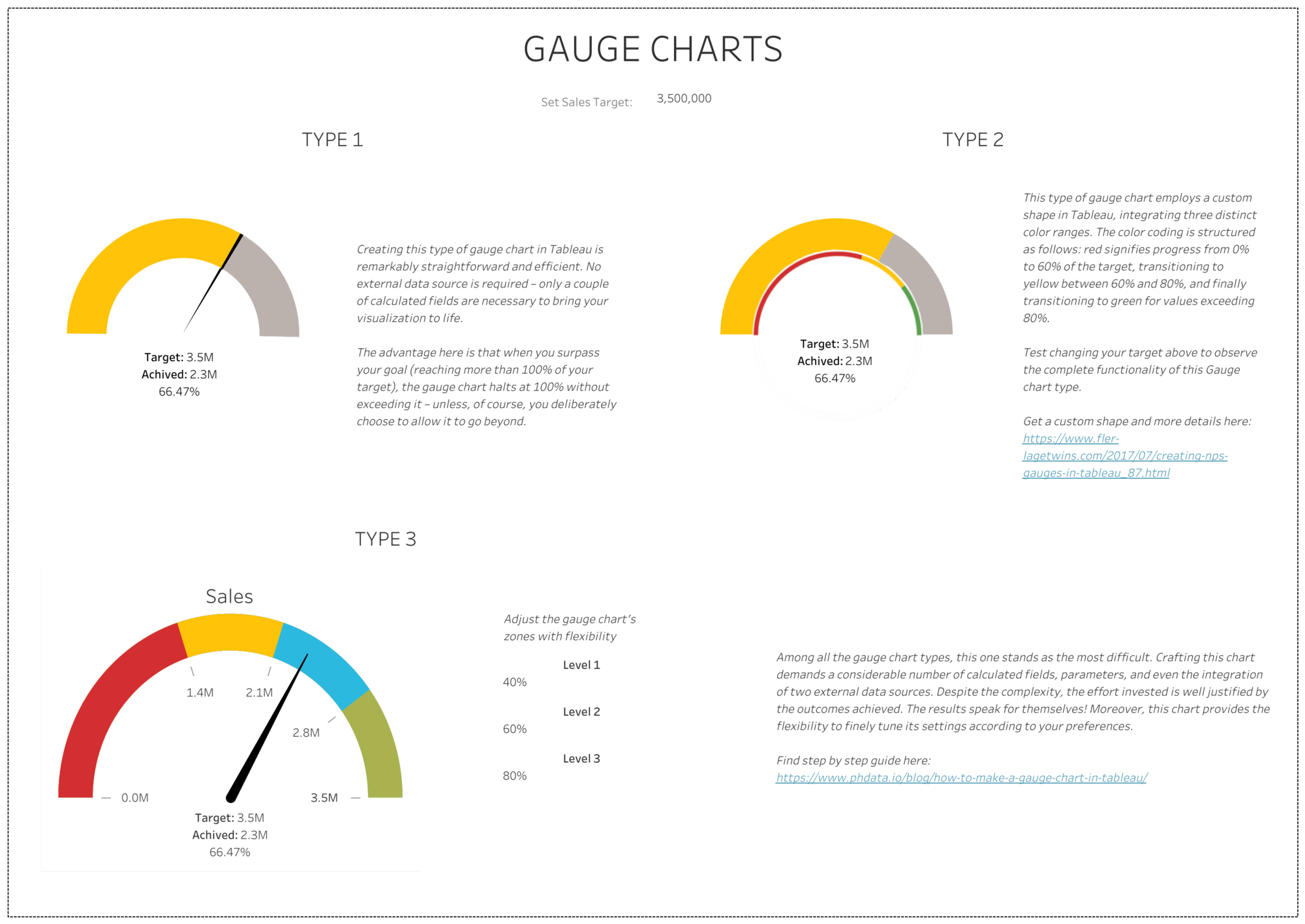
Katerina Protivenskiy: 3 types of Gauge charts
See the latest Viz of the Day, trending vizzes, featured authors, and more on Tableau Public.
Check out some inspirational vizzes created by the community:
-
Katerina Protivenskiy: 3 types of Gauge charts
-
Louis Yu: Pac-ful of Characters
-
Stephen Mutea: Energy Consumption Per Person
Community Projects
Back 2 Viz Basics
A bi-weekly project helping those who are newer in the community and just starting out with Tableau. Not limited just to newbies!
Web: Back 2 Viz Basics
Twitter: #B2VB
Week 15: Percent Change
Workout Wednesday
Build your skills with a weekly challenge to re-create an interactive data visualization.
Web: Workout Wednesday
Twitter: #WOW2022
Week 33: Map Drill-down Challenge
Makeover Monday
A weekly social data project.
Web: Makeover Monday
Twitter: #MakeoverMonday
Week 33: Energy Use per Person
Preppin' Data
A weekly challenge to help you learn to prepare data and use Tableau Prep.
Web: Preppin’ Data
Twitter: #PreppinData
Week 33: HR Month - Combinations
DataFam Con
A monthly challenge covering pop culture and fandoms.
Web: DataFam Con
Twitter: #DataFamCon
April 2023: Kids Month!
EduVizzers
A monthly project connecting real education data with real people.
Web: Eduvizzers
August 2023: Data Analytics Programs in the U.S.
Games Night Viz
A monthly project focusing on using data from your favorite games.
Web: Games Nights Viz
Twitter: #GamesNightViz
Season 2: Exploding Hungry Pie-Charts
Iron Quest
Practice data sourcing, preparation, and visualization skills in a themed monthly challenge.
Web: Iron Quest
Twitter: #IronQuest
Advanced Chart Types
Storytelling with Data
Practice data visualization and storytelling skills by participating in monthly challenges and exercises.
Web: Storytelling with Data
Twitter: #SWDChallenge
August 2023: what does your audience know?
Project Health Viz
Uncover new stories by visualizing healthcare data sets provided each month.
Web: Project Health Viz
Twitter: #ProjectHealthViz
June 2023: Funding for Research for Various Conditions and Diseases
Diversity in Data
An initiative centered around diversity, equity & awareness by visualizing provided datasets each month.
Web: Diversity in Data
Twitter: #DiversityinData
May 2023: Mental Health Awareness Month and LGBTQ+ Representation in film
Sports Viz Sunday
Create and share data visualizations using rich, sports-themed data sets in a monthly challenge.
Web: Sports Viz Sunday
Twitter: #SportsVizSunday
January 2023: Is it a Sport or a Game?
Viz for Social Good
Volunteer to design data visualizations that help nonprofits harness the power of data for social change.
Web: Viz for Social Good
Twitter: #VizforSocialGood
June 9 - July 18, 2023: Gord Downie & Chanie Wenjack Fund
Real World Fake Data
Create business dashboards using provided data sets for various industries and departments.
Web: Real World Fake Data
Twitter: #RWFD
Session 5: Diversity Score Card
Data Plus Music
A monthly project visualizing the data behind the music we love!
Web: Data Plus Music
Twitter: #DataPlusMusic
Autres sujets pertinents
DataFam Roundup June 2026
DataFam Roundup May 2026

Iron Viz 2026: Read Between the Data
 28 Mai, 2026