
10 Best Practices for Building Effective Dashboards
Learn how to make your dashboards more informative, compelling, and effective
Download this free whitepaper
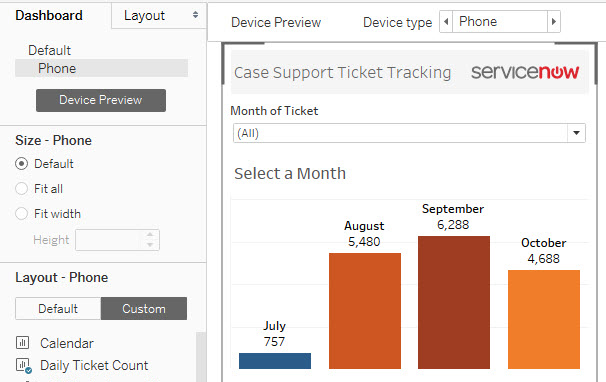
When a dashboard is done right, people wonder how they ever lived without it. Why? A well-designed dashboard is a launch point for insights into all of your systems. Armed with data from your ticketing, budgeting or monitoring systems, your IT organization can make faster decisions based on a single source of truth.
Read this whitepaper to discover how:
- Thoughtful planning will allow you to become familiar with your dashboard audience, evaluate proper display size, and appropriately plan for fast load times.
- Informed design draws from the “sweet spot” of visual cues, is critical of view and color quantity, incorporates interactivity to encourage exploration, and considers progressive formatting.
- Refining your dashboard puts the onus on tooltips, emphasizes the story within your story, eliminates clutter, and sets you up for dashboard testing opportunities.
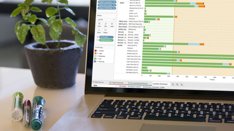
Tableau is one of the best tools out there for creating really powerful and insightful visuals. We’re using it for analytics that require great data visuals to help us tell the stories we’re trying to tell to our executive management team.