Designing Accessible Dashboards for Screen Reader Users


Dashboards are used to monitor and share data across a wide variety of domains ranging from business and finance to public policy and healthcare. The combination of multiple visual elements (e.g., charts, text, filtering widgets) and interactivity between these elements makes dashboards powerful interfaces for data analysis and communication. However, these very characteristics of dashboards that make them powerful also often make them inaccessible to people with blind and low vision (BLV) who primarily interact with dashboards via screen readers such as JAWS and VoiceOver. With current dashboards, at best, screen reader users get access to the underlying dataset or can navigate through the individual elements of a dashboard—neither of which are equivalent to the experience of leveraging the visual structure of a dashboard or dynamically querying data using the supported interactions.
Through a collaborative design study, Tim Harshbarger (Accessibility Consultant at Deque Systems), Darrell Hilliker (Accessibility Support Engineer at Salesforce), Jennifer Mankoff (the Richard E. Ladner Professor at the University of Washington), and I developed a system to generate web-based dashboards that are more accessible via screen readers.
Design Process and User Experience
We followed a participatory design process to ensure that our motivations were grounded in real challenges faced by screen reader users and worked closely with Tim and Darrell (both screen reader users) throughout our research. The design process lasted over four months, and included weekly or bi-weekly meetings where we reviewed and iterated on prototype dashboards. At a high-level, we noted that making dashboards accessible via screen readers required a (minimal) set of three components: 1) a textual description of the dashboard, 2) a document object model (DOM) structure that was easy to navigate, and 3) a summarization of key changes after data updates (e.g., via filtering).
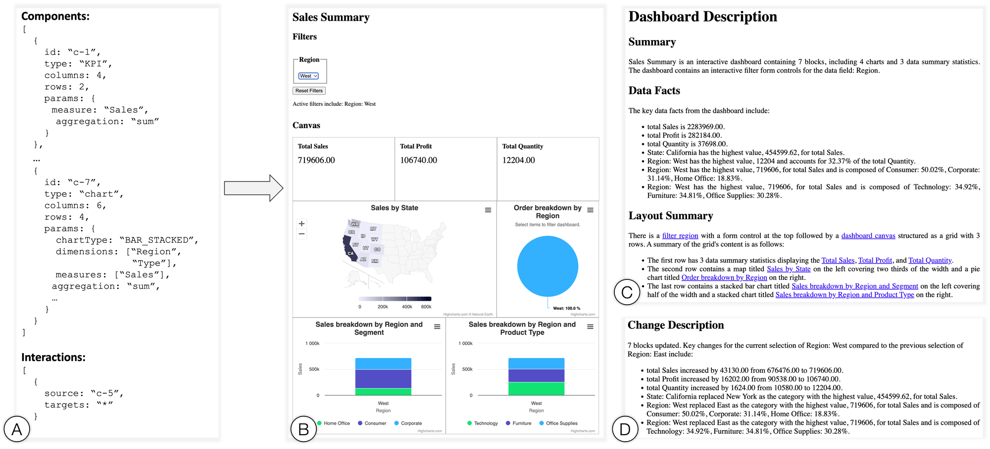
Example where Azimuth is provided with a JSON specification of a dashboard displaying sales data for a fictional company, Superstore. The system, in response, generates a web page with three sections including: 1) a screen reader-friendly dashboard, 2) a textual description summarizing the dashboard, its layout, and key data takeaways, and 3) a dynamic text blurb that summarizes any data changes made to the dashboard during interaction.
Incorporating the aforementioned design goals, we implemented Azimuth, a prototype system to generate dashboards optimized for screen reader users. Specifically, given a dataset and a dashboard specification, the system parses the specification to generate a web page with a dashboard inherently structured for smooth navigation via screen readers. Besides the dashboard itself, Azimuth also generates a textual description to summarize the dashboard and its key takeaways. Finally, as users interact with the generated dashboard and apply filters, the system dynamically populates and updates summaries of the data changes through a textual change description. The combination of the structured dashboard and the complementary descriptions allows SRUs to gain an overview using the description and then dive into the dashboard canvas and leverage the dynamic change summaries for analysis.
You can play this 3-minute video as an illustration of how the different components of the generated dashboard can be used together or read on for details about the individual bits.
Dashboard Description
Azimuth generates a description that summarizes the dashboard’s content and key takeaways. First, to give users a sense for the dashboard’s content, the description provides a brief alt text-like summary covering metadata including the dashboard title, the number and type of components, as well as if there are any interactive filtering options. Next, the description lists the key data facts from the dashboard. These data facts include a call-out of any KPIs in the dashboard and a key takeaway from each chart in the dashboard (automatically inferred by Azimuth using a set of statistical functions). Lastly, to help users create a mental model of the dashboard, the description summarizes the visual layout of the dashboard canvas as a grid of rows and columns. This layout summary also serves as an interactive index to the dashboard, linking the text to the corresponding component headings in the main dashboard.
As an illustration of the above details, here is a 1-minute video reading out a dashboard description generated by Azimuth.
Dashboard Structure & Navigation
When rendering the dashboard, Azimuth optimizes for screen reader-based readability and navigation. For instance, the system ensures that each component has a meaningful title even if it is not explicitly defined in the input specification. Additionally, to make interactive filtering more apparent and accessible, the system detects interactive chart components in the input specification and automatically adds a filter widget (e.g., dropdown menu, radio button) for the underlying dimension in the chart. In terms of the DOM, we employ a consistent heading structure (e.g., individual dashboard components are all at the same heading level) and use standardized HTML form controls like <select>. This consistent use of standardized web elements enables users to flexibly navigate the dashboard and leverage built-in screen reader shortcuts to jump to specific portions ad-hoc (e.g., using the ‘F’ key in JAWS to cycle through filters).
Here is a 1-minute video illustrating the experience of navigating an Azimuth dashboard using a screen reader.
Change Description
As stated earlier, a key feature that dashboards offer is the ability to actively monitor real-time data or dynamically query data by applying different filters. To help screen reader users comprehend and track changes between states of the dashboard in such scenarios, Azimuth also dynamically generates a textual change description. This change description summarizes the number of dashboard components that were impacted by a data change, lists any active data filters, as well as a set of key data takeaways similar to those in the original dashboard description. Azimuth supports two modes of analytic inquiry via the change description—namely, summary and comparison. In the summary mode (default), the system lists the data facts for the active state of the dashboard, making it similar to the takeaways in the dashboard description but for a subset of the data. When in the comparison mode, however, the change description is phrased to not only state the key takeaways from the active state of the dashboard but also to relativize them to the previous state of the dashboard.
Play this 2-minute video to experience Azimuth’s change description feature and its two modes of analytic inquiry.
What’s next?
To assess the effectiveness of Azimuth’s dashboards and techniques, we conducted a preliminary evaluation with five BLV users where participants used Azimuth’s dashboards to perform both targeted and open-ended analysis. Overall, participants commented favorably on the dashboards and said that the interface promotes autonomy and self-service analytics which is essential for data work. For instance, commenting on the level of access offered by the generated dashboards, one participant stated: “Just to be able to have access to data at the granularity level that this system gives you access to is great...You have the equivalent experience that someone who could look at that chart would have. You could filter it by different things and know what you’re looking at without having to kind of either having to ask others or just not have the information.” Motivated by such feedback, we hope to continue this line of research on designing accessible visualization interfaces and explore ways to imporove dashboard accessibility at scale, support mixed-ability collaboration, and consider alternative devices and interaction modalities to support accessible human-data interaction (e.g., mobile devices and touch/voice).
Note that this is a summary of a Tableau Research project and the dashboard experience described in this post is not currently implemented in the Tableau product. However, product teams are actively working on accessibility features (e.g., the recently launched editable viz alt-text feature) with the mission of helping everyone see and understand their data. If you have questions or feedback on accessibility features in Tableau, please engage using the Tableau community forums.
This post is based on the research paper “Azimuth: Designing Accessible Dashboards for Screen Reader Users,” co-authored by myself, Tim Harshbarger (Deque Systems), Darrell Hilliker (Salesforce.com), and Jennifer Mankoff (University of Washington). The paper was presented at the 25th International ACM SIGACCESS Conference on Computers and Accessibility (ASSETS) held in New York, NY from 23–25 October 2023 where it also received a nomination for the Best Paper award.
To learn more about the Tableau Research team and other research projects, visit research.tableau.com.
Autres sujets pertinents

Which Model Speaks Your Data Language? A User-Centered Approach to Evaluating LLMs for Conversational Visual Analytics
 14 avril, 2026
Rethinking How Data Workers Revisit Analytical Conversations and Communicate Insights
 10 avril, 2026
Stepping through Charted Territory: Creating Interactive Step-by-Step Dashboards Tours
 8 juin, 2025