Understanding and using Box and Whisker Plots
Try Tableau for FreeHow to read Box and Whisker Plots
Box and whisker plots portray the distribution of your data, outliers, and the median. The box within the chart displays where around 50 percent of the data points fall. It summarizes a data set in five marks. The mark with the greatest value is called the maximum. It will likely fall far outside the box. The mark with the lowest value is called the minimum. It will likely fall outside the box on the opposite side as the maximum.
The box itself contains the lower quartile, the upper quartile, and the median in the center. The median is the value separating the higher half from the lower half of a data sample, a population, or a probability distribution. You can think of the median as "the middle" value in a set of numbers based on a count of your values rather than the middle based on numeric value. These sections help the viewer see where the median falls within the distribution. The lower quartile is the 25th percentile, while the upper quartile is the 75th percentile. The median is the middle, but it helps give a better sense of what to expect from these measurements. The whiskers (the lines extending from the box on both sides) typically extend to 1.5* the Interquartile Range (the box) to set a boundary beyond which would be considered outliers. Hence the name, box, and whisker plot.
What type of analysis do Box and Whisker Plots support?
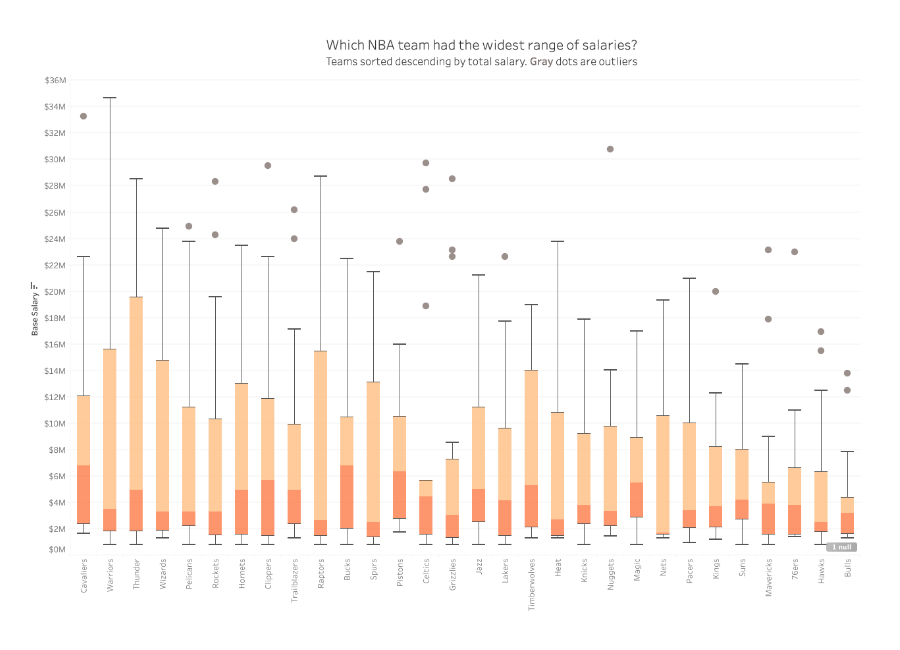
Use a box and whisker plot to show the distribution of data within a population. They allow for users to determine where the majority of the points land at a glance. They are even more useful when comparing distributions between members of a category in your data. The example above is the distribution of NBA salaries in 2017. It's broken down by team to see which one has the widest range of salaries. It also shows which teams have a large amount of outliers. As shown above, one can arrange several box and whisker plots horizontally or vertically to allow for easy comparison.
When and how to use Box and Whisker Plots for Visual Analysis
Use a box and whisker plot when the desired outcome from your analysis is to understand the distribution of data points within a range of values. They also help you determine the existence of outliers within the dataset.
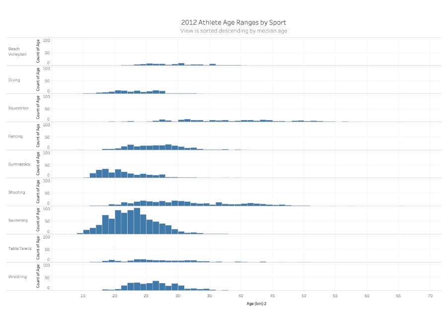
Keep in mind that the steps to build a box and whisker plot will vary between software, but the principles remain the same. You need a qualitative categorical field to partition your view by. You also need a more granular qualitative value to partition your categorical field by. Finally, you need a single set of values to measure. In the view below our categorical field is “Sport”, our qualitative value we are partitioning by is “Athlete”, and the values measured is “Age”.
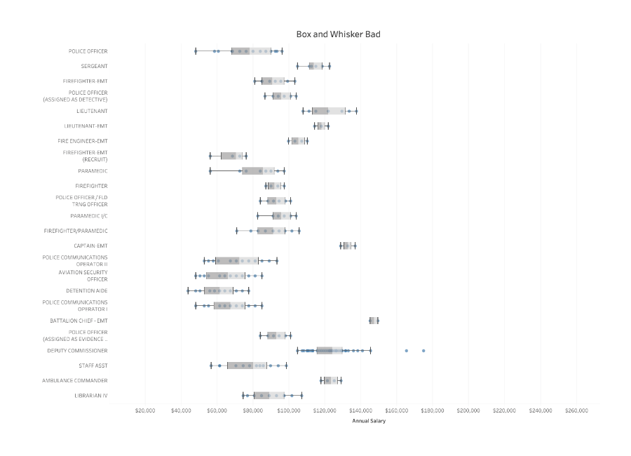
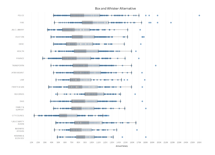
The view below compares distributions across each category using a histogram. This type of visualization can be good to compare distributions across a small number of members in a category. It can become cluttered when there are a large number of members to display. The same can be said when attempting to use standard bar charts to showcase distribution.
When the number of members in a category increases (as in the view above), shifting to a boxplot (the view below) can give us the same information in a condensed space, along with a few pieces of information missing from the chart above. Specifically: Median, Interquartile Range (Middle 50% of our population), and outliers.
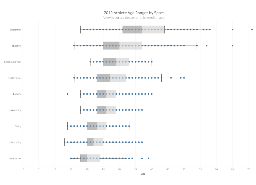
While the box-and-whisker plots above show individual points, you can draw more than enough information from the five-point summary of each category which consists of:
Upper Whisker: 1.5* the IQR, this point is the upper boundary before individual points are considered outliers.
Upper Hinge: The top end of the IQR (Interquartile Range), or the top of the “Box”
Median: Middle value by count of values
Lower Hinge: The bottom end of the IQR (Interquartile Range), or the bottom of the “Box”
Lower Whisker: 1.5* the IQR, this point is the lower boundary before individual points are considered outliers.
Do not use a box and whisker plot if:
- You only have a limited number of data points
- The measurements are all the same, or too close to the same
An alternative for a box and whisker plot is the histogram, which would simply display the distribution of the measurements as shown in the example above.
Great examples of Box and Whisker Plots
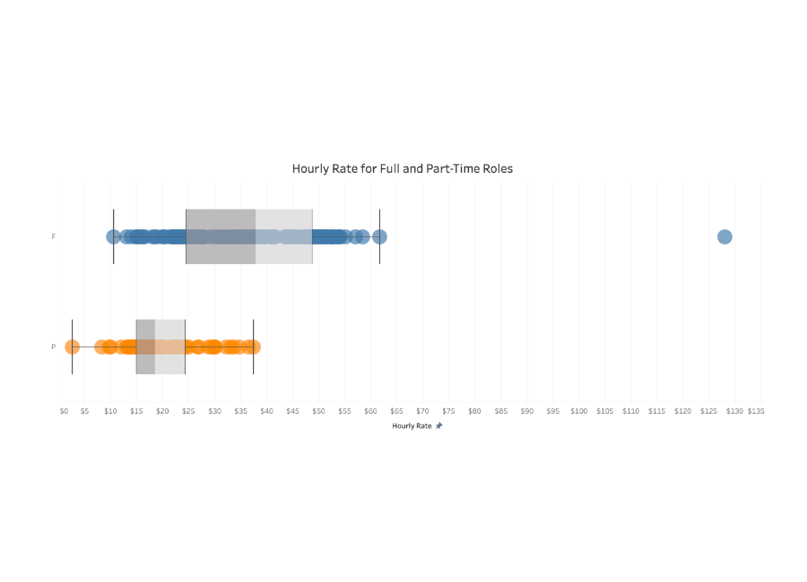
In this box and whisker plot, salaries for part-time roles and full-time roles are analyzed. Two plots show the average for each kind of job. Applicants might be able to learn what to expect for a certain kind of job, and analysts can quickly determine which job titles are outliers.
- The measures use consistent colors
- There is clearly a 25th percentile, a median, and a 75th percentile