Todas las historias de Visualizations
 Visualizations
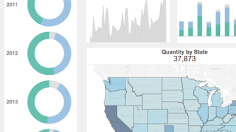
Format This Interactive Key-Metrics Dashboard in Just 10 Minutes
Want more of your colleagues to dive into data? Introduce them to the data-informed way of life with an elegant dashboard about key metrics. A high-level dashboard that keeps the company updated at all levels and also drills down in seconds can help people evolve from passive consumers of data to self-service can-doers.
 Visualizations
Data Dialogues: To Pie Chart or Not to Pie Chart?
 26 Noviembre, 2015
Oh, the poor, maligned pie chart. The chart type that gets pushed around and bullied on the data-viz playground more than any other.
 Visualizations
Got a Scatter Plot? Learn How to Add Marginal Histograms
16 Noviembre, 2015
Scatter plots are my favorite visualization type, hands down. From my very first interactive data graphic about The Great One to the most recent visualization below on major league pitchers, I’ve learned a great deal from these Cartesian classics over the years. In this post I’ll show you how to make them even better than the standard ones in Tableau. Visualizations
Are you as Tableau-smart as a Tableau consultant?
 23 Octubre, 2015
I joined Tableau in September 2013 as a product consultant. We PCs are Tableau experts. We help with all things product-related, from technical sales to internal support and training, to content development. Basically, if you have a problem in Tableau, you get help from a PC. Every new PC starts working through the challenge workbook on the first day. The goal is to become an expert before ever getting on a customer call. This works so well for us internally that I thought it would only be fair to share with our community!
23 Octubre, 2015
I joined Tableau in September 2013 as a product consultant. We PCs are Tableau experts. We help with all things product-related, from technical sales to internal support and training, to content development. Basically, if you have a problem in Tableau, you get help from a PC. Every new PC starts working through the challenge workbook on the first day. The goal is to become an expert before ever getting on a customer call. This works so well for us internally that I thought it would only be fair to share with our community! Visualizations
The viz that reigned supreme at Iron Viz 2015
 23 Octubre, 2015
It was the 20 tensest minutes of all of Tableau Conference. Three of the world’s preeminent data artists gathered in Viz Stadium at the MGM Grand. Shine Pulikathara, Matt Chambers, and Skyler Johnson had all come to claim the same coveted glory. But as host Ross Perez made clear, “only one can walk away with the prize”—$2,000 and the title of Iron Viz Champion.
23 Octubre, 2015
It was the 20 tensest minutes of all of Tableau Conference. Three of the world’s preeminent data artists gathered in Viz Stadium at the MGM Grand. Shine Pulikathara, Matt Chambers, and Skyler Johnson had all come to claim the same coveted glory. But as host Ross Perez made clear, “only one can walk away with the prize”—$2,000 and the title of Iron Viz Champion. Visualizations
Check Out These Visual Analytics Features in Tableau 9.1
Tableau 9.1 lets you ask and answer more explicit questions of your data. Take advantage of these visual analytics features to dig deeper. Visualizations
Protip for students: 5 steps to creating A+ data visualizations
 16 Septiembre, 2015
An effective data visualization lets users see and understand the data at the speed of thought. You can visualize data from biology labs, accounting case studies, or any other subject you’re studying to find answers faster. Here are five ways to improve the overall value of your dashboards.
16 Septiembre, 2015
An effective data visualization lets users see and understand the data at the speed of thought. You can visualize data from biology labs, accounting case studies, or any other subject you’re studying to find answers faster. Here are five ways to improve the overall value of your dashboards. Visualizations
Tableau on Tableau: How we design our Salesforce dashboards
 14 Septiembre, 2015
A dashboard is only effective if it answers useful questions for people. That’s why a customized, user-specific dashboard is more impactful than a ready-made, one-size-fit-all report. Here at Tableau, we always design visualizations with the user in mind. Here are several techniques we use to customize our sales dashboards.
14 Septiembre, 2015
A dashboard is only effective if it answers useful questions for people. That’s why a customized, user-specific dashboard is more impactful than a ready-made, one-size-fit-all report. Here at Tableau, we always design visualizations with the user in mind. Here are several techniques we use to customize our sales dashboards.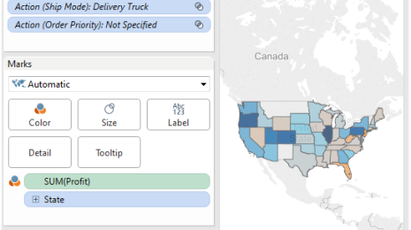 Visualizations
How to dynamically set default values for quick filters
Can we set a default value for a quick filter based on an action? Don’t be too quick to say, “No!” That was my first inclination. But I was wrong; there is a way!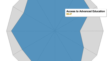 Visualizations
Utilice gráficos de radar para comparar dimensiones con base en diferentes métricas
Los gráficos de radar son una herramienta ideal para comparar miembros de una dimensión en una función de varias métricas. Por ejemplo, si quisiera comprar un smartphone, podría usar un gráfico de radar para comparar distintos dispositivos con base en diferentes métricas, como duración de la batería, calidad de la cámara y capacidad de la memoria.
 Visualizations
5 tips on creating an interactive résumé using Tableau
One of my most popular dashboards on Tableau Public is a visualization about my career. Tableau is a tool that lets you paint with data, so your imagination is the limit on what you can build. Here are some tips to get you started on building your own visual résumé.
 Visualizations
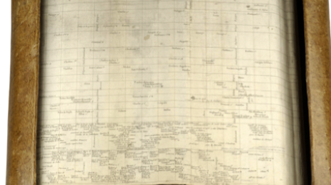
What This 250-Year-Old Chart Can Teach Us about Visualizing Data
 8 Julio, 2015
In 1753, Jacques Barbeu-Dubourg took on the non-trivial task of creating a timeline showing the complete history of the world. It was a noble effort, and his final chart came in at a whopping 54 feet (16 meters) wide! Barbeu-Dubourg didn’t have screens, of course. Instead, he had to be creative. He created a mechanical scroller. And believe it or not, his work can teach us a few things.
8 Julio, 2015
In 1753, Jacques Barbeu-Dubourg took on the non-trivial task of creating a timeline showing the complete history of the world. It was a noble effort, and his final chart came in at a whopping 54 feet (16 meters) wide! Barbeu-Dubourg didn’t have screens, of course. Instead, he had to be creative. He created a mechanical scroller. And believe it or not, his work can teach us a few things.