Human Resources Dashboards
Examples from the Tableau Community
Track Basic Headcount Metrics
Accelerator’s dashboard helps HR teams understand their critical headcount numbers. Tableau Accelerators' team has an entire suite of dashboards built out for HR on Tableau Public.
Interact with the dashboardHeadcount fluctuation report
This dashboard started as an internal project for our Starschema’s HR department because they wanted more insights into employee turnover so they can plan our growth more accurately. Read more about the project on their web site.
Interact with the dashboardIntracompany movements by location
This dashboard helped Starschema answer, “What’s happening within the company?” as employees moved to new locations.
Interact with the dashboardStarbucks Workforce Diversity
Starbucks publishes their workforce diversity data in detail using Tableau dashboards. Learn more on their web site.
Interact with the DashboardCornell University’s Diversity Dashboard
Cornell University publishes its University Factbook with Tableau. This view gives insights into campus diversity.
Interact with the dashboardPrinceton University’s Diversity Dashboard
Princeton University's CPUC (Council of the Princeton University Community) task force on Diversity, Equity, and Inclusion provides regular reporting on student and employee demographics to monitor progress in the areas of Gender, Race/Ethnicity, and U.S. Citizenship Status.
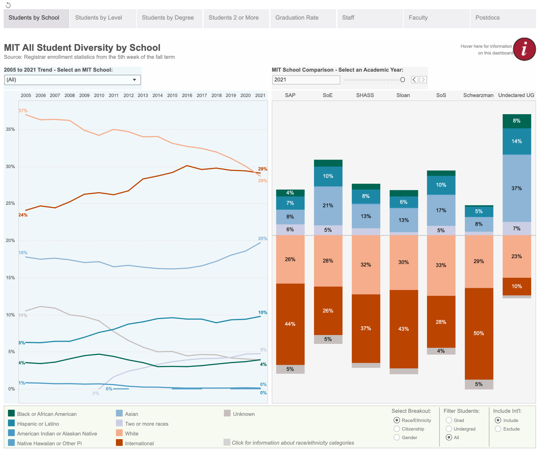
Interact with the DashboardMIT’s Diversity Dashboard
Explore the gender and race/ethnicity of the MIT community in the Diversity Dashboard from Institutional Research.
Interact with the dashboardThe University of Alabama’s Diversity Dashboard
The University of Alabama’s Office for Diversity, Equity, and Inclusion publishes this dashboard tracking DEI at the school.
Interact with the DashboardUniversity of Connecticut Diversity Dashboards
The University of Connecticut’s Office of Institutional Research and Effectiveness publishes a series of Tableau dashboards tracking the school’s diversity metrics.
Interact with the DashboardHR Diversity Scorecard by Lovelytics
This dashboard by Tableau Visionary Chantilly Jaggernauth helps businesses understand their diversity numbers. Watch this webinar to understand how she created it and learn best practices for visualizing data.
Interact with the Dashboard9 Box Employee Ratings by Decisive Data
Decisive Data worked alongside the HR reporting team to redesign the classic 9 Box Ratings report. Leveraging data dashboard best practices, Decisive Data used appropriate visual hierarchies and layered dashboards for detail giving the HR executives the ability to drill down by rating and department and see all relevant employee metrics and details.
Interact with the DashboardPayScale analyzes pay gap data
This dashboard which shows industries with the largest gender pay gaps is one of a collection of dashboards showing pay issues. Payscale presented at TC19 about how it provides customers reporting on their gender pay gap. See all of their dashboards on their Tableau Public Profile.
Interact with the dashboardJob application process funnel
This dashboard from Starschema tracks the job application process through to offer and hiring and provides insights about how to improve the recruiting process.
Interact with the dashboardCompetition for Talent
This dashboard shows insights into how to recruit in a tight talent market and compares job listings with similar requirements.
Interact with the DashboardEmployee flight risk dashboard
This dashboard by Decisive Data asses the risk employees might depart a company and allows managers to prioritize reaching out to employees to help reduce turnover.
Interact with the DashboardEmployee Attrition Analysis
This dashboard by Technomatic helps businesses understand patterns in attrition data so they can find the areas of improvement to reduce attrition
Interact with the dashboardEmployee Turnover: When, Who, and Why
The Human Resources Dashboard created by Lovelytics showcases key metrics related to employee turnover.
Interact with the dashboardEmployee Survey Analysis
This dashboard from Tableau’s own People Analytics team shows how the company analyzes its employee survey data and gets a better understanding of the impact of working from home on its workforce. Learn more on the Tableau on Tableau: Leading Through Change case study.
Interact with the dashboardCovid-19 HR Dashboard on Employee Safety
This dashboard from Lovelytics shows how Covid-19 data can be joined with data on office locations to help understand employee safety during the pandemic.
Interact with the dashboard


