Your JSON data is ready for analysis in Tableau 10.1!


See and understand your JSON data without data prep! In Tableau 10.1, you can connect to your local JSON files, reason about their structure, and start analyzing.
What's JSON? JSON stands for JavaScript Object Notation. It's had explosive growth and is now the standard format for the web, ranging from APIs to logs. Twitter, Facebook, Yelp, and many others have APIs that return JSON.
One of JSON’s benefits is flexibility. It can accommodate both simple flat structures and complex hierarchical data. Now in Tableau 10.1, you can analyze both types without any data prep! It’s as simple as drag and drop.
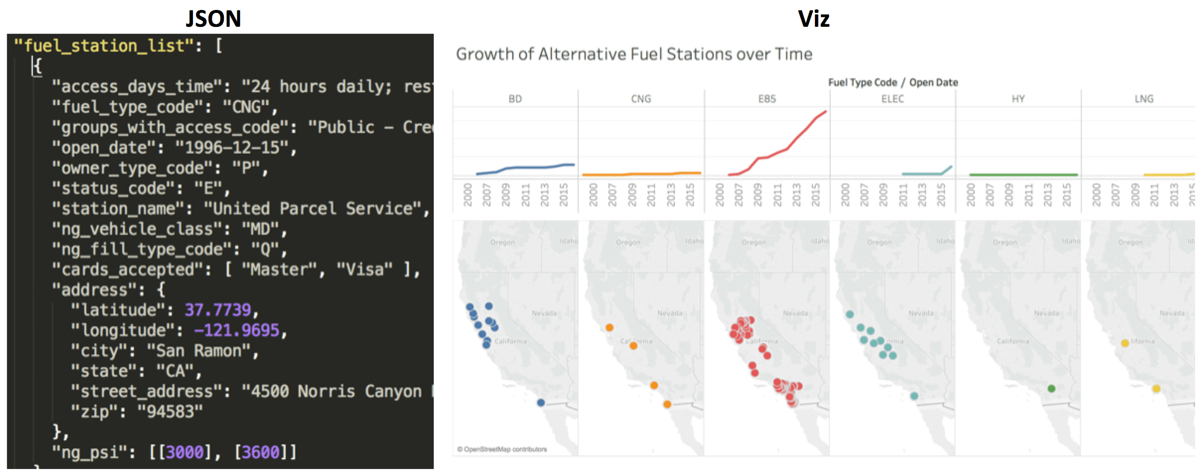
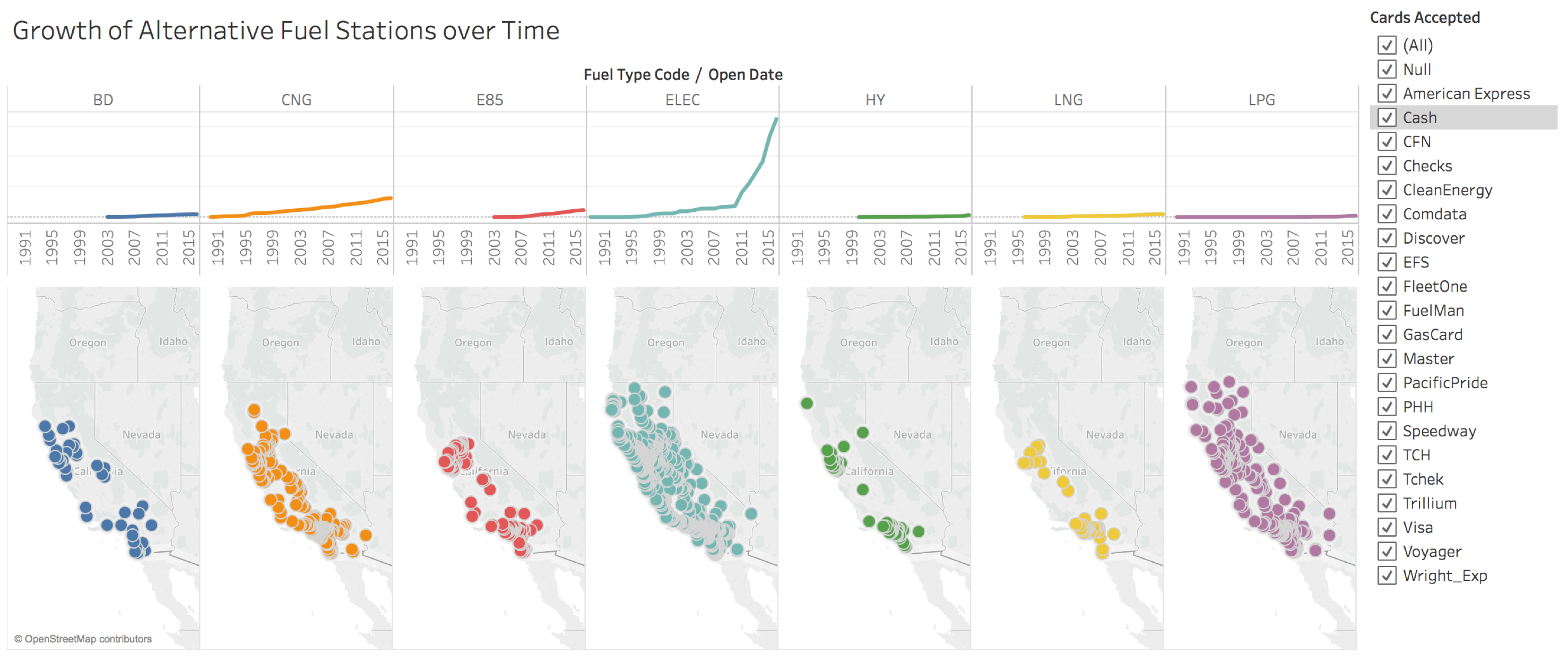
Let me show you how easy it is to explore complex JSON data with this new feature. Let’s say I am curious about the growth of alternative fuel stations in the state of California. The National Renewal Energy Laboratory offers an API through which I can download this data in JSON.
Using Tableau, I can turn the JSON file on the left into an intuitive viz, like the one seen on the right.
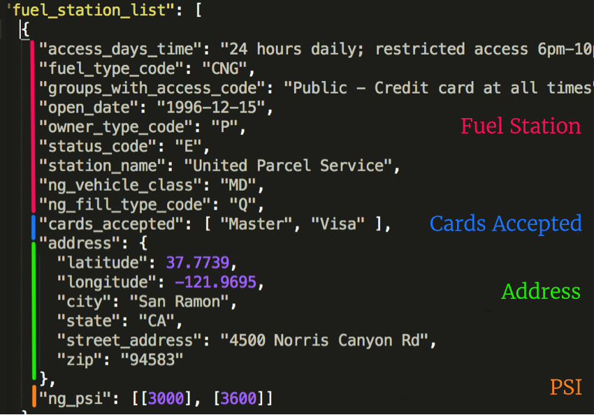
This JSON file has four schema levels available, including:
- Fuel Station: Information about the station
- Cards Accepted: List of all credit cards accepted by the station
- Address: Location of the station
- PSI: When compressed natural gas is available, this lists the available pressures (PSI) you get from the station.
Now let's read that same data in Tableau. To do that, I pick the new JSON file option and select the “fuelstations.json” file.
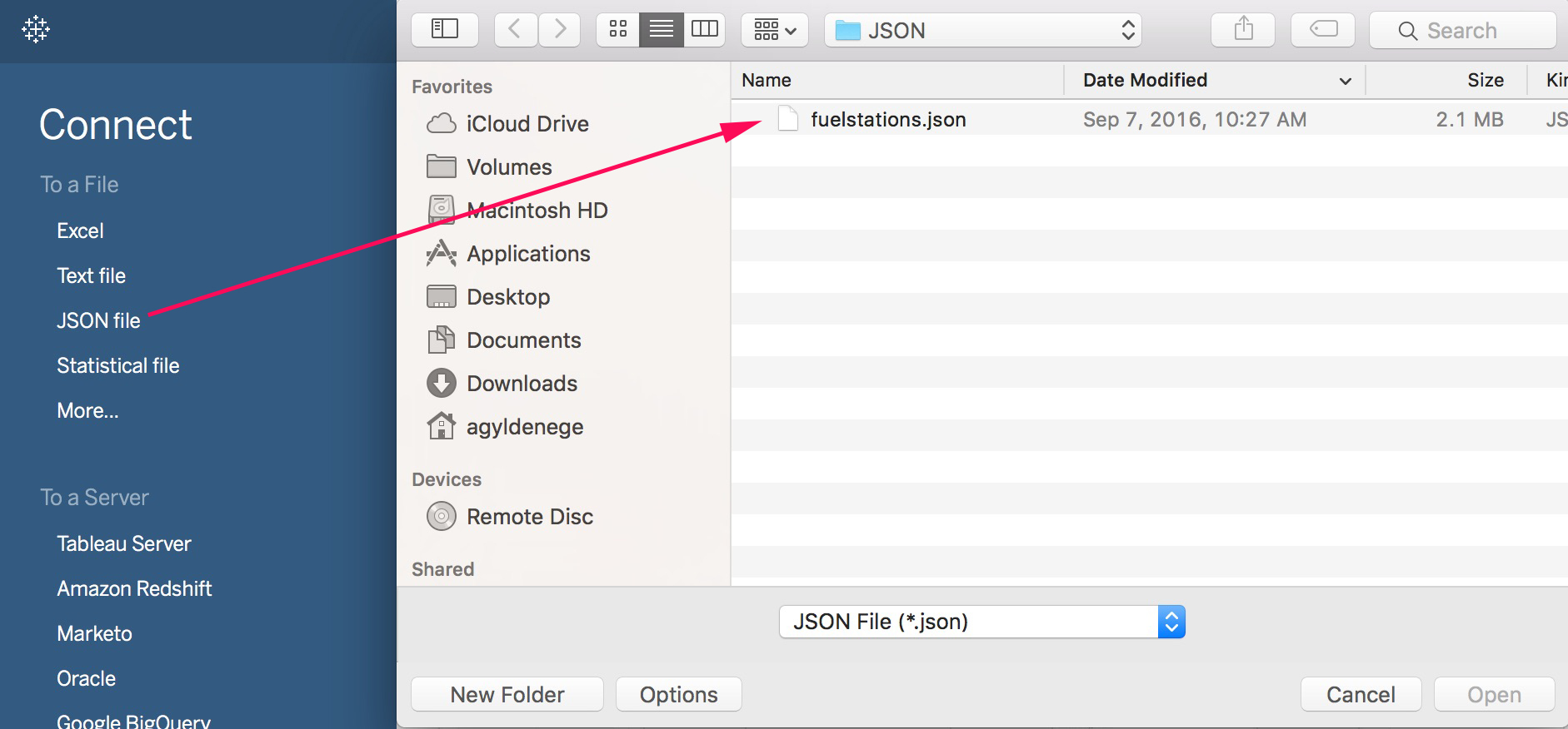
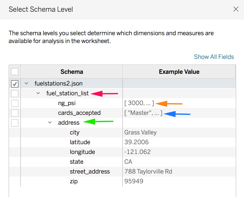
Tableau immediately reviews the file, infers a schema, and shows me the same levels we saw earlier with sample data! Now I can easily reason about my JSON file and pick which levels I want to use for analysis. I’ll pick Address, Cards Accepted, and Fuel Station List.
Now let's create a viz! On the data tab, my dimensions are organized by the same levels as the JSON document. It even put the cards_accepted array into the Fuel Station List folder.
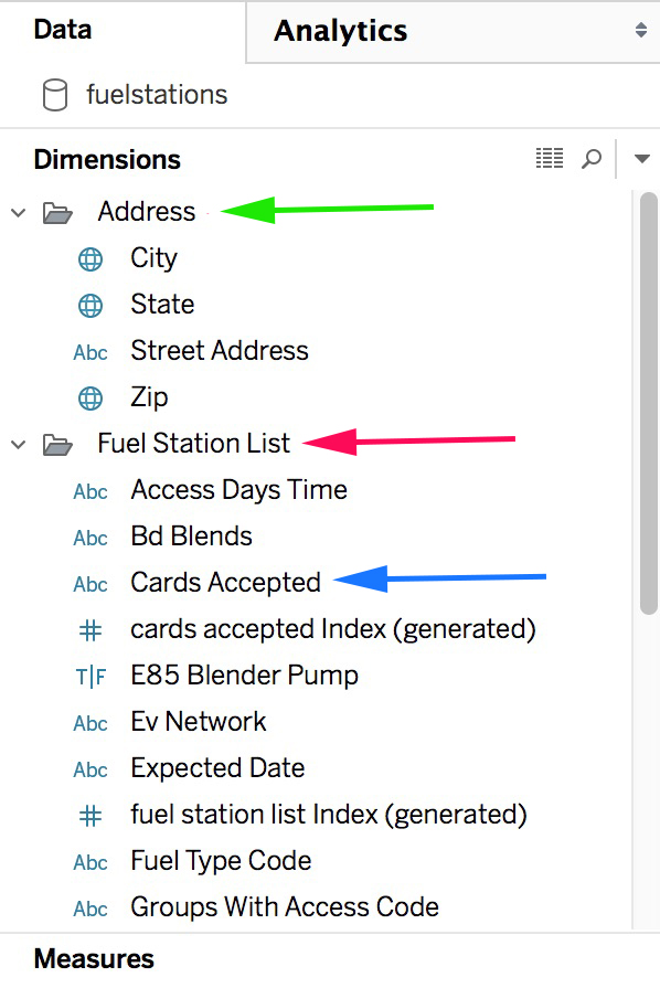
My measures are also named and organized by their schema level. Fuel Station List has four measures that all end with “per fuel station list.” Why did Tableau create these? These measures help me aggregate at the right level of detail. Let’s take a closer look at Tableau’s universal measure, Number of Records.
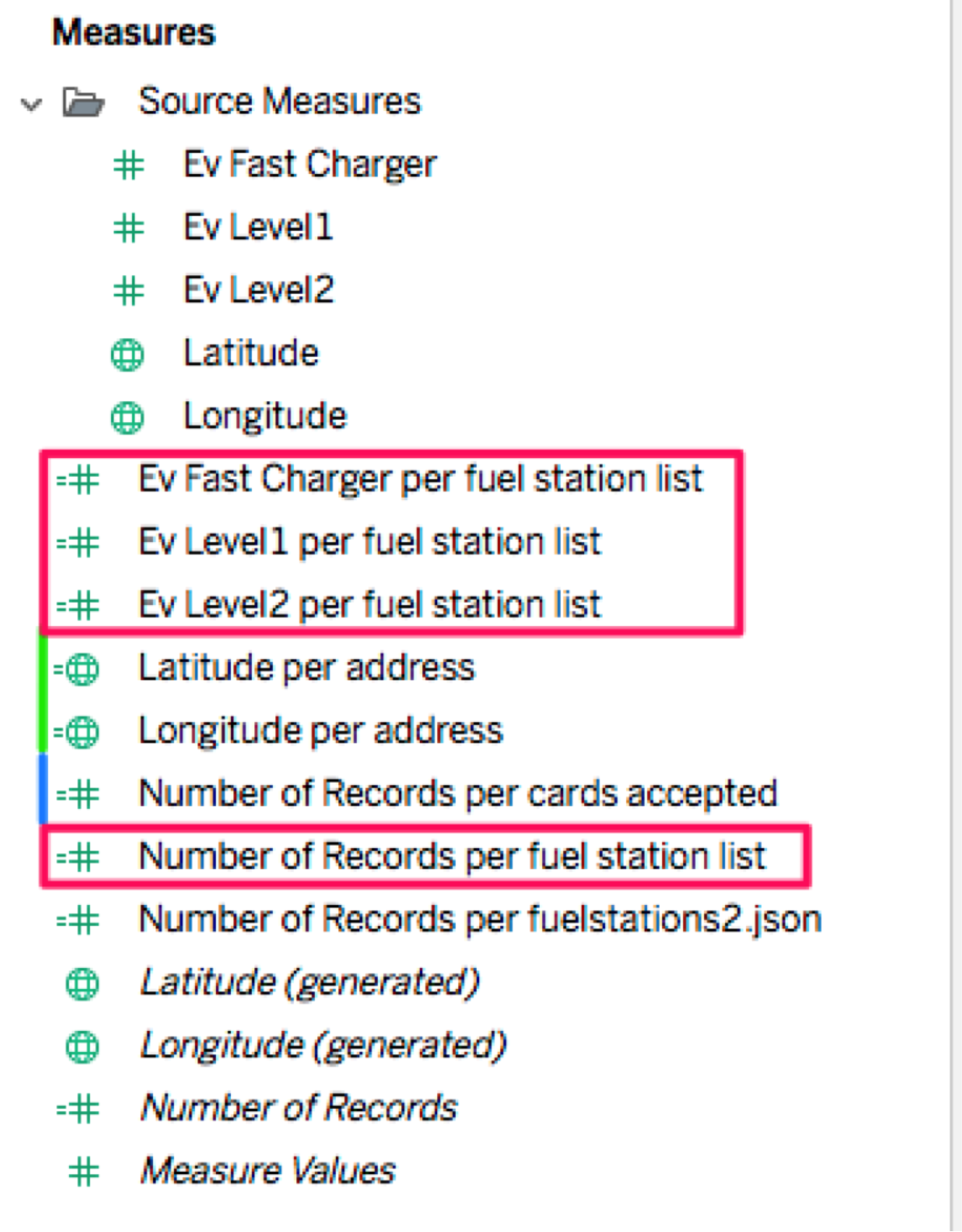
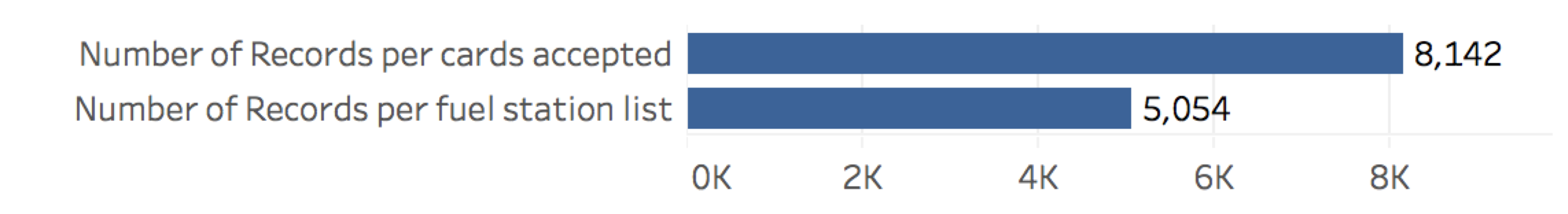
Tableau created Number of Records Per Fuel Station List, which counts the unique number of fuel stations, and Number of Records Per Cards Accepted, which counts the number of cards accepted by each station. If we chart these, we can see that many stations accept more than one type of credit card.
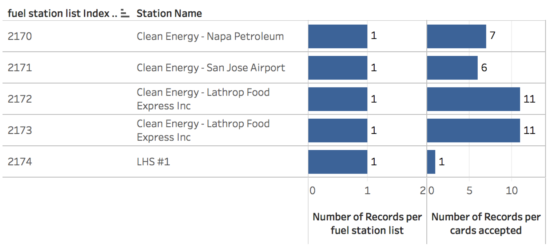
How is Tableau doing this? When we flatten the JSON data, we create special index fields for each level in the hierarchy. We then auto-generated level-of-detail measures so you can easily aggregate to the right level. In the viz below, you can see the unique index for each fuel station, the Station Name, the Number of Records Per Fuel Station List, and the Number of Records Per Cards Accepted. Since we’re aggregating by the station, the count of stations is always one, where the cards accepted is as high as 11 per station.
We auto-generate these measures, but you can change the name or the formula at any time. We also keep the original measures in a folder called Source Measures.
After creating my viz, I can see how electric charging stations have grown significantly since 2011 and are the widest spread! I can even filter the stations by their payment options.
New JSON data sets are appearing all the time. Imagine what you can analyze with the new local JSON connector:
- Explore meteorite-fall data from NASA
- Analyze food trucks in San Francisco
- Examine traffic data in Chicago
- Take the Yelp Data Set Challenge
Join the beta
Check out our beta program to learn more and sign up. The beta program is available for existing Tableau customers. Customers with an active maintenance license can upgrade for free when Tableau 10.1 is released.
See what's new in Tableau
Alert! Alert! Turn on Conditional Subscriptions with 1 Click in Tableau 10.1
Connect Directly to Your Marketo Data in Tableau
Tableau 10.1 Beta Is Here
To learn more about finding stories in your big data, visit our big-data analytics page. And continue the conversation on our Tableau Server & Tableau Online Admin Community Forum.
Related Stories
VizQL Data Service from Tableau: Use Your Data, Your Way
 August 8, 2024

When and How to Use Multi-fact Relationships in Tableau
 August 1, 2024

Top data books of 2021
 December 12, 2021